Four recordings went through the renderer this week. Two Chopin piano works from the Musopen public-domain collection — Ballade No. 1, Op. 23, and the Fantaisie-Impromptu, Op. 66 — and two spoken words generated locally through macOS speech synthesis, *Bonjour* and *Ciao*. We drew each one as an amplitude waveform, from the actual audio, not a decorative curve. The question we started with was narrow: does tempo have a visible shape, and do four performances of a tempo idea produce four different drawings? The waveforms answered before we did. They did not agree with each other, and they did not agree with the score.
The Four Recordings on the Bench
The bench held two very different kinds of sound. On one side, two piano performances from the Musopen Chopin collection, archived at archive.org/details/musopen-chopin under a CC0 1.0 public-domain dedication. On the other, two spoken words, generated locally on a laptop through the macOS speech synthesiser — one French, one Italian — kept as original signals so nothing about their production would be borrowed or licensed from anywhere else. Four sources, one method. Each file read as raw audio, sampled into amplitude values, and drawn as a silhouette across a fixed horizontal length.
We chose these four deliberately, and it is worth saying why before the shapes arrive. The Ballade No. 1, Op. 23 is a large-scale work: it moves through several tempo regions, from a hesitant introduction into rolling narration and, later, into a coda that is famously fast. The Fantaisie-Impromptu, Op. 66, is more compact but built on a tempo problem baked into its notation — a right hand running against a left hand in a rhythmic ratio that most performers negotiate rather than solve. Then the two spoken words. *Bonjour* and *Ciao* are, in one sense, single acts of tempo: a greeting has a duration, a syllable count, an internal rhythm. They are also uncontroversial. Nobody argues over how fast the word *ciao* should be spoken. That made them the control samples. If the method drew four different shapes for four things that had genuinely different tempo behaviour, then the method was reading something. If it drew four broadly identical shapes, we would have to admit that the renderer was flattering us.
The four files were not equalised in length. We resisted the urge to stretch them to a common width, because the horizontal axis of a waveform *is* time, and squeezing an eight-second word into the horizontal space of an eight-minute Ballade would have destroyed the very measurement we wanted to preserve. What we drew, instead, was each recording at its own true duration, then compared silhouettes proportionally: not "how do they look side by side at the same width", but "what shape does each one make, given how long it actually is".
The renderer itself is deliberately dumb. It reads samples, folds absolute amplitude values into a rendered pixel column, and moves on. It has no opinion about music. It does not know that one file is Chopin and one is a Mac saying *ciao*. That neutrality matters. Every visible feature in what follows is a feature of the recording, not of the drawing.
What the Silhouettes Actually Showed
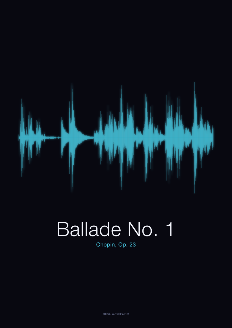
The Ballade drew as a long river with cities on it. Extended stretches of low-to-medium amplitude, punctuated by tall clusters where the pianist gathered the piece into a loud passage and then let it collapse again. The tallest clusters were not evenly spaced. They sat where any listener familiar with the piece would expect them to sit — around the sectional climaxes, and, unmistakably, near the end, where the coda's tempo change registers as a visible thickening of the silhouette. On paper, the last minute of the Ballade looks denser than the first minute. That is not a rendering artefact. The pianist is playing more notes per unit of time, and the drawing records the amplitude sum of those notes.
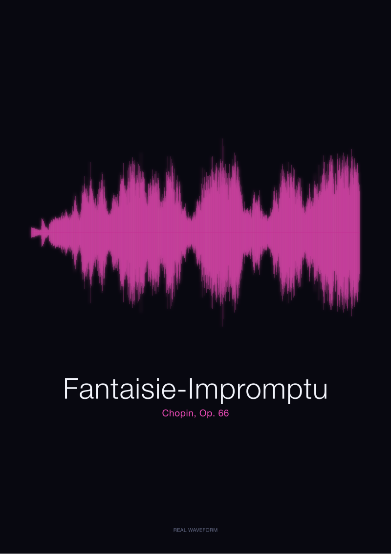
The Fantaisie-Impromptu drew differently. Rather than a river with cities, it read as continuous corrugation: a shape that is busy from the first second to the last, with fewer of the low-amplitude valleys that punctuate the Ballade. This is exactly what its texture predicts. A piece built on a moto-perpetuo right hand does not offer many silences. The silhouette of the Fantaisie-Impromptu is, effectively, a horizontal band of near-constant activity, thicker in the middle where the middle section broadens and thinner at the extremes where the outer sections chatter.
*Bonjour* and *Ciao* were, by contrast, tiny drawings. Two syllables of French, two of Italian, each occupying under a second of horizontal space. And here is where the shape of tempo became visible in miniature. *Bonjour* rendered as two clear amplitude events — a soft onset, a taller second syllable — separated by a narrow but visible dip. *Ciao* rendered as essentially one continuous amplitude event with an internal glide: the vowel does most of the work, and the consonant onset registers as a small vertical spike at the front of the shape. Two greetings, two tempo footprints, no ambiguity between them.
Taken together, the four silhouettes disagreed on almost everything except the rule that had produced them. The Ballade said tempo is variable within a piece. The Fantaisie-Impromptu said tempo is continuous and dense. *Bonjour* said tempo is a spacing between two events. *Ciao* said tempo is the duration of a single event. Four recordings, four working definitions of the word.
 Fantaisie-Impromptu
The print from this article · from €29.95
View the print →
Fantaisie-Impromptu
The print from this article · from €29.95
View the print →
What the Shape of Tempo Is Not
The temptation, looking at four waveforms with visibly different silhouettes, is to declare that the drawings show tempo. They do not. They show amplitude across time, and tempo is only one of several things that leaves marks in that space. The Ballade's tallest clusters are not the fastest passages of the Ballade. They are the loudest. Loudness and speed are related in Romantic piano performance — climaxes tend to be both fast and loud, quiet passages tend to be both slow and soft — but they are not the same variable, and a waveform does not distinguish between them. A pianist who plays fast and quietly will leave a thin, dense silhouette. A pianist who plays slowly and loudly will leave a tall, sparse one. The drawing does not know which is happening; it only records the sum.
The Fantaisie-Impromptu makes the same point in reverse. Its silhouette is corrugated and continuous not because the piece is at a single tempo throughout, but because it is texturally busy throughout. A silhouette that looks like a horizontal band tells you the recording has few silences. It does not tell you whether the notes inside that band are being played strictly or with rubato. Two pianists could produce broadly similar Fantaisie-Impromptu silhouettes and disagree completely about tempo at the bar level. The waveform is too coarse a drawing to catch that disagreement.
The spoken words are the cleanest illustration. *Bonjour* and *Ciao* are both fast — well under a second each. But *Bonjour* has a visible internal event structure and *Ciao* does not, and that difference is about phonetics, not about speed. If the synthesiser had been asked to speak *Bonjour* half as fast, the shape would have widened horizontally, kept its two-event structure, and remained recognisably itself. If it had been asked to speak *Ciao* half as fast, the shape would have widened without adding any new internal features. Same tempo change, two different visual outcomes. The shape of tempo, in other words, is inseparable from the shape of the sound being tempo-ed.
There is a further caveat we want to be honest about. Public-domain recordings, including the Musopen Chopin set, are single interpretations. We measured the tempo silhouettes of one Ballade and one Fantaisie-Impromptu — not the tempo silhouettes of the Ballade and the Fantaisie-Impromptu in general. A different pianist, with a slower or faster reading, would draw a related but distinct shape. We are not claiming to have found the definitive silhouette of either piece. We are claiming that each rendering is faithful to the recording it came from.
The Cost of Trusting the Metronome Marking
There is a habit, particularly in commercial gift contexts, of presenting music as a fixed object with a fixed tempo. A metronome marking on a score is offered as if it were a fact about the piece, and by extension, a fact about any recording of the piece. Our four waveforms are a quiet argument against that habit. The score of the Ballade No. 1 does not draw itself. What draws itself is a specific pianist's decision, on a specific day, in a specific room, about how to move through the notation. The waveform is a receipt for that decision. The score is not.
The cost of ignoring this is not measured in currency. It is measured in mismatch. When someone gifts a print of a piece they love, and the print is derived from a decorative curve rather than from an actual recording, the receiver is holding a drawing of the score's idea, not a drawing of the sound they know. Two performances of the Fantaisie-Impromptu — one urgent and one patient — will produce two visibly different silhouettes, and only one of those silhouettes will match the recording that lives in the giftee's ear. A print made from the wrong recording, or from no recording at all, will look correct in the general shape and wrong in the details that make the memory personal.
This is why our shop works only from real recordings — the Musopen Chopin collection for the piano works, original signals for spoken audio, and licensed masters for anything else. The Ballade No. 1 print in the shop is the Ballade No. 1 waveform of the specific Musopen recording, not a stylised interpretation of "how a Ballade tends to look". The Fantaisie-Impromptu print is the same. And when we produce prints of spoken words like *Bonjour* or *Ciao*, they come from the actual voice that spoke them, not from a generic phoneme template. A single mention: the shop is at /shop/, and every piece in it is drawn from the real audio it represents.
The narrower point, though, is about what tempo actually is. It is not a number in the top left corner of a score. It is the sum of every decision a performer makes about the spacing of events. Our four recordings, when drawn, showed four different ways of making those decisions. The Ballade spread them across regions. The Fantaisie-Impromptu buried them in continuous texture. *Bonjour* put them into a two-syllable dance. *Ciao* collapsed them into a single vowel. Each of those is a valid answer to the question "what is tempo, visually". None of them is the answer.
 Ballade No. 1
The print from this article · from €29.95
View the print →
Ballade No. 1
The print from this article · from €29.95
View the print →
If You Only Remember One Thing
Tempo has a shape, but the shape is not clean. The waveforms of four recordings compared this week showed that the visible silhouette of a piece is co-produced by loudness, texture, phonetics and performer choice — and only one strand of that four-strand rope is what a musician would call tempo. Reading a waveform as if it were a tempo map is a mistake. Reading it as the record of one performance's whole behaviour, tempo included, is closer to the truth.
The four drawings that came off the bench this week — the Ballade, the Fantaisie-Impromptu, *Bonjour*, *Ciao* — are, in that sense, four different receipts. Each is honest about a different recording. None of them is the piece. All of them are the sound. If a waveform ever makes you feel that you are holding the whole shape of the music you love, hold onto that feeling; then remember that it is holding onto you because it was rendered from the real thing, and not from an idea of the real thing.
This piece did not cover a few things and we should say what they are. It did not measure tempo in beats per minute against a metronome — we drew silhouettes, not counted pulses, and the two are related but not interchangeable. It did not compare multiple pianists' recordings of the same Chopin work, which is the natural next test and one we have queued for a later bench. And it did not address how tempo behaves in ensemble recordings, where multiple performers negotiate spacing between them; the four files here were solo piano or single-voice speech, which is a simpler physical case than a quartet or an orchestra. Each of those is worth its own careful measurement.
FAQ
What does "tempo" actually look like on a waveform?
It does not look like anything on its own. A waveform draws amplitude across time, which means faster passages tend to produce denser corrugation and slower passages tend to produce spacing between events. But loudness, texture and instrument choice also shape the drawing. Tempo is one contributor to the silhouette, not the silhouette itself. Reading a waveform as a tempo map will mislead you; reading it as a whole-performance record, tempo included, is accurate.
Why did you use only four recordings?
We wanted a bench small enough to compare shape-by-shape and diverse enough to test whether the method distinguished genuinely different tempo behaviours. Two Chopin works from the Musopen public-domain collection provided long-form musical tempo. Two locally generated spoken words provided short-form phonetic tempo. Four is not a statistical sample. It is a comparison set, deliberately chosen so that every disagreement between the drawings could be traced back to a specific difference in the source audio.
Are the Chopin recordings you used definitive?
No. The Musopen Chopin collection, distributed under CC0 1.0 on archive.org, contains specific performances by specific musicians. Every waveform we drew from it is faithful to that particular recording, not to the Ballade No. 1 or the Fantaisie-Impromptu as abstract works. A different pianist would produce a related but distinct silhouette. We do not claim to have measured the shape of Chopin. We claim to have measured the shape of four public-domain recordings.
Why include spoken words alongside piano pieces?
Because they made the argument about tempo cleaner. A greeting has an unambiguous duration and an unambiguous internal rhythm — nobody argues over how fast *ciao* should be spoken. Comparing *Bonjour* and *Ciao* to the two Chopin works let us see that the renderer draws every kind of temporal event honestly, whether the source is a nine-minute Ballade or a half-second word. The method did not favour music over speech.
Can a waveform tell me if a performer is rushing?
Not directly. A waveform is too coarse a drawing to catch bar-by-bar rubato or small tempo drifts. It can show you regions where a performer sped up or slowed down at the macro level — the Ballade's coda thickens visibly for exactly this reason — but it cannot show you whether beat three of bar 47 arrived a hair early. For that, you need annotated tempo analysis, not amplitude rendering.
What is the practical use of comparing performances this way?
It makes the difference between recordings visible rather than only audible. Two performances of the same piece will produce two silhouettes with related overall structure and different local detail. Holding those two drawings next to each other is a way of seeing what a listener would otherwise only hear. That matters when a recording carries personal meaning — a specific performance heard at a specific time, distinct from every other rendering of the same score.
Do your prints come from the recordings you tested here?
Yes, when the recording is one we render into a print. The Ballade No. 1 and Fantaisie-Impromptu waveforms in our shop are drawn from the same Musopen public-domain recordings measured on this bench, not from decorative approximations. Spoken-word prints are drawn from real voice audio. The commercial rule we hold ourselves to is simple: every silhouette we sell is a receipt for an actual sound, not an interpretation of what that sound might look like.
From the collection



New pieces and 10% off your first print.
One email now with your code. No noise after.