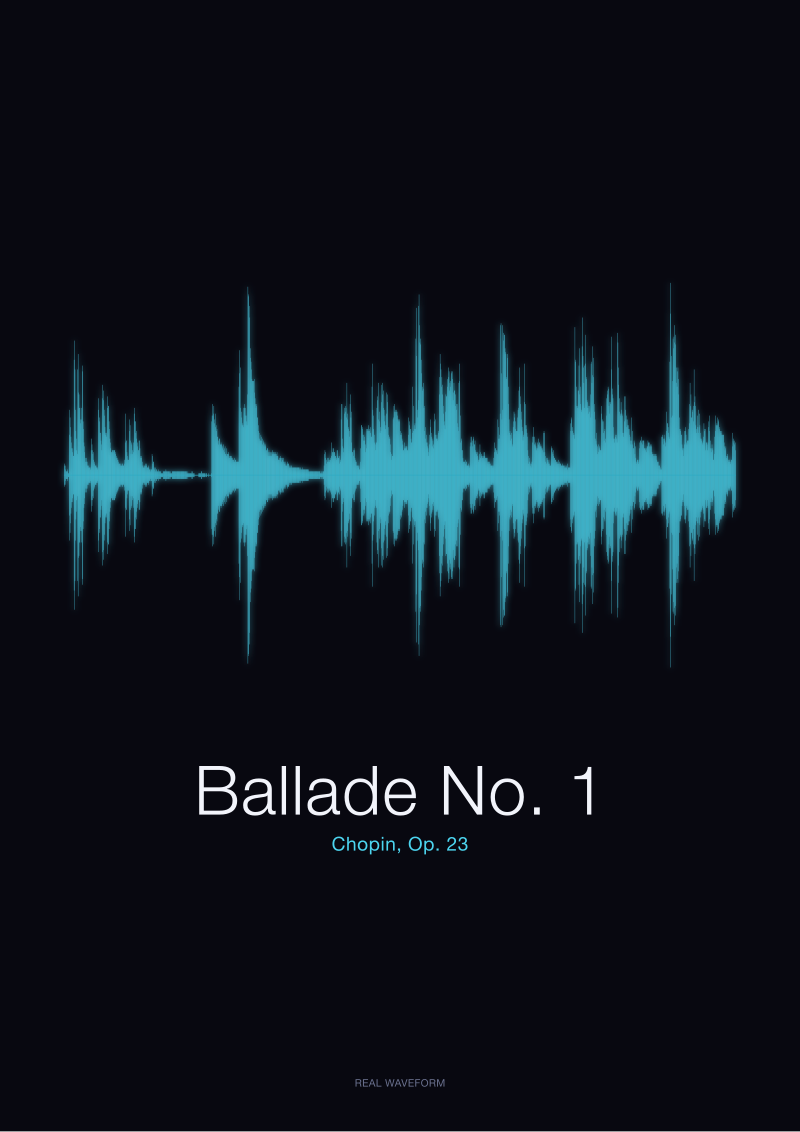
Most color choices for a soundwave print are made against the music, not for it. The buyer opens the configurator, sees six swatches, and picks the one that matches the sofa. The waveform of Chopin's Ballade No. 1 — a real amplitude drawing rendered from a public-domain recording in the Musopen Chopin collection — does not care about the sofa. It cares whether its quietest passages remain legible, whether the loudest second still reads as loud, and whether the eye can trace the shape from across the room. Color decides all three, quietly, before the frame is even chosen.
We say this as a studio that renders real recordings into real waveforms, not as a shop that wants to talk you into an upsell. There is no premium color at Waveform Prints. There is only a set of choices, each of which does something specific to a specific piece of music. Some of those choices flatter the sound. Some fight it. The point of this piece is to name which is which, without pretending every option is equally good for every waveform.
Hear us out. The right color for your print is almost certainly the one you were about to talk yourself out of.
Black on White Is the Default for a Reason, and the Reason Is Not Boredom
Black on white is what the industry that draws sound has always used. Not because designers lacked imagination. Because ink on paper was the first medium that could hold a waveform steady enough to read, and the eye evolved to parse dark marks on light ground faster than any other combination. A phonograph engineer in 1928 would recognise the waveform we render today. They would also recognise the reason it is drawn the way it is.
Contrast is the mechanism. A waveform is not a shape in the ordinary sense. It is a dense field of vertical lines whose heights carry the amplitude of the recording. When those lines are black on white paper, every one of them is visible to the eye at reading distance and from three metres away. When they are pale grey on cream, the loudest peaks survive but the quiet interior of the piece — the two-minute stretch inside a Nocturne where Chopin barely lifts his hand from the keys — disappears into the background. What you gain in warmth, you lose in music.
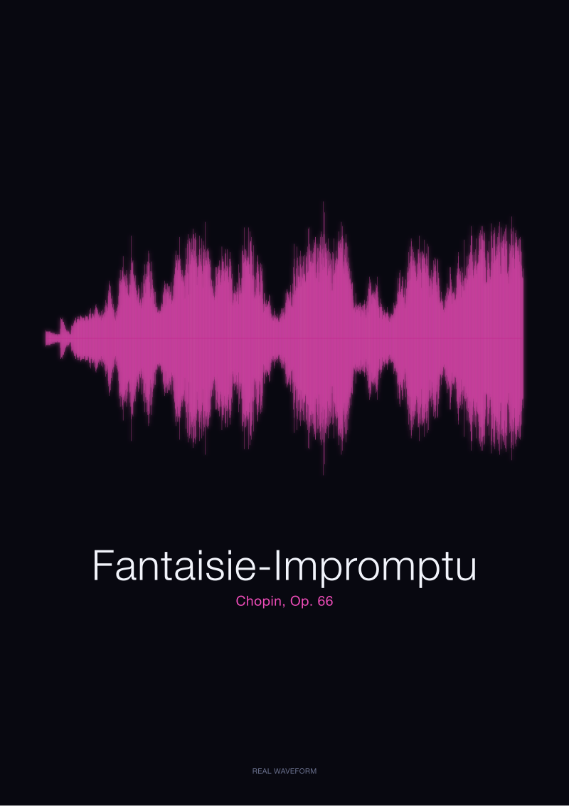
This matters more for some recordings than others. The Fantaisie-Impromptu, Op. 66, is dense throughout. Its waveform is a thick, active band from the first bar to the last, and even a mediocre contrast ratio will render it recognisably. The Ballade No. 1 is different. It has a long, hushed opening and quiet passages that account for a meaningful portion of its total shape. Reduce the contrast and you erase precisely the parts of the drawing that make it that particular piece. A high-contrast Ballade is a Ballade. A low-contrast Ballade is a general drawing of the piano.
Black on white is not the safe choice. It is the accurate choice. It is the one that treats the waveform as information rather than decoration, and it is why every serious visualisation of sound — from the first oscilloscope traces to the sonograms in a modern acoustics lab — defaults to it. If you want your print to be readable in ten years without the room lighting cooperating, this is where you start.
The honest limitation is that black on white can read as clinical. A dense piano piece rendered edge-to-edge in ink can dominate a wall that was not asking to be dominated. If the room is small, if the wall is already busy, if the frame is unfinished timber and the light is warm, the sharpness will feel like an intrusion. That is a real trade-off. It is not solved by picking a softer colour. It is solved by giving the print more white space around it, by choosing a smaller size, or by moving it to a wall where sharpness is welcome.
Color Reads the Room Before It Reads the Music
The moment you leave black, you enter a decision that has less to do with the recording and more to do with the light the print will live in. This is not a criticism. It is the physical reality of pigment. A deep navy waveform on ivory paper looks like a considered editorial choice under the cool daylight of a north-facing room in January. The same print under a 2700K incandescent bulb in October reads as slightly muddy black. The pigment did not change. The light did. Colour is a promise the paper cannot keep alone.
There are two useful families here, and it helps to name them plainly. The first is what we would call chromatic near-blacks: deep forest, ink navy, oxblood, warm charcoal. These sit within a few percent of the contrast ratio of true black against white or ivory paper, which means the waveform remains legible in the way we described in the previous section. What they trade is a small amount of graphic sharpness for a large amount of tonal integration with the room. A recording of the Ballade No. 1 printed in ink navy on soft ivory does not stop being the Ballade No. 1. It becomes the Ballade No. 1 wearing a different suit. The dynamics are still visible. The quiet passages still register as quiet. The single tallest peak still reads as the tallest peak in the room.
The second family is what happens when the swatch drifts further from black — mid-tone sage, dusty rose, terracotta, mustard. These are the colours that look most striking on a configurator screen and most fragile on the wall. Contrast against white paper collapses to somewhere in the mid-range, and the quiet interior of the waveform starts to disappear at reading distance. Whether that matters depends entirely on the recording. A spoken-word waveform — the syllables of *Bonjour* or *Ciao*, generated locally from macOS speech synthesis, each a compact drawing of a single spoken greeting — survives a mid-tone treatment well. The waveform is short, high-contrast within itself, and structured around a clear attack. There is very little quiet interior to lose. A Chopin Ballade does not survive it. Too much of the music lives in the space between the loud moments, and that space needs contrast to exist as a drawing.
The rule we use in-house is not a rule about colour. It is a rule about what the recording is asking the paper to do. Dense, sustained pieces with dynamic range — the Ballade, the Fantaisie-Impromptu — reward strong contrast because their information is spread across the whole surface. Short, punctuated pieces — a spoken word, a bell, a single vocal phrase — tolerate softer palettes because their information is concentrated in a few peaks that will survive almost any pigment. Pick the colour to match the recording's dynamic profile, not the pillow.
The honest limit here is that we cannot see your room, and no swatch on a screen can either. If the print will hang under a warm bulb in a warm interior, a warm-family near-black will integrate better than true black. If it will hang in a naturally-lit space with white walls, true black will hold up longest. Both are defensible. Neither is a compromise unless you treat the other as a compromise.
 Ballade No. 1
The print from this article · from €29.95
View the print →
Ballade No. 1
The print from this article · from €29.95
View the print →
The Frame Around the Print Chooses the Color You Cannot See
The colour you choose for the waveform is the colour you spend the most time thinking about. It is not the colour that decides how the print looks on the wall. The frame does. And the frame is almost always chosen last, after the ink has already been committed, which is the wrong order.
A thin black frame around a black-on-white waveform doubles down on the contrast. It tells the eye that this is a technical drawing, an artefact, something to be read. It works well for pieces where the reading matters — a recording of something specific and intimate, a first dance, a Chopin piece with personal meaning, the actual amplitude drawing of the actual sound. It fights against warmth. It has no interest in blending in. In a room of hard edges and cool light, this is the correct answer.
A raw oak or ash frame does the opposite. It softens every contrast decision inside the paper. A true-black waveform inside a warm-timber frame reads as a considered graphic object rather than an instrument reading. The ink loses about ten percent of its perceived sharpness the moment the timber goes around it, which is either a bug or a feature depending on where the print is going. In a warm room, this integration is usually the point. In a cool room, it can make the whole print look like it is dressed for the wrong season.
White frames are the option nobody asks about and everybody should. A white or off-white frame around a black waveform on white paper turns the entire composition into a single field of white with a graphic mark inside it. It disappears into a white wall almost completely and lets the waveform do all the visual work. This is the answer for people who wanted the sound and did not want a piece of furniture. It is also the answer for very large sizes, where a heavy frame starts to compete with the drawing.
The uncomfortable truth is that the frame decision reverses some of the colour decisions we spent the previous section defending. A soft dusty-rose waveform that looked timid on white paper alone becomes precise and intentional inside a thin black frame — the frame provides the contrast the ink refused to. A high-contrast black-on-white waveform inside a heavy warm-timber frame reads softer than a mid-tone print inside a thin metal one. Colour and frame do not add. They multiply. Which means the honest way to choose either is to choose them together, and to be told this before you commit to one and then the other.
If you want to see how any of this applies to a specific recording — the Ballade, the Fantaisie-Impromptu, a spoken greeting, or something you send us — the shop at /shop/ is where the actual waveforms live, rendered from the actual audio, with the colour and frame combinations shown against neutral ground rather than a lifestyle photograph designed to sell one particular choice.
This piece started as an argument for black on white and turned into something more honest, which is that the correct colour for a soundwave print is the one that respects the shape of the sound and the light in the room, in that order, and that pretending otherwise is a form of dishonesty a studio should not be in the business of. We did not cover the paper stock, which changes the maths of every contrast decision above and deserves its own piece. We did not cover the mat, which sits between paper and frame and does more work than it gets credit for. And we did not cover multi-track prints, where two waveforms have to co-exist on the same page and the colour question becomes a question of relationship rather than a question of tone. Each of those is a longer argument than we could fit here, and each one starts, again, from the sound.
 Fantaisie-Impromptu
The print from this article · from €29.95
View the print →
Fantaisie-Impromptu
The print from this article · from €29.95
View the print →
From the collection



New pieces and 10% off your first print.
One email now with your code. No noise after.