A waveform is a drawing of air. Before it is a print on a wall or a thumbnail in a music app, it is a record of the tiny pressure changes a Chopin Ballade made in a room, translated into numbers, and then translated again into a line. The studio works with real recordings — the Musopen public-domain Ballade No. 1, Op. 23, the Fantaisie-Impromptu, Op. 66, a single spoken "Bonjour," a single spoken "Ciao" — and every silhouette we render is the actual amplitude of that actual audio. Nothing decorative. Nothing invented. This piece explains, plainly, how that translation happens.
A Waveform Is a Drawing of Air, Not a Decoration
Most images labelled "waveform" on the internet are lying, gently. They are hand-drawn sine curves, or generative wiggles seeded with a nice-looking noise function, or stock vectors bought in a bundle. They have the pleasant, symmetrical rhythm of something that has never been in a room. A real waveform does not look like that. A real waveform of the opening bars of the Ballade No. 1, Op. 23 — the recording we work from is the Musopen public-domain release, freely available at archive.org/details/musopen-chopin under a CC0 1.0 dedication — begins with something almost apologetic. A long, low approach. The first phrase in the left hand is quiet and unhurried, and the waveform for those seconds sits close to the horizontal, barely lifting off its own axis. Then the melody enters and the line thickens. Then, minutes later, when Chopin finally lets the coda go, the waveform swells into a dense, black mass of amplitude that is unmistakably the loudest thing in the piece. The shape of the Ballade is not a metaphor. It is a plot of what the microphone heard.
We insist on this distinction because it is the entire premise of the studio. A print of a Chopin Ballade waveform is not a mood; it is a receipt. You could take the same recording, load it into any competent audio editor, zoom to the same timestamp, and see the same silhouette. If we rendered the Fantaisie-Impromptu, Op. 66 from the same Musopen collection, you would see something visibly different — a busier, more restless line, because the piece is busier and more restless. The right hand runs in near-constant sixteenths against a rolling left hand, and the amplitude envelope reflects that constancy: less white space, more sustained middle-range activity, punctuated by the rare true silences where the pedal lifts and the sound briefly clears. The Ballade breathes in long paragraphs. The Fantaisie-Impromptu breathes in fast, shallow ones. The waves show you this before you press play.
The same rule applies to speech. When we render a single spoken "Bonjour" — a signal we generated locally, on a laptop, using the operating system's built-in speech synthesis — the waveform has exactly two humps. You can count them with your eye. One for *bon*, softer, shorter. One for *jour*, longer, with a slower decay that fades into silence like an exhale. When we render a spoken "Ciao," you see one hump instead of two, and it has that hard, bright attack at the front — the *ch* — followed by the long, open vowel. This is not artistic license. This is what the microphone captured and what any waveform viewer, on any machine, would show. The word is a shape. Every word is. Every recording is. This is the truth the studio is built on, and it is the reason we have never once used a decorative curve.
Sampling Is the Quiet Bureaucracy Between Sound and Shape
To draw the shape, you first have to write it down. Sound in the world is continuous — the air pressure in front of a piano varies smoothly, without gaps, as the strings vibrate. A computer cannot store *smooth*. A computer stores numbers, and numbers are discrete. So somewhere between the microphone in front of the pianist and the file on the archive, an act of translation happens, and that act is called sampling. It is one of the least glamorous ideas in physics and one of the most consequential, and it is worth understanding at the level of a general reader, because everything about how a recording looks and sounds flows from it.
Sampling means, roughly, this: many thousands of times per second, the recording device asks the microphone a question. The question is *how loud is it, right now?* The microphone answers with a number. The number is written down. Then the device asks again, and again, and again. The rate at which the device asks is called the sample rate, and it is measured in samples per second. Common sample rates for music — the numbers you have probably seen on a project's export settings — are in the tens of thousands. When you play the file back, the machine reads those numbers in order and reconstructs, from them, a continuous-looking signal that a speaker cone can follow. The whole process runs on the premise that if you ask the question fast enough, the reconstructed signal is, for human ears, indistinguishable from the original air.
For the visible shape of a piece, sampling is what makes drawing possible at all. A waveform, as displayed on a screen or printed on paper, is a plot of those recorded numbers against time. Horizontal axis: time, running left to right. Vertical axis: the number the microphone reported at that moment — the amplitude, positive above the centre line, negative below. If you tried to draw the Ballade at the actual sample rate, at a normal print size, you would get a solid black rectangle: the samples are far too dense to see as individual dots. What every waveform viewer does — what our renders do — is summarise. For each pixel of horizontal width, the viewer takes the highest and lowest sample values that fall within that pixel and draws a vertical stroke between them. The result is the familiar silhouette: a symmetrical mass, thin where the recording is quiet, thick where it is loud, punched through with white where it is silent.
This is why, when we render the Musopen Ballade at one size, the shape has a certain grain, and when we render it larger — with more horizontal pixels covering the same duration — the grain becomes finer and the line reveals detail that was previously hidden inside a single stroke. It is the same audio. It is the same sampling. What changes is how much of the underlying number stream survives the summary. There is no correct amount of detail. There is only the size of the paper and the honesty of the process. When we deliver a print, the shape you see is the highest-fidelity summary that fits the format. Nothing has been smoothed for beauty. Nothing has been amplified for drama. The bureaucracy of the sampled numbers passes through, undecorated, into the drawing.
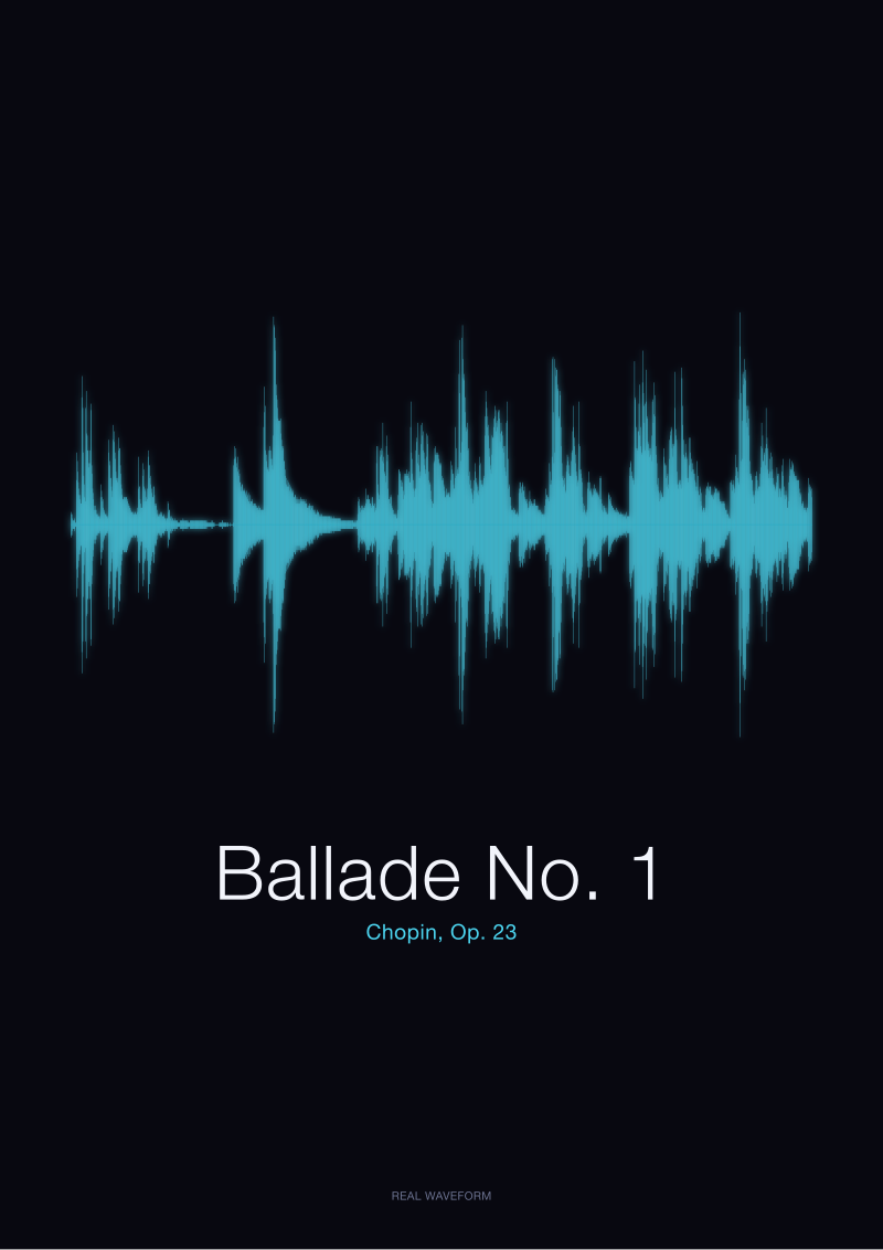 Ballade No. 1
The print from this article · from €29.95
View the print →
Ballade No. 1
The print from this article · from €29.95
View the print →
Amplitude Is the Only Thing You Are Actually Seeing
Here is a distinction that catches even musical listeners off guard. A waveform, in the sense the studio uses the word, does not show you pitch. It does not show you harmony. It does not show you which key the piece is in, or which chord is currently sounding, or whether the pianist has arrived at the second theme. It shows you one thing only: how loud the recording is, moment to moment. The vertical axis is amplitude. The horizontal axis is time. That is the entire vocabulary.
This is worth sitting with, because it explains why two very different pieces can produce waveforms that, at a glance, look similar, and why two performances of the same piece almost never do. A slow, quiet nocturne and a slow, quiet passage from a spoken poem might both appear on paper as long thin lines with occasional gentle swells — because both are, in the physical sense, quiet events in the room. Meanwhile the Ballade No. 1 and the Fantaisie-Impromptu, which are worlds apart musically, share certain gross features in their silhouettes: dense middle passages, dramatic peaks, silences at the beginning and end. What separates them, when you look carefully, is the *distribution* of those peaks and silences over time. The Ballade organises itself around a small number of large events. The Fantaisie-Impromptu is almost uniform in its restlessness. The two shapes, once your eye is trained, are not remotely alike. But they are alike in the sense that both are, honestly, drawings of loudness.
The same limitation is also the source of the form's strange emotional accuracy. Because amplitude is a physical fact rather than a musical one, the waveform is indifferent to whether a passage is happy or sad, resolved or unresolved. A minor-key lament and a major-key hymn, played at the same dynamic level, will produce similar-looking envelopes. And yet — and this is the quietly moving thing — a specific recording of a specific piece by a specific performer produces a shape that no other recording will exactly duplicate. Rubato, the pianist's small pushes and pulls against the beat, shifts the timing of every peak by fractions of a second. A slightly heavier left hand thickens a whole passage. A held pedal extends a decay and closes the white space. The shape is a fingerprint of a performance, not of a work. This is why the studio always names both the piece and the source recording. The Musopen Ballade No. 1, Op. 23 has a silhouette. Some other pianist's Ballade No. 1, Op. 23 would have a different one. Neither is more correct. They are two truthful records of two different moments in the air.
Once you accept that a waveform is only amplitude and time, the paradox resolves itself: the drawing does not tell you what the music means. It tells you what the room contained. Meaning, as it always has, remains between the listener and the piece. What the wall gives you is the proof that the sound was there, in that shape, on that day.
This piece is a plain explanation and, deliberately, not several other things. It does not cover the difference between sample rate and bit depth in any depth beyond noting that the first exists — bit depth, the precision of each individual number, is a separate essay and deserves one. It does not cover the specific rendering choices the studio makes when translating a summarised waveform into an ink line on paper — margins, weights, contrast, paper stock — because those belong in a note about craft, not physics. And it does not attempt to argue that a waveform is the *only* honest way to draw a piece of music; sheet music is another, spectrograms are another, and each answers a different question. This one answers the narrowest question, which is how the numbers become the line. What started as a note about sampling turned, in the writing, into a longer argument about the difference between decoration and record — and the studio, unsurprisingly, kept siding with record.
FAQ
What actually gets measured when a microphone records a Chopin recording?
The microphone measures air pressure at its diaphragm, thousands of times per second, and reports each measurement as a number. That is the entire physical event being captured. The recording is then a long ordered list of those numbers. When the studio renders a print of the Musopen Ballade No. 1, Op. 23, the horizontal position on the page corresponds to time in the recording and the vertical extent corresponds to the size of those numbers — nothing more elaborate is happening underneath.
Does the waveform show the pitch of the notes being played?
No. A waveform in the sense used here plots amplitude against time, and amplitude is loudness, not pitch. You cannot look at the silhouette of the Fantaisie-Impromptu, Op. 66 and read the melody off it. A spectrogram, which decomposes the signal into frequencies, is the drawing that shows pitch information. The studio's prints are deliberately the amplitude view, because that view is what gives a piece its recognisable overall shape — its dynamics over time.
Why do two recordings of the same piece produce different waveforms?
Because a waveform is the fingerprint of a performance, not of the composition. Tempo choices, rubato, pedal held a fraction longer, a heavier or lighter left hand — every one of these shifts the amplitude at specific moments in time. Two pianists playing the same Chopin Ballade will produce silhouettes with the same broad architecture but different fine detail. Neither is more accurate. Each is a truthful record of the air in a specific room on a specific day.
What is sampling, in one paragraph?
Sampling is the act of turning a continuous sound wave into a discrete list of numbers by measuring the wave's amplitude at regular, very frequent intervals. The number of measurements per second is called the sample rate. On playback, the numbers are read back in order and used to drive a speaker, reconstructing something the ear treats as identical to the original sound. Without sampling there is no digital audio, and without digital audio there is no way to plot a recording as a line.
Are the studio's waveforms drawn by hand or by a design template?
Neither. Each print is generated directly from the actual audio file — for the Chopin pieces, the CC0 Musopen recordings hosted at archive.org/details/musopen-chopin; for spoken words like "Bonjour" and "Ciao," short signals generated locally on a laptop. The rendering summarises the sampled numbers into a line whose thickness at every point reflects the loudest and quietest samples in that horizontal slice. No decorative curve is added. No shape is smoothed for prettiness.
Why do "Bonjour" and "Ciao" look so different as waveforms?
Because they are physically different events. "Bonjour" is two syllables, so the waveform has two clear humps of amplitude — a softer *bon* and a longer, slower-decaying *jour*. "Ciao" is one syllable with a sharp consonantal attack at the front and a long open vowel that fades — a single hump with a bright leading edge. The shape of a spoken word is, in a very direct sense, a picture of how the mouth produced it.
Can a waveform be "wrong"?
It can be dishonest — a drawing labelled as a waveform of a specific piece when it is in fact a generic decorative curve is wrong in that it is not a record of anything. But a waveform generated from actual audio cannot be inaccurate to the audio it came from, so long as the sampling and summarising steps are done straightforwardly. Different rendering choices — the horizontal resolution, the size of the print — will reveal more or less detail, but they will not contradict each other. They are all faithful summaries at different scales.
Where can I hear the exact recordings the studio renders?
The Chopin pieces — Ballade No. 1, Op. 23 and Fantaisie-Impromptu, Op. 66 — are drawn from the Musopen Chopin collection, released under CC0 1.0 (Public Domain) and freely available at archive.org/details/musopen-chopin. The spoken "Bonjour" and "Ciao" signals were generated locally using operating-system speech synthesis. If you want to see the corresponding prints, the pieces we render live on the studio's own shop at /shop/, each listed against the recording it was drawn from.
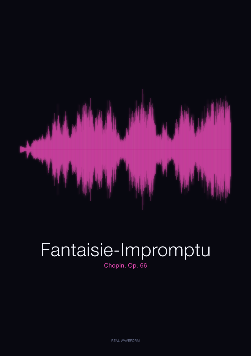 Fantaisie-Impromptu
The print from this article · from €29.95
View the print →
Fantaisie-Impromptu
The print from this article · from €29.95
View the print →
From the collection



New pieces and 10% off your first print.
One email now with your code. No noise after.