There is a tidy assumption people bring to waveforms the first time they see one: loud pieces make big drawings, quiet pieces make small ones. Amplitude equals emotion, height equals weight, and the *Moonlight Sonata* — pianissimo, sempre, senza sordino — should therefore render as a thin grey ribbon, barely troubling the page. It is a reasonable belief. It is also the belief our studio hears most often from first-time visitors standing in front of a Chopin *Nocturne* print, asking, politely, whether the machine got it right.
Why This Is Actually True
Amplitude is loudness. That much is not a lie. A digital audio file is a series of samples measuring instantaneous air pressure against the microphone, and rendering those samples as a curve produces a shape whose vertical extent is a direct function of how much energy hit the diaphragm. Bigger sound, taller peaks. There is no metaphor here, no interpretive layer. A snare drum will always outline a rectangle. A whisper will always crouch near the horizontal.
This is why the conventional intuition works so often. Watch a waveform of a rock track and the choruses genuinely do bulge outward from the verses. Watch a lecture recording and the applause is visible as a hairball of density. In the studio we render short speech samples for language prints — a single spoken *Bonjour*, a single spoken *Ciao*, each generated locally at controlled level — and the shape correlates exactly with what the ear reports: two syllables, two crests, a small basin of silence in between. First-time viewers who guess "loud equals tall" are not wrong. They are working with a heuristic that reliably fits the samples they have heard most.
The intuition also tracks tradition at the compositional level. The first movement of Beethoven's Piano Sonata No. 14 in C-sharp minor, Op. 27 No. 2 — the movement popular usage calls the *Moonlight* — is marked *pianissimo* throughout, *sempre*, *senza sordino*. Pianissimo is quiet. The whole movement is quiet. It is not a marking to be interpreted or apologised for. Beethoven wanted a hush. If the drawing on paper were tall and dense, that would be evidence the pianist disobeyed him, or the microphone was placed inside the piano, or the recording had been aggressively normalised in mastering. The intuition, in that sense, is a diagnostic tool: it lets a listener catch a bad rendition without knowing the score.
So yes — amplitude is real, the correlation is real, and the folk theory that quiet music draws small holds up in a large majority of cases the eye ever meets.
But here is what that framing misses entirely.
Where It Breaks Down
The *Moonlight* first movement is not a single dynamic. It is a long meditation on how small a difference can still be a difference. The triplet figure in the right hand runs almost continuously for the length of the *Adagio sostenuto*. Under it, the melody enters and withdraws. Above it, later, the melody rises through a register change. Below both, the sustain pedal is depressed and, per Beethoven's own *senza sordino* instruction, is never fully lifted — every note bleeds into the next. What a waveform of that movement records is not silence interrupted by notes. It is a continuous shimmer.
Continuous shimmer draws differently from silence-then-note. A pianissimo passage in which every attack decays directly into the next attack produces a shape whose local peaks are modest but whose *density* along the horizontal is total. There are no gaps for the drawing to be short. The result is not tall, but it is thick. On paper it reads as a continuous low band — the visual signature of sustain, not the visual signature of loudness. A visitor scanning the print for the "peaks" of the piece finds that the whole print is the peak, held at the same modest height for minutes on end.
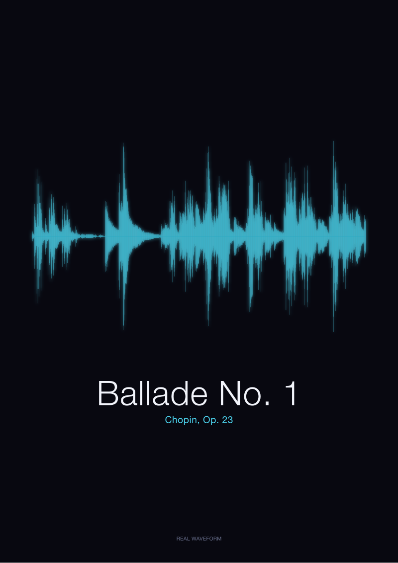
Set this beside a piece we do render, Chopin's *Ballade No. 1*, Op. 23, in our public-domain CC0 rendering from the Musopen Chopin collection at archive.org/details/musopen-chopin. The Ballade opens with a Largo introduction that is almost as quiet as the *Moonlight* — but with breath between the phrases. Each chord is followed by a real gap while the piano rings out and decays alone. In amplitude terms, the introductory peaks and the *Moonlight* triplet peaks would sit near each other. In shape terms, the two pieces are opposites. The Ballade's opening looks like a row of separated islands. The *Moonlight* opening would look like a low plateau. Same nominal loudness. Different drawings.
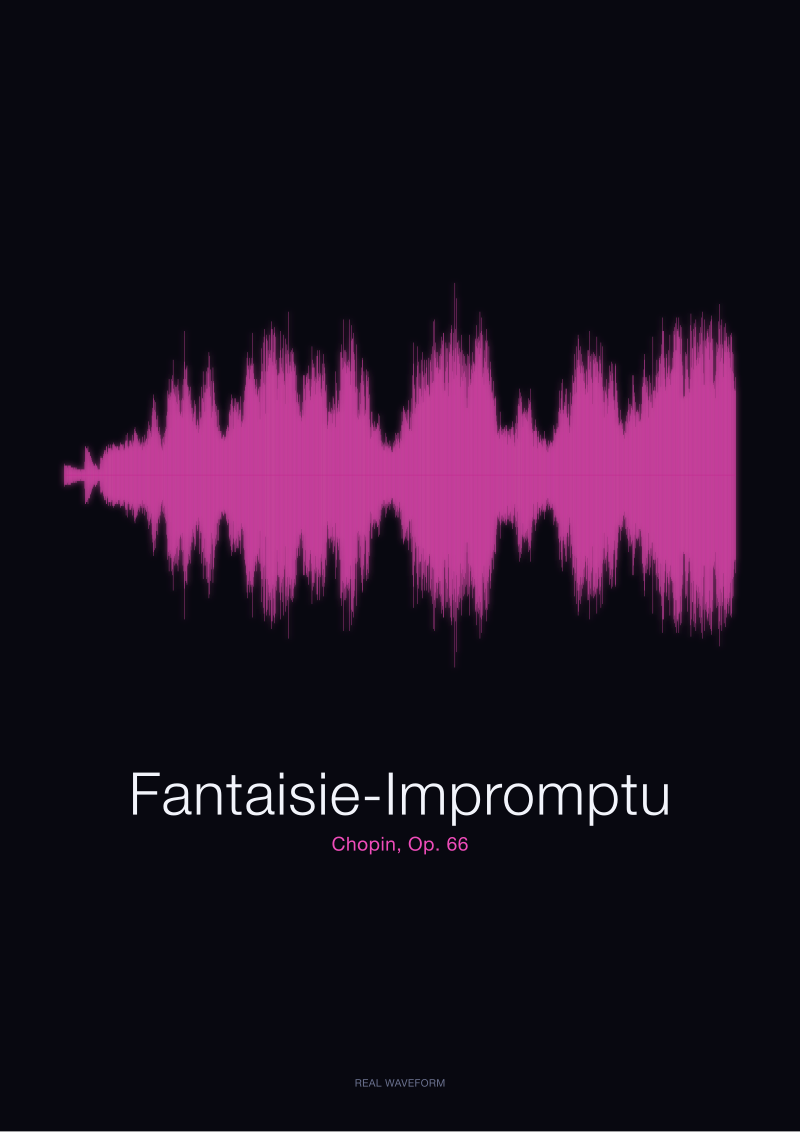
The intuition breaks down again in the opposite direction. Chopin's *Fantaisie-Impromptu*, Op. 66, opens with a moto perpetuo of rapid figuration in both hands that is fast and busy and full — but not necessarily loud in the ear. It reads on the page as continuous activity. On a waveform, that activity draws as a thick, sustained mass regardless of how the pianist controls dynamics. A restrained performance still draws a full page. The visual quantity is decoupled from the auditory volume.
This is where "loud equals big, quiet equals small" collapses. What amplitude actually measures is *instantaneous pressure*. What the human ear reports as "loud" is a perceptual weighting of frequency, duration, envelope, and context. What the waveform *draws* is neither of those two things. It draws density over time. And density can be high at any dynamic level, including pianissimo.
 Nocturne
The print from this article · from €29.95
View the print →
Nocturne
The print from this article · from €29.95
View the print →
The Rule I Use Instead
The reframing is a two-axis one. Amplitude is one axis. The other axis is *time-density* — how much of the horizontal span is actually filled with signal, as opposed to silence. The visual weight of a print is the product of the two, not either one alone. Neither axis is dominant. Both must be read.
A tall-but-sparse piece — a percussion recording, a series of hand-claps, the two syllables of a spoken *Bonjour* — draws as tall spikes separated by wide white gaps. Amplitude high, density low. The eye reads it as rhythmic. A quiet-but-dense piece — the *Moonlight* first movement — draws as low, continuous shimmer. Amplitude low, density high. The eye reads it as sustained, contemplative, weather-like. A tall-and-dense piece — the coda of the *Ballade No. 1*, where Chopin escalates into a prestissimo that fills the room — draws as a wall. Both axes maxed. The eye reads it as climax.
This is the rule we now use when describing a print to a first-time visitor. Do not ask "is this piece loud." Ask "how much of the time is filled." A Chopin nocturne is quiet *and* sparse: it draws as a narrow line with long white breaks between phrases. Chopin's *Fantaisie-Impromptu* is moderate *and* dense: it draws as a continuous band that occasionally spikes. Beethoven's *Moonlight* first movement is quiet *and* dense: it draws as a low, unbroken hum, a horizon at dusk. Three different silhouettes, three different musical intents, and only one of them — the sparse nocturne — fits the folk theory.
The practical consequence for anyone thinking about a waveform on a wall is that the piece's dynamic marking is a bad predictor of the print's presence in a room. The predictor is the piece's use of sustain, texture, and rest. A restrained Debussy prelude may cover as much page as a Rachmaninoff prelude. A Bach two-part invention may cover less than either. Our shop at /shop/ is organised by piece, not by loudness, precisely because knowing the composer and the opus tells you more about the silhouette than knowing the dynamic. The right question in front of the print is not "how loud was this." It is "how full is this."
When the Old Rule Still Wins
The intuition survives, unmodified, for two families of recording. First: percussive or transient material with wide silences — solo drum, sparse choral punctuation, isolated spoken-word pieces like the *Bonjour* and *Ciao* prints we render from single synthesised utterances. There the amplitude of each event is essentially the whole story, because the density is near zero. Loud stays loud, quiet stays small, and the waveform is honest to the ear.
Second: any listening context where a rough energy estimate matters more than a portrait. If someone is trying to decide, in three seconds, whether a track is a lullaby or an anthem, peak amplitude is a fast and reliable signal. It fails on the sonatas and the impromptus and the sustained pieces. It does not fail on the rock choruses and the crowd applause. For a large part of everyday listening, "loud equals big" remains a functional shorthand — and shorthands, even imperfect ones, are how the eye first learns to read a shape before it learns to read two axes at once.
 Ballade No. 1
The print from this article · from €29.95
View the print →
Ballade No. 1
The print from this article · from €29.95
View the print →
From the collection


New pieces and 10% off your first print.
One email now with your code. No noise after.