A waveform of Chopin's Ballade No. 1 is mostly quiet. Long stretches of the print — the actual amplitude curve of a public-domain recording from the Musopen Chopin collection — sit close to the centre line, barely a flicker of ink. Then, somewhere past the middle, the coda arrives and the shape swells into a dense black mass that occupies almost the full height of the page. That mass is not a designer's flourish. It is air pressure, measured, and drawn. The history of how we learned to draw it runs from a glass tube in a Victorian laboratory to a framed print above a sofa, and the interesting parts are in the middle.
What the Oscilloscope Actually Showed
The first machine that turned sound into a picture in real time was not called an oscilloscope, and it was not built to draw music. Karl Ferdinand Braun, working in Strasbourg in 1897, adapted a cathode ray tube so that a beam of electrons would sweep horizontally across a phosphor-coated glass screen while a signal fed to a pair of deflection plates pushed the beam up and down. What appeared on the glass was a wobbling line of green light: the shape of a changing voltage over time. Feed the tube the voltage from a microphone and you had, for the first time, sound as a moving picture.
The picture was, in a strict sense, not the sound. It was the electrical signal the microphone had produced when the sound pressed against its diaphragm. That distinction matters, and we will come back to it. But the correspondence was tight enough that a trained eye could read the trace and hear the noise it represented — a whistle as a smooth curve, a spoken word as a jagged succession of hills, a clap as a single towering spike.
Braun's tube predates the word "oscilloscope" by about two decades. It also predates any practical way to record the trace. You could look at it while it was happening, and then it was gone. To keep the image you had to photograph the screen with an open shutter — a technique that produced the first surviving pictures of what a note actually looks like in flight. Those photographs, mostly of sine waves and tuning forks, are the earliest known music visualisations in the modern sense. They are also, technically, drawings of light drawn by electrons steered by air.
The step before Braun is worth naming, because it is older than most people assume. In 1857, in Paris, Léon Scott de Martinville built the phonautograph: a horn, a membrane, a bristle, a rotating drum coated in lamp-black. Speak into the horn and the bristle scratched a line into the soot — the world's first sound recording, made twenty years before Edison's cylinder. Scott never intended his machine to play anything back. He wanted a picture of speech that a stenographer could read. He drew waveforms; nobody in the room realised they had built a recorder.
What Nobody Mentions About Those Early Traces
The received story goes: phonautograph draws the shape, oscilloscope makes it live, computer makes it printable. That story is tidy and mostly wrong about the middle part. Between 1897 and, roughly, the 1970s, the oscilloscope was almost never used to visualise music as music. It was a laboratory instrument. Engineers used it to check circuit behaviour, physicists to study wave phenomena, radio operators to diagnose interference. The traces on the screen were of test tones — pure sine waves, square waves, the occasional voice used for calibration.
The reason is unglamorous: real music, seen live on an oscilloscope, does not look impressive. A full orchestra collapses into a smear of overlapping vibrations that the phosphor cannot keep up with, so the screen fills with a fuzzy vertical band and stays there. The Ballade No. 1's beautiful quiet-then-loud contour, so obvious in a finished print, is invisible in real time on a scope because the screen only shows you the last fraction of a second. Music has architecture that unfolds over minutes; oscilloscopes have memories measured in milliseconds.
What changed was not the oscilloscope. It was the storage. When magnetic tape became reliable in the 1950s, engineers could finally record a signal, slow it down, and trace it slowly across a plotter. When digital sampling arrived in the 1970s — the whole minute-long file sitting in a computer's memory at once — the whole shape of a piece became a single object you could look at, resize, and print. The waveform-as-portrait, rather than the waveform-as-moving-instrument-reading, is a child of digital storage, not of the cathode ray tube.
There is a second thing nobody mentions. The oscilloscope trace shows amplitude — how loudly the air is being pushed — but it does not show pitch in any legible way. A high C and a low C at the same volume produce a line of the same height; only the wiggle rate differs, and at musical frequencies that wiggle rate is far too fast to see. Every wall-print waveform you have ever encountered, ours included, is a picture of loudness through time. Melody is not in the drawing. This is either a limitation or, depending on your temperament, the whole reason the drawing is beautiful: it shows the piece's breathing, its silences, its architecture, without the tyranny of the tune.
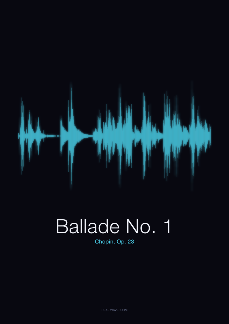 Ballade No. 1
The print from this article · from €29.95
View the print →
Ballade No. 1
The print from this article · from €29.95
View the print →
The Real Cost of Turning Sound Into a Drawing
To turn a recording into a print, we sample it. Audio arrives as a continuous pressure wave; the computer measures that pressure tens of thousands of times per second and stores each measurement as a number. CD-quality audio uses 44,100 samples per second, each 16 bits deep. A four-minute piano piece is therefore something like ten million individual numbers. Draw every one of them as a vertical line at its measured height and you get a curve — but a curve so dense it is unreadable, a solid black rectangle from edge to edge.
So compression happens, and this is where honesty is required. When we render the Fantaisie-Impromptu, Op. 66, for a print at, say, sixty centimetres wide, we have to decide how many samples get collapsed into each visible column of ink. A print that is 6,000 pixels wide, drawing four minutes of audio, means each column represents roughly 1,700 samples of sound, or about a thirtieth of a second of played music. What we draw for that column is not one of the samples but a summary of all of them — typically the loudest positive and the loudest negative value in the group. The result reads as the piece's amplitude envelope: the outline of the loud parts, with quieter fluctuations folded inside.
The cost, and it is real, is that fine detail disappears. A single struck note, a fingernail's tick against a key, a breath — any event shorter than that thirtieth of a second — is either subsumed into the envelope or lost. What survives is architecture: the phrasing, the crescendos, the rests. The Ballade's coda survives beautifully because it is loud and sustained and unmistakable. A single grace note in the exposition may not survive at all, because it is too brief to influence its column's maximum.
This is why a wall print of a piece is not a substitute for the recording. It is a translation. The recording holds the note, the tone, the humanity of the performance. The print holds the shape. When someone gifts a rendered waveform of a first-dance song, or of the words *bonjour* and *ciao* spoken into a microphone at a specific moment on a specific afternoon, what they are gifting is the outline of that sound — not the sound itself, but the silhouette the sound cast when it happened. The recording lives on a hard drive somewhere. The silhouette is what goes on the wall.
For readers curious to see what specific pieces look like as prints of their real amplitude curves — Chopin's Ballade No. 1 and Fantaisie-Impromptu among them, all rendered from the public-domain audio we have described — the studio's see the Ballade No. 1 print has the current collection. We keep the source recordings named and the licences documented, so the shape you buy is provably the shape of the sound it claims to be.
If You Only Remember One Thing
The oscilloscope did not give us waveform prints. Digital storage did. Braun's tube in 1897 made sound visible in the moment; it took the ability to hold a whole recording still in a computer's memory, seventy-plus years later, for the shape of a full piece of music to become a thing you could look at as a single portrait.
And the drawing is not the music. It is the music's silhouette — its loud passages and its quiet ones, its architecture and its rests, drawn from the actual pressure measurements of a real recording. What you gain, hanging one on a wall, is not a replacement for listening. It is a permanent record of what the listening looked like.
This piece did not cover the parallel history of Fourier analysis and spectrograms, which draw frequency rather than amplitude and produce a completely different kind of picture — one that shows melody but hides shape. It did not cover the audio-reactive visualisations of the 1990s Winamp era, which are their own strange sub-history worth its own article. And it did not cover the mathematics of how sampling actually reconstructs a continuous wave from discrete numbers — the Nyquist–Shannon theorem — which is genuinely interesting and genuinely long. Each of those is a separate essay, and each has its own shape.
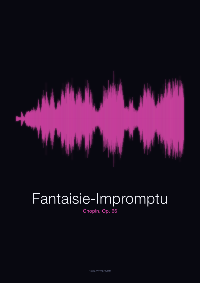 Fantaisie-Impromptu
The print from this article · from €29.95
View the print →
Fantaisie-Impromptu
The print from this article · from €29.95
View the print →
FAQ
When was the first machine that could draw sound as a picture built?
Léon Scott's phonautograph, built in Paris in 1857, is the earliest device that turned sound into a visible line — a bristle scratching soot on a rotating drum. Karl Ferdinand Braun's cathode ray tube of 1897 made the drawing happen in real time on a phosphor screen. Both predate the electronic oscilloscopes most people picture, and both predate any way to play the drawn sound back.
Does an oscilloscope trace of music show the melody?
No. An oscilloscope trace, and a printed waveform derived the same way, shows amplitude — how loudly the air is being pushed at each moment. Pitch is encoded in how fast the line wiggles, but at musical frequencies the wiggle is too fast to see with the naked eye. What survives is the piece's dynamic architecture: its loud passages, its quiet passages, its silences. Melody sits inside the shape, invisible.
Why did waveform prints only become common after computers, if oscilloscopes existed since the 1890s?
Because oscilloscopes have almost no memory. The screen shows the last fraction of a second and then loses it. A full piece of music has structure that unfolds over minutes, and you cannot see that structure on a phosphor screen. Only when digital sampling let engineers hold an entire recording in memory at once — from the 1970s onward — did the whole shape of a piece become a single object you could look at, scale and print.
What is actually being measured in a printed waveform?
Air pressure, translated by a microphone into voltage, then digitised as a stream of numbers representing that voltage tens of thousands of times per second. A print at CD quality is a compressed drawing of roughly 44,100 measurements per second of audio. Each vertical stroke of ink summarises a small window of those measurements — usually the loudest positive and negative values in that window — to keep the shape readable at wall size.
Is a waveform print an exact reproduction of the recording?
No, and it is important to be honest about that. A print is a translation, not a copy. The full recording is a continuous stream of ten-million-plus numbers for a four-minute piece; a print collapses that into a legible outline. Broad architecture — swells, rests, the coda of a Ballade — survives clearly. Events shorter than the print's resolution, like a single grace note or a breath, are folded into the envelope or lost.
Why do quiet and sad pieces look calm even when they feel intense?
Because amplitude is not emotion. A waveform draws only how much the air was moved. A nocturne played tenderly barely disturbs the centre line; a march played loudly fills the page. That is why a waveform of Chopin's Fantaisie-Impromptu shows very different weather in different sections, and why a piece's emotional intensity — carried in harmony, in rubato, in silence — is only partially readable from the shape alone.
Can spoken words be visualised the same way as music?
Yes, and they produce their own recognisable silhouettes. A recording of the single word *bonjour* generated from a real speech signal draws as a short, jagged cluster of two syllables; *ciao* draws as an even shorter, sharper burst. Because speech is amplitude in air just like music, the same rendering process applies. The shape a spoken word makes on paper is as specific to the speaker and the moment as any musical performance.
What history does this article deliberately leave out?
Three things. The parallel tradition of spectrograms and Fourier analysis, which draw frequency instead of amplitude and produce completely different pictures. The 1990s software visualisers — Winamp and its descendants — which reacted to music in real time but rarely produced anything you could print. And the mathematics of digital sampling itself, particularly the Nyquist–Shannon theorem, which explains how a smooth wave can be reconstructed from discrete numbers. Each deserves its own piece.
From the collection



New pieces and 10% off your first print.
One email now with your code. No noise after.