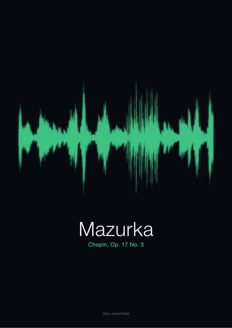
A nocturne is mostly quiet. On paper, the Chopin C-sharp minor waveform we render from the public-domain Musopen recording is a long, slender silhouette with two or three tall gestures and a great deal of white space around them. That shape does not behave like a photograph or a poster. It rewards air. Before choosing a dimension, the studio asks three questions in order: how far the viewer stands, how much wall the piece has to breathe into, and how loud the room already is. This guide is that flowchart, written out.
Question 1: How Far Will You Stand From It?
Viewing distance is the first fork because a nocturne's silhouette is legible in a way most images are not. Where a photograph asks the eye to resolve detail — a face, a texture, a horizon — a waveform asks the eye to resolve rhythm. The tall spikes and the long lulls are the whole subject. That means the piece survives being small in a way a portrait does not, and it also means it can grow without ever feeling crowded, because there is nothing inside it to crowd.
The studio uses three distance bands: close (under 1.2 metres, a hallway or a reading nook), medium (1.5–2.5 metres, most sofas and beds), and long (over 3 metres, open-plan rooms and stairwell landings). Each band has a different failure mode. Close-viewing prints fail when they are too large — the eye cannot take the whole silhouette at once, and the shape reads as noise rather than as gesture. Long-viewing prints fail when they are too small — the quiet middle sections dissolve into a beige line, and the whole point of a nocturne, the ratio of loud to quiet, disappears.
If You Will Stand Close (Under 1.2 Metres)
Choose a small format: A4 (21 × 30 cm) or A3 (30 × 42 cm) in horizontal orientation. At this distance the eye reads the print like a page in a book — attack by attack, rest by rest. The Chopin C-sharp minor rendering shows perhaps a dozen distinct amplitude events across its full length; at close range each one is a discrete visual beat, and a small print keeps them that way. Anything larger than A3 in a hallway forces the viewer to step back to see the whole shape, which defeats the intimacy the distance was chosen for.
If You Will Stand at Medium Range (1.5–2.5 Metres)
Choose a medium format: A2 (42 × 59 cm) or 50 × 70 cm, still horizontal. This is the default living-room and bedroom band, and it is where the nocturne's silhouette becomes recognisably musical — the ear-in-the-eye moment. The print is large enough that a guest across the sofa can see the shape at a glance, small enough that it does not dominate. Do not exceed 50 × 70 cm at this distance unless the wall behind is genuinely bare; the piece will start to argue with the room.
If You Will Stand Far Away (Over 3 Metres)
Choose a large format: 70 × 100 cm or 100 × 140 cm, horizontal. At three metres the silhouette becomes almost architectural — a horizon line with weather in it. The white space, which felt like breathing room at medium range, becomes structural at long range; it is what carries the eye across the room. A print smaller than 70 × 100 cm at this distance reads as an accessory rather than as a piece. That is a legitimate choice, but it is a different choice from the one this branch describes.
Question 2: How Much Empty Wall Surrounds the Piece?
The second question exists because a waveform print is a shape on a field, and the field is the wall. A nocturne's silhouette needs margin the way a paragraph needs white space. Hang a large horizontal print six centimetres from a doorframe and the silhouette will fight the architecture; hang the same print with sixty centimetres of clear wall on each side and the shape will read as intended, which is: something quiet with occasional gestures, floating in air.
The studio's rule of thumb, adapted from framing convention: leave clear wall on each side equal to at least one-third of the print's width, and above and below equal to at least one-fifth of the print's height. Below those ratios the print looks squeezed. Well above them the print looks stranded. The question below asks the reader to measure the actual wall in question — not the room, the wall — and to route accordingly.
If the Wall Is Generous (More Than 2 Metres of Uninterrupted Surface)
Size up. A generous wall can hold a 70 × 100 cm or 100 × 140 cm print without the surrounding architecture crowding it. This is where the nocturne's long, slender silhouette does its most characteristic work: the horizontal format reads as a landscape line, the amplitude spikes become punctuation, and the empty passages become the subject. Under-sizing on a generous wall is a real risk. A 50 × 70 cm print floating in three metres of blank plaster reads as an afterthought, not as a decision.
If the Wall Is Tight (Under 1.5 Metres, or Interrupted by Furniture, Doors, Sockets)
Size down. The failure mode on a tight wall is not too-small but too-large: a 70 × 100 cm print with fifteen centimetres of clearance on either side looks compressed regardless of how well the shape itself is drawn. Choose A3 or A2, and consider whether horizontal is still the right orientation. In a tight vertical slot — between a doorframe and a bookshelf, for example — a horizontal nocturne will always feel wrong. The studio's default remains horizontal because that is how a waveform is read (left to right, time), but on a truly narrow wall a smaller horizontal placed high, with the visual weight balanced by a lamp or a plant below, tends to resolve better than forcing a rotation.
 Nocturne
The print from this article · from €29.95
View the print →
Nocturne
The print from this article · from €29.95
View the print →
Question 3: Is the Room Quiet or Busy?
The third question is the one most sizing guides ignore, and it is the one that decides whether the print will still work in six months. A room is visually loud or visually quiet independent of its wall square-footage. A minimalist studio with white walls, one sofa, and a floor lamp is visually quiet. A room with patterned wallpaper, three artworks already hung, a bookshelf, and a colourful rug is visually loud. The nocturne's silhouette — thin, dark, mostly white space — behaves very differently in each.
In a quiet room, the waveform becomes an event. It is the thing on the wall. Size it up so that it earns that status: a 50 × 70 cm or 70 × 100 cm print will hold the room without competing with anything, because there is nothing to compete with. In a loud room, the waveform must instead find a way to belong without adding to the noise. This usually means sizing down and choosing a placement that gives the print its own quiet zone within the busy field.
If the Room Is Visually Quiet
Choose the upper end of whatever band the previous two questions produced. A quiet room is the nocturne's natural habitat — the silence in the recording and the silence in the room resonate, and the amplitude events become the punctuation of the whole space, not just of the print. The risk in a quiet room is under-sizing: a small print in a large empty room reads as tentative, and tentativeness is exactly the wrong register for a piece whose whole argument is confidence about silence.
If the Room Is Visually Busy
Choose the lower end of the band, and prioritise a spot with local calm — above a sideboard, over a bed's headboard, on a stair wall away from the gallery of family photos. The nocturne cannot win a shouting match with a patterned rug and three other artworks; it can, however, hold its own in a small pocket of visual quiet within a busy room. Consider whether the print needs a wider mat than default (a 5 cm mat becomes 8 cm), because in a busy field the mat is what carves out the print's local silence.
If You Answered Everything: The Recap Table
The three questions produce eight combinations. The table below maps each to a size recommendation. Read your own three answers across, then read the recommendation.
| Q1: Distance | Q2: Wall | Q3: Room | Recommendation |
|---|---|---|---|
| Close | Generous | Quiet | A3 horizontal, wide mat, centred with generous margin above eye line. |
| Close | Generous | Busy | A4 horizontal in a quiet pocket; do not scale up just because the wall allows. |
| Close | Tight | Quiet | A4 horizontal; treat the tight wall as a frame and let the print sit within it. |
| Close | Tight | Busy | A4 horizontal, wider mat than default, placed above a piece of furniture for anchoring. |
| Medium | Generous | Quiet | 50 × 70 cm horizontal, standard mat, hung with the centre at 145–150 cm from the floor. |
| Medium | Generous | Busy | A2 horizontal with a wider mat; find a local pocket of calm rather than the middle of the busiest wall. |
| Medium | Tight | Quiet | A2 horizontal; do not push to 50 × 70 cm even though the room would allow it, because the wall will not. |
| Medium | Tight | Busy | A3 horizontal, wide mat, above a sideboard or headboard where it has architectural anchoring. |
For long-distance viewing (over 3 metres, Q1 answer three), the table collapses: choose 70 × 100 cm if the wall is tight or the room is busy, and 100 × 140 cm if the wall is generous and the room is quiet. There is no small-print resolution at long range that renders a nocturne faithfully; the ratio of loud to quiet requires size to survive the distance.
One caveat the table cannot encode: ceiling height. If the ceiling is under 2.4 metres, drop one size from whatever the recap suggests, because a large horizontal print in a low-ceilinged room compresses the vertical space above and below it in a way that flattens the whole wall. The recap assumes standard 2.5–2.7 metre ceilings.
This guide does not cover framing choice (float mount versus mat, oak versus black, glazing versus none) — that is a separate decision and depends on the frame's dialogue with the room's woodwork, not on the print's dimensions. It does not cover multi-print arrangements — pairing the Chopin nocturne with a second waveform is a compositional problem, not a sizing one. And it does not cover custom oversize formats above 100 × 140 cm, which the studio produces on request but which have their own installation considerations that a decision tree cannot honestly compress.
FAQ
What is the single most common sizing mistake with a waveform print?
Under-sizing at long viewing distance. The instinct is to treat a waveform like a poster and default to A2 or 50 × 70 cm, which works beautifully at two metres and disappears at four. A nocturne especially suffers from this because its quiet passages need enough physical width to remain visible as silence rather than dissolving into a thin horizontal line. If the primary viewing point is across a room, size for that viewing point first and adjust down only if the wall genuinely cannot hold it.
Should the nocturne always be hung horizontally?
Yes, in almost every case. A waveform is a drawing of time on the x-axis and amplitude on the y-axis; rotated ninety degrees, that grammar breaks and the shape stops reading as sound. The only legitimate exception is a narrow vertical wall slot where no horizontal option fits, in which case a smaller horizontal print placed high with a visual anchor below usually resolves better than rotating the piece into a vertical it was not designed for.
How high off the floor should the centre of the print sit?
The gallery convention is 145 to 150 cm from the floor to the centre of the piece, which corresponds to average adult eye level. For a nocturne this convention holds well because the silhouette is horizontally symmetrical in weight — the visual centre is close to the geometric centre. Above furniture (sofa, sideboard, headboard) the rule shifts: leave 15 to 25 cm of clear wall between the top of the furniture and the bottom of the frame, which will usually place the centre slightly above 150 cm.
Does the recommendation change for a bedroom versus a living room?
The room type matters less than the three questions in this guide (distance, wall, visual noise). A bedroom is often visually quieter than a living room, which pushes the recommendation up one size band. A bedroom is also often viewed from bed, which is a medium-to-long distance depending on room size; the print above the headboard is seen not from directly beneath it but from across the room. Answer the three questions honestly for the specific wall in question rather than defaulting to a room-type template.
What about hanging the print in a hallway?
Hallways are close-viewing environments (under 1.2 metres by definition) and usually tight walls. That combination puts the recommendation firmly in A4 or A3 territory, horizontal, with a slightly wider mat than default to give the silhouette breathing room within the narrow field. Hallways are also visually busy in a specific way — they are transit spaces, and the eye moves along them rather than resting — so the print should reward the glance rather than demand attention.
Can I use these rules for a different piece, not the Chopin nocturne?
Partly. The three questions transfer directly — distance, wall, room noise apply to any print. The recommendations shift with the source piece's dynamics. A nocturne is mostly quiet with occasional gestures, so it needs air and rewards horizontal formats. A polonaise has denser rhythmic weight and can hold a slightly smaller size at the same distance without dissolving. An étude with sustained loud passages behaves more like a photograph in terms of density and can tolerate tighter walls than a nocturne can.
Is a larger print always better if the wall allows it?
No. Over-sizing has its own failure mode: at close viewing distance, a large print forces the eye to scan rather than to take in the whole silhouette at once, and the shape stops reading as a shape. A nocturne's argument depends on the viewer seeing the ratio of loud to quiet in a single glance. If the print is so large that the eye cannot hold both a spike and a rest in the same field of view, the piece fails on its own terms regardless of how well it fits the wall.
Where can I see the actual Chopin nocturne print in different sizes?
The studio's shop at /shop/ shows the Chopin C-sharp minor nocturne — rendered from the public-domain Musopen recording, CC0 1.0 — in each of the standard formats discussed above (A4, A3, A2, 50 × 70 cm, 70 × 100 cm, 100 × 140 cm), with mock-ups at typical viewing distances so the decision tree in this guide can be checked against real wall scenarios before ordering.
From the collection


New pieces and 10% off your first print.
One email now with your code. No noise after.