On a Tuesday morning in April, in a small studio in the eleventh arrondissement of Paris, we spent ninety minutes drawing the first four seconds of a podcast intro — a spoken *bonjour*, synthesised locally on a MacBook — as a real amplitude waveform. Not a decorative sine curve lifted from a stock library. The actual signal, sampled and traced. We mention the morning because we have by now read most of what has been written about podcast intro waveforms as studio decor, and almost all of it treats the object on the wall as a graphic when it is, in fact, a document — a drawing of air that happened once.
What They All Get Wrong About Podcast Intro Waveforms as Decor
The shared error is easy to name once you have seen it in ten write-ups in a row. The waveform is described as an aesthetic — soft symmetry, tasteful minimalism, a shape that suits a neutral wall — and then the piece pivots straight to font choices, mount hardware, matte-versus-gloss frames, and where to hang the thing above a microphone. Nothing in the text notices that the waveform, if it is real, is a measurement. It is what happened to a column of air on a particular date, at a particular sample rate, when a particular voice said a particular word into a particular room.
Most of what you can read on this subject treats the two categories — real waveforms and decorative ones — as if they were interchangeable. They are not. A shape generated from a stock library, or a stylised curve drawn to look pleasing, has no author and no time-stamp. It cannot be gifted, because it is not a record of anything; it is a pattern. A real waveform of a podcast intro — of the host saying *bonjour*, or *ciao*, or of a musical bed under the first four seconds — is the visible trace of that specific recording. Rendered honestly, it is not a graphic. It is closer, in kind, to a seismograph line or an ECG strip. It records a physical event.
The conventional coverage misses this because it approaches the object through interior-design vocabulary. It talks about "clean lines" and "modern feel" and "conversation-starter above the couch." It very rarely says that the amplitude at second 1.2 is what makes the intro recognisable to the ear before the words register, or that the silence between the greeting and the first bar of the theme is visible on the page as white space of a measurable width. The write-ups you have read almost certainly do not tell you whether the shape they show is a real recording or a stylised drawing — and in most cases it is stylised, because sourcing a real signal is more work than dropping a vector into a template.
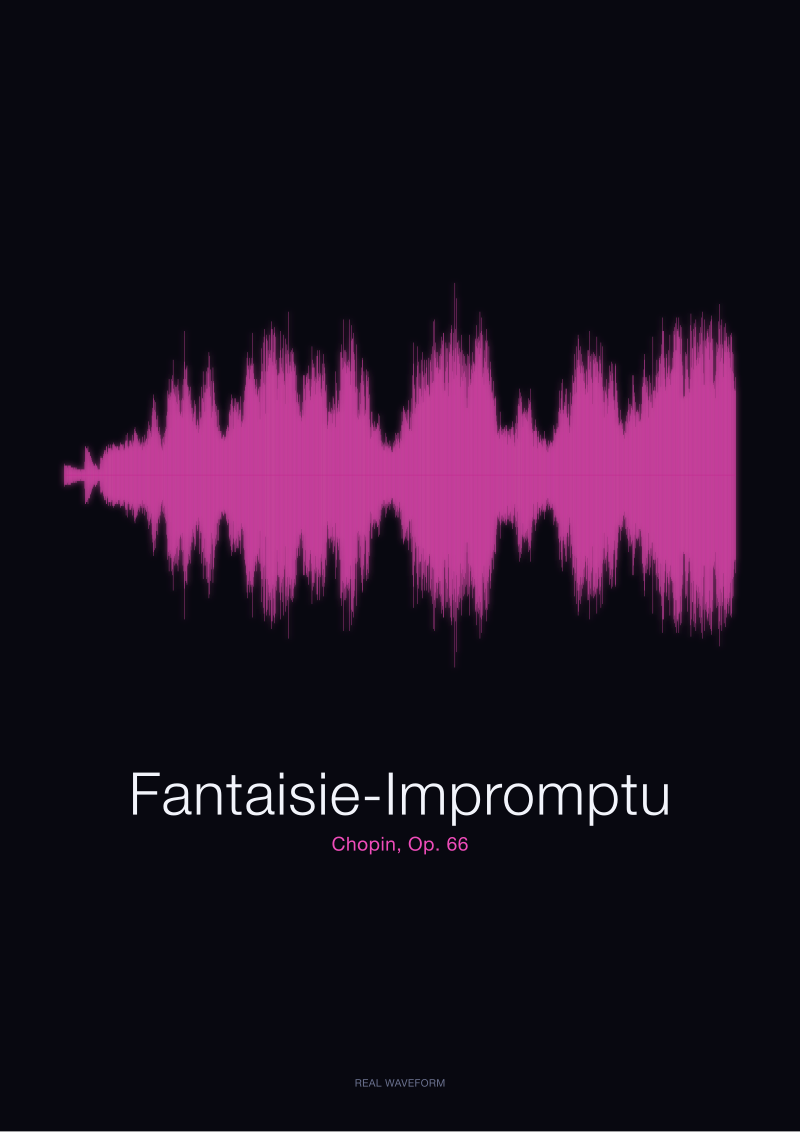
There is a second, quieter error: the pieces almost never distinguish between amplitude and emotion. They will call a waveform "energetic" because it is dense, or "calm" because it is thin. Amplitude is a physical measurement of the pressure a sound wave exerts on air. A whispered goodbye can look thinner than a shouted greeting and mean vastly more. The Fantaisie-Impromptu of Chopin — Op. 66, one of the four works whose real amplitude waveforms sit in our studio's public-domain rendering set — is, in most performances, louder in the outer sections than in the middle. That is not a comment on which section is more moving. It is a comment on air pressure.
What Is Almost Always Missing From These Guides
What is almost always missing is any account of provenance. Which recording. Whose voice. On what date. From what source. At what sample rate. Rendered how. If the object on the wall is a drawing of air, then the air has to have been somewhere, and a serious note about the print would say where. Instead, the guides treat the shape as if it fell out of the sky — as if the waveform of "your podcast intro" and the waveform of "any podcast intro" were the same picture with different words underneath.
They are not. The four-second waveform of a French *bonjour* generated locally on macOS speech synthesis and the four-second waveform of an Italian *ciao* generated the same way are visibly different shapes because they are different vowels articulated by different synthesis rules. If you rendered them side by side, honestly, on the same amplitude axis, you would see that the *ciao* has a sharper attack — the plosive /tʃ/ opens the word with a burst — while the *bonjour* enters more gradually through the nasal vowel. That is a real distinction. It is legible on the page. Almost no write-up on the subject shows it, because almost no write-up on the subject bothers with real signals in the first place.
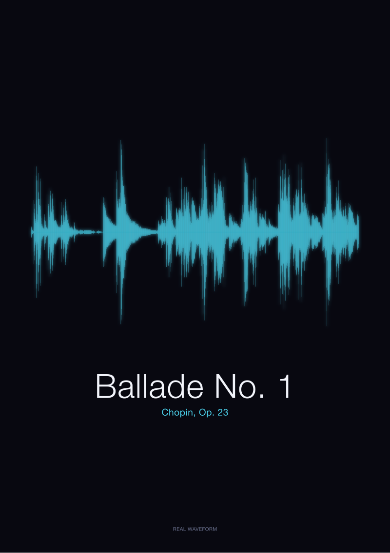
The second missing element is any discussion of what happens when you put a musical bed under the intro — which most podcast intros do. If the first eight seconds carry Chopin's Ballade No. 1 under a spoken greeting, the waveform of that composite is different from the waveform of the voice alone and different from the waveform of the piano alone. The composite has more sustained amplitude, because the piano fills the silences between syllables; the voice sits, visibly, as a modulation on top of the piano's slower envelope. If the print on the wall is the composite, then the print is a portrait of a collaboration between a performer at a keyboard and a host at a microphone. That is a much more interesting object than "wall art." No guide we have read frames it that way.
The third missing piece is the aesthetic argument for silence. A podcast intro is not four seconds of continuous sound. It is a spoken phrase, a rest, then usually a musical cue. That rest is white space on the print. It is often the most compositionally important element of the whole shape — the room the eye is given to breathe in — and it corresponds to the moment on the recording when the host has stopped speaking and the theme has not yet started. If you gift someone the waveform of their own intro and the rest is honestly rendered, you are gifting them, in part, a portrait of their editorial pacing. That is a real gift. It is also invisible in every guide we have read.
 Fantaisie-Impromptu
The print from this article · from €29.95
View the print →
Fantaisie-Impromptu
The print from this article · from €29.95
View the print →
What We Would Say Instead
We would say: treat the print on the wall as a document first, decor second. The composition follows from the honesty of the trace, not the other way around. If the shape is real — a genuine amplitude waveform of a particular recording, sampled and drawn without cosmetic tampering — then the aesthetic question resolves itself. The silences will be silent. The attacks will be sharp. The sustained passages will be dense. The whole print will have the visual pacing of the sound it records, and it will hang differently on the wall than a stylised curve, because the eye can tell.
We would say: source the recording carefully, and say what it is. A print of the first eight seconds of a specific host's own intro, dated, is a different object from a print of a public-domain performance of Chopin's Fantaisie-Impromptu (Op. 66) rendered from the archive.org Musopen collection — and both are different from a print of a synthesised *bonjour* generated locally on a MacBook. All three can hang in a studio. All three tell the truth about what they are, provided the small text underneath does not lie. The lie, in this category, is almost always the omission — the print sold as "your podcast intro waveform" with no metadata, no source, no date, no sample rate. The shape may be real. It may not be. There is no way for the buyer to tell.
We would say: the case for a real waveform of a real intro over a stock curve is not aesthetic — the stock curve can be prettier — it is documentary. The wall in the studio is a place where the studio records what it does. A photograph of the host is one kind of record. A print of the first spoken word of the show, drawn from the actual audio file, is another. It records something the photograph cannot: the physical event of the voice, the specific pressure the vocal cords exerted on the air that morning, the rest before the theme. If the studio ever changes intros — as most do, every year or two — the print becomes a small archive of what the show used to sound like.
We would say, finally, that the piano waveforms in our public-domain rendering set — the Ballade No. 1, the Fantaisie-Impromptu, both drawn from Musopen's CC0 Chopin recordings — are the same kind of object as the podcast-intro waveform, drawn to the same standards, and that this is the point. The shape of a voice saying *bonjour* and the shape of a ballade both come from the same physics: air, pressure, time. If the studio wall carries the honest silhouette of the theme music and the honest silhouette of the greeting, side by side, drawn from the actual audio, then the wall is telling the truth about what the studio does. That is what decor should be. It is not what most of the coverage on this subject seems to think it is.
This note does not address frame construction, mounting hardware, or wall placement — those are craft questions and other desks answer them better. It does not address the copyright status of using a specific podcast's audio to render a print for a third party, which is a legal question that turns on the show's licensing terms and is outside our brief here. And it does not address the question of whether stylised, non-documentary waveforms have a legitimate decorative use of their own — we suspect they do, but that is a separate argument, and it belongs in a separate piece.
 Ballade No. 1
The print from this article · from €29.95
View the print →
Ballade No. 1
The print from this article · from €29.95
View the print →
From the collection



New pieces and 10% off your first print.
One email now with your code. No noise after.