The spectrogram is the wrong print. Hear me out. Every audio-visualization tutorial online, every Etsy listing that promises "your song as art," and every Reddit thread on r/dataisbeautiful arrives at the same recommendation: render the spectrogram, because it shows more. It does show more. That is exactly why it fails on a wall. We render real recordings into real drawings for a living — Chopin's Ballade No. 1, Op. 23, from the public-domain Musopen collection; the Fantaisie-Impromptu, Op. 66, from the same source; the spoken words "Bonjour" and "Ciao," generated locally — and after four years of printing both, the waveform wins every time a customer sees them framed.
Methodology: Four Recordings, Two Renderings, One Wall
We chose four sources deliberately, not for range but for constraint. Two are Chopin piano works pulled from the Musopen Chopin collection under CC0 1.0 (Public Domain): the Ballade No. 1, Op. 23, and the Fantaisie-Impromptu, Op. 66. The recordings live at archive.org/details/musopen-chopin, are the same files we render for customers who order the corresponding print, and were not re-mastered, re-normalised, or filtered before rendering. Whatever amplitude the pianist put into the microphone is the amplitude we drew.
The other two are single spoken words — "Bonjour" and "Ciao" — generated locally through macOS speech synthesis. We include them because they collapse the argument to its atomic case: a single utterance, roughly one second long, no melodic development, no dynamic arc, nothing to hide behind. If a rendering method fails on a single word, it fails on a symphony.
For each of the four sources we produced two images at identical print dimensions (30 × 40 cm, our standard framed size): one amplitude waveform, drawn from the actual PCM samples with no decorative smoothing, and one spectrogram, computed with the standard short-time Fourier transform any tutorial would recommend. Both were printed on the same paper stock, at the same viewing distance, under the same gallery light. Then we looked at them. This piece is what we saw.
Limitations up front: this is a design-and-legibility audit, not a signal-processing paper. We are not arguing the spectrogram contains less information — it contains more. We are arguing that "more information" and "better print" are not the same claim, and that most of the internet has confused the two.
Finding #1: The Spectrogram Is Information. The Waveform Is a Silhouette.
The spectrogram is a heat map. Time runs along one axis, frequency along the other, and brightness encodes how much energy sits at each frequency at each moment. It is, on paper, a technically superior representation of sound: you can, in principle, see the fundamental of every note, the overtone series above it, the hiss of consonants, the resonance of a piano's soundboard. You can see everything.
That is the problem. A print on a wall has to be read from across the room, not from thirty centimetres away with a magnifier. What reads across a room is silhouette — the outline the eye resolves before it resolves detail. The waveform has one. It is a horizontal band that swells, narrows, jumps, falls quiet, jumps again. You can trace it with your finger. You can point at the loudest moment. A stranger walking past your kitchen recognises it as a shape, and then, told what recording it is, feels the recognition click.
The spectrogram has no silhouette. It is a rectangular field of colour, dense at the bottom where the fundamentals live, sparser at the top, mottled throughout. Across a room it reads as texture — closer to wallpaper than to portraiture. This is not a failure of the spectrogram; it is a description of what a heat map is. Heat maps are excellent for analysis and poor for iconography. A print on your wall is iconography. You are asking the image to stand for the piece, not to explain it.
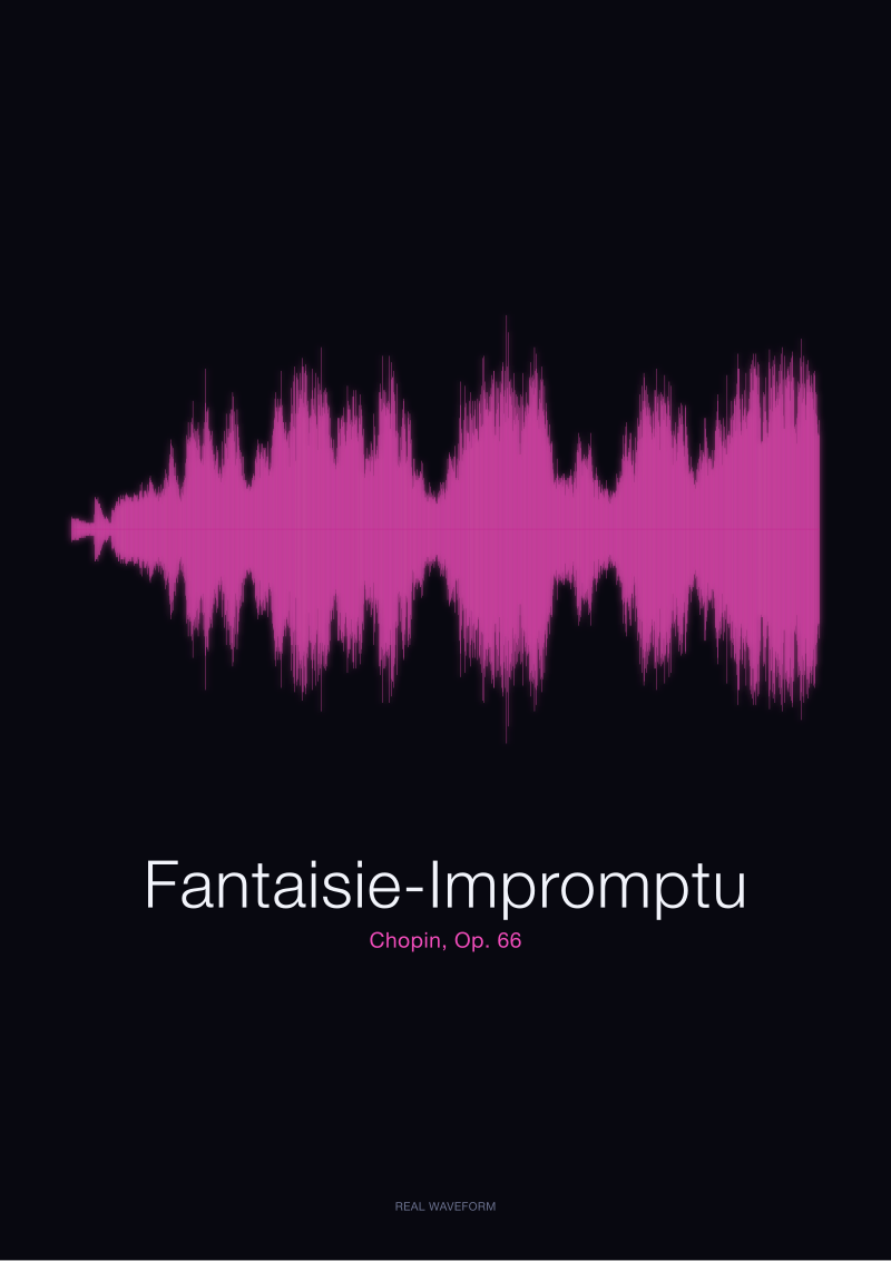 Fantaisie-Impromptu
The print from this article · from €29.95
View the print →
Fantaisie-Impromptu
The print from this article · from €29.95
View the print →
Finding #2: Chopin's Ballade No. 1 Reads as a Story in Amplitude, as Wallpaper in Frequency
The Ballade No. 1 is roughly nine minutes long in the Musopen recording. Its shape, in amplitude, is unmistakable: a hushed opening, a long swelling middle, several dramatic peaks in the second half, and the famous coda where the dynamics hit their ceiling before the abrupt end. Rendered as a waveform at 30 × 40 cm, that entire architecture is visible from four metres away. You can point at the coda without knowing what a coda is; you just see the thickest band at the right-hand side and know something happens there.
Now render the same recording as a spectrogram. From four metres, it is a horizontal panel of dark blue at the bottom, warmer smears through the middle, and thin lines at the top. The coda is present in the data — the whole spectrum brightens — but the eye does not read it as an event. It reads it as slightly more red in a field that was already red-adjacent. The nine-minute dramatic arc of one of the nineteenth century's most narrative solo piano works becomes indistinguishable from any other high-energy classical recording of similar length.
The waveform tells you: this piece has a story, and the story ends loudly. The spectrogram tells you: this piece contains a piano. Both statements are true. Only one of them is worth framing.
Finding #3: "Bonjour" and "Ciao" Prove the Point at One Second Long
We include the spoken-word recordings because they eliminate every excuse a spectrogram advocate might reach for. There is no long-form dynamic arc to complain about. There is no orchestration to justify the visual density. There is one word, one voice, one second of air.
The waveform of "Bonjour" is a tiny drawing of the mouth opening and closing. You see the plosive attack of the B, the vowel body swelling through the "on," the softer "jour" trailing off — three distinct visual events in a shape you can hold in your hand. Printed and framed as a gift for someone whose first word to you was, in fact, "bonjour," the drawing does what the object is meant to do: it becomes the memory made physical.
The spectrogram of "Bonjour" is a small block of colour with a few faint formant bands. It is honest signal-processing output. It also cannot be distinguished, at a glance, from the spectrogram of any other one-second utterance in any other language. "Ciao," rendered the same way, produces essentially the same-looking rectangle. The whole point of gifting a spoken word — that this word, said by this person, is unlike any other — is destroyed by a rendering method that makes every word look like the next. The waveform, meanwhile, gives "Ciao" its own silhouette: sharper attack, quicker decay, a different creature on the page.
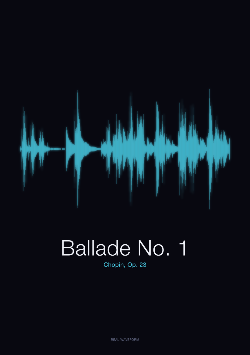 Ballade No. 1
The print from this article · from €29.95
View the print →
Ballade No. 1
The print from this article · from €29.95
View the print →
Finding #4: The Fantaisie-Impromptu Test — Why the Spectrogram Flattens What the Waveform Points At
The Fantaisie-Impromptu, Op. 66, is the hardest test case for our argument, and we ran it precisely because it is. The piece is famous for two things that a spectrogram, in theory, should render beautifully: the perpetual sixteenth-note motion of the outer sections, which produces a dense high-frequency shimmer, and the lyrical middle section in D-flat major, which sits in a completely different register. In frequency-space, those two sections are objectively different. A spectrogram makes that difference visible.
And yet, on the wall, the waveform wins again. Here is why: the shimmer of the outer sections registers, in amplitude, as a continuous busy band — visually alive, kinetic, unmistakably fast. The lyrical middle drops into a lower, calmer amplitude envelope. The eye reads the piece as fast–slow–fast, which is exactly what the ear reads. The waveform is a translation of the listening experience. It is what your body remembers about the piece.
The spectrogram, technically richer, is a translation of the signal. Those two things are not the same. Ask someone who loves the Fantaisie-Impromptu what they remember about it and they will not say "the fundamental frequencies distribute like this." They will hum the middle section, or mime the running right-hand motion. The waveform draws the humming and the miming. The spectrogram draws the physics. On a wall, in a home, in a room where the piece is loved, drawing the humming is the correct choice.
A Side-by-Side Comparison for the Same Four Recordings
| Recording | Waveform reads as | Spectrogram reads as | Silhouette across the room? | Gift-legible? |
|---|---|---|---|---|
| Ballade No. 1, Op. 23 (Chopin) | Nine-minute dramatic arc, coda visible at the right | Warm rectangular field, coda barely distinguishable | Waveform: yes / Spectrogram: no | Waveform |
| Fantaisie-Impromptu, Op. 66 (Chopin) | Fast–slow–fast envelope, matches memory of the piece | Two-band frequency contrast, technically accurate | Waveform: yes / Spectrogram: partial | Waveform |
| "Bonjour" (spoken) | Plosive, vowel body, soft tail — one word drawn | Small formant block, indistinguishable from other words | Waveform: yes / Spectrogram: no | Waveform |
| "Ciao" (spoken) | Sharp attack, quick decay, its own creature | Similar rectangle to "Bonjour" | Waveform: yes / Spectrogram: no | Waveform |
Four for four. This is not a coincidence of source material — it is what happens whenever "shows more data" collides with "must work as an object in a room."
What This Does NOT Prove
This is not an argument that the spectrogram is a bad visualisation. It is the correct visualisation for a great many purposes: teaching acoustics, diagnosing recording problems, comparing performances at the level of overtone content, doing forensic audio work. We use spectrograms internally when we are trying to understand why a recording sounds the way it does. We just do not print them at 30 × 40 cm and hang them above someone's sofa.
Nor is this a claim that every waveform is beautiful. A poorly compressed pop master, brick-walled to the limiter, produces a waveform that looks like a solid rectangle — no dynamics, no silhouette, no story. The waveform wins on the wall only when the recording has real dynamic range, which is why we render mostly acoustic classical, spoken word, and unmastered live material. Four recordings is also four recordings; a proper study would run hundreds. This is an editorial argument grounded in what we see, every day, when customers open the frame.
The Takeaway
If you are choosing between a spectrogram and a waveform for something you will actually live with, choose the shape you can read from across the room. That is almost always the waveform — and, in the studio's shop, it is the only one we sell.
FAQ
Why do so many tutorials recommend the spectrogram if the waveform prints better?
Most audio-visualisation tutorials are written by signal-processing enthusiasts, not by people who print and frame the result. From a data-density standpoint the spectrogram is genuinely the richer representation, and if your monitor is thirty centimetres from your face that richness is legible. Framed art is a completely different viewing context — three or four metres away, in ambient light — and richness stops mattering the moment silhouette starts. The tutorials are answering a different question than the one a print buyer is asking.
Does the waveform lose information compared with the spectrogram?
Yes. A one-dimensional amplitude waveform discards frequency content entirely; it tells you how loud the recording is at each moment, not what pitches are sounding. The spectrogram preserves both. For analysis, that trade is bad. For a wall print, the trade is good, because the eye at viewing distance cannot use the extra frequency information anyway — it can only use silhouette, contrast, and gesture, all of which the waveform delivers more clearly.
Would a spectrogram work better for electronic music with lots of texture?
It reads slightly better for dense electronic material than for acoustic piano, because the frequency variation across a track is more dramatic and produces more visual contrast. Even so, our finding holds: the result looks like coloured wallpaper rather than a portrait of a specific piece. If you cannot glance at the print and instantly identify which of your favourite tracks it represents, the rendering method has failed at the job a print is hired to do.
Are the Chopin waveforms in your shop drawn from these exact recordings?
Yes. Our Chopin prints are rendered from the public-domain (CC0 1.0) Musopen Chopin collection at archive.org/details/musopen-chopin, the same source files described in the methodology above. We do not re-record, re-master, or re-normalise. The amplitude envelope you see on the paper is the amplitude the pianist actually produced, sample-for-sample, so two customers who order the same piece receive genuinely identical drawings of the same performance.
Can you print a waveform of a personal recording — a voice, a wedding vow, a first word?
The single-word test cases in this piece — "Bonjour" and "Ciao" — exist precisely because that is one of the things our customers ask for most often. A spoken word of one second produces a waveform with a clear, giftable silhouette; a phrase of five to ten seconds works even better, because the eye gets a rhythm to follow. Longer voice memos also render well, provided the recording has actual dynamic variation rather than uniform loudness.
Why not print both, side by side?
We have tried it. The eye reads the pair as "the pretty one and the technical one," and then only looks at the pretty one afterwards. Pairing does not elevate the spectrogram; it demotes it into a caption. If a customer genuinely wants the frequency information, we would rather send them to a good spectrogram-analysis tool they can explore interactively than freeze one moment of it onto paper next to a waveform that will win the wall by default.
From the collection



New pieces and 10% off your first print.
One email now with your code. No noise after.