A sad song looks calm on paper because a waveform draws air, not feeling. The amplitude line records how hard a sound pushes against a microphone in a given moment, and grief — the kind Chopin wrote into the Ballade No. 1, Op. 23 — tends to push gently. Loud is not the same as intense. A nocturne can break a listener open at pianissimo and leave almost no visible mark on the page. We render real recordings into real waveforms at this studio, and the sad pieces are among the flattest we draw. That is not a failure of the drawing. It is the whole argument.
We keep meeting people who assume the sadder a piece is, the more dramatic its silhouette must be. A big black wave, they picture, jagged and heavy, the way grief feels in the chest. Then we hand them the print of the ballade they cried to at a funeral and it is mostly a slender ribbon of ink, thickening only in a few places. They look confused. They look, honestly, a little disappointed. And then, after a minute, they look relieved. Because the shape on the paper is closer to the truth of what the piece did to them than any dramatic silhouette would have been.
This essay is an argument against a very common misreading: that visible loudness is the same as emotional intensity. It is not. It has never been. The waveform is honest about this in a way that language rarely is. And once you can see the difference, you stop wanting waveforms of sad music to look sad, and you start wanting them to look accurate.
Amplitude Measures Air, Not Sorrow
When we render a recording, what our software draws is a scalar quantity called amplitude — the instantaneous pressure difference in the air that a microphone picked up, sampled tens of thousands of times per second, then squished into a horizontal ribbon. A tall spike means the air pushed hard against the diaphragm at that moment. A thin line means the air barely moved. That is all it means. It does not know whether the note that produced the spike was a shout of joy, a scream of grief, or a piano teacher accidentally slamming the lid at the end of a take. It reports air.
This is important because we have inherited, from centuries of visual metaphor, the assumption that emotional weight and physical weight are the same thing. Heavy grief. A crushing loss. A weight in the chest. Music-marketing imagery leans into it — the album covers where the sad piece is illustrated by a dense black wave crashing against something. It sells, because the metaphor is intuitive. It is also, on the level of physics, backwards.
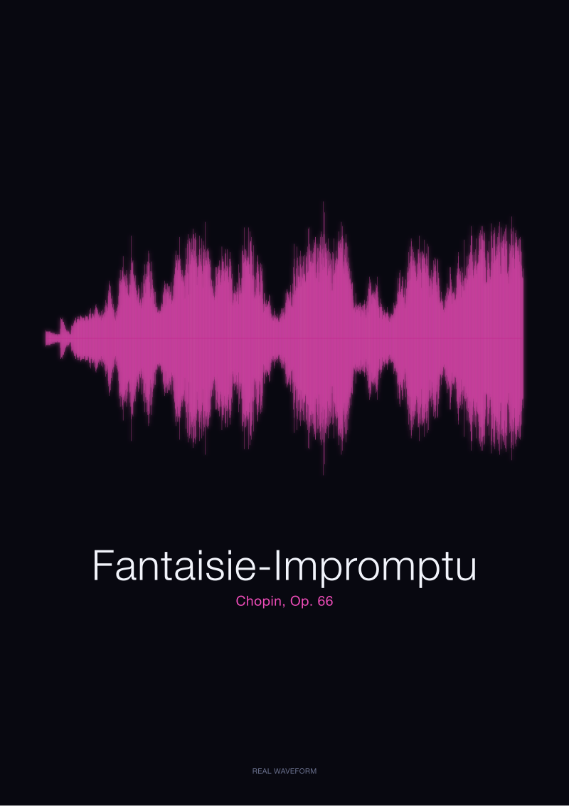
Consider what Chopin did with the Fantaisie-Impromptu, Op. 66. It is not principally a sad piece; the outer sections race, dance, glitter. But there is a middle section that most listeners point to as the emotional core, and it is quieter than what surrounds it. If you were expecting the print of this piece to show its emotional peak as a visible peak on paper, you would have to argue that the outer figuration matters more than the middle. Nobody who has actually listened to the piece would argue that. The waveform reflects effort, not meaning; the middle is drawn with less ink because the pianist is pushing less air.
We say this to customers before they order a print of a piece they associate with a hard time in their life. The shape will be quiet. The shape will not perform sadness for you. It will only record what actually happened in the room where the recording was made. And that ends up being the more powerful gift, because you already know the sadness — you brought that with you. What you did not have was the visible fact that the sound itself was, most of the time, barely disturbing the air.
The Loudest Recordings Are Almost Never the Saddest Ones
There is a rough correlation, when you have rendered enough recordings, between how dark the finished print looks and what kind of piece it holds. The very black prints, the ones that look almost solid in the middle band, tend to be orchestral works in full tutti, or rock and pop tracks compressed to the ceiling of the digital format, or spoken-word recordings where somebody was close to the microphone. They fill the vertical space because the air was being pushed hard, constantly, for a long time.
The saddest music we render is almost never in that category. It sits, instead, in a family of prints that look — from across the room — almost like a horizontal pencil stroke. Some texture. Not much darkness. You have to walk closer to see what is actually there.
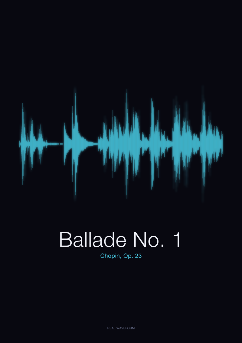
We keep going back to the ballade for the clearest example, because it is the one people request most often for grief, and because Chopin wrote it as a piece that opens with a slow, tentative theme, builds through several waves, and then breaks — actually breaks — into a coda that is genuinely loud and genuinely fast. So the ballade does have a tall passage. It has a small black cluster at the end where the pianist is finally allowed to detonate. But most of the piece, and specifically the passages that people remember as the sad ones, are drawn thin. The visible drama at the end is the exception, not the throughline. Even here, in a piece with a real climax, the shape refuses to editorialise.
Compare that to a spoken word we sometimes render just to show the difference — the single French word bonjour, spoken into a microphone at conversational distance. It is not a sad recording. It is not even a musical recording. It is a friendly greeting that lasts less than a second. On paper it looks bigger than long passages of the nocturne it might sit next to on a wall. This is a genuinely instructive thing to see printed at scale, because it destroys the intuition that visual size on a waveform maps to emotional size in life. The greeting is louder than the grief. The greeting is not, by any measure that matters, more important.
We have printed the Italian equivalent — ciao — for the same reason, when customers wanted a pair, and the result is the same: a small percussive event that pushes air hard for a fraction of a second, dwarfing, on paper, whole minutes of piano music that a person would recognise as the more meaningful sound. If you take one thing from this argument, take that. On the axis a waveform measures, a hello and a goodbye are, physically, louder than most grief. The waveform is telling the truth. The truth is just not the one we assumed.
 Fantaisie-Impromptu
The print from this article · from €29.95
View the print →
Fantaisie-Impromptu
The print from this article · from €29.95
View the print →
A Flat Line Is Not an Empty One — It Is a Held Breath
The move that unlocks all of this — and the reason people keep coming back to sad-music prints even after we warn them the shape will be quiet — is realising that a flat stretch on a waveform is not the absence of something. It is the presence of restraint. A pianist playing pianissimo is not doing less than a pianist playing fortissimo; they are, in many ways, doing more. Control at low volume is harder than power at high volume. It requires the fingers to travel almost imperceptibly, to weight each note with something like handwriting rather than something like drumming. The line on paper stays thin because the performer is exerting exquisite discipline. That thin line is a held breath. It is not silence.
You can see this even in the Fantaisie-Impromptu, which is not principally a quiet piece but which contains, in that famous middle section, a long stretch of relative calm that the pianist has to hold together across many bars while the audience adjusts to the temperature change. On the print, the middle looks like the shoulders of the piece have dropped. That is exactly what has happened in the room, too. The pianist has dropped their shoulders. The audience has, quite literally, breathed differently. None of this shows up as spectacle on the wave. All of it shows up as a subtly different ribbon width and a subtly different density of little vertical strokes packed into the horizontal.
There is a physical reason a held breath draws this way, and it is worth saying plainly. When a note is played gently, the vibration of the string, the resonance of the soundboard, and the reflected sound of the room all still happen — they just happen at lower amplitude. The rate of oscillation, which is what determines pitch, is unchanged. The complexity of the harmonic content is unchanged. The character of the sound is unchanged. Only the pressure of the air moving away from the instrument is lower. The waveform draws pressure. So the waveform draws a thin line for a note that is, in every musically meaningful sense, doing full work.
This is why so many of the sad-music prints we ship end up hung in bedrooms and reading rooms rather than living rooms — customers instinctively understand, once they see the shape, that it belongs in a space where the person looking at it will also be quiet. The print does not perform grief at the wall. It waits. It rewards attention. If the ballade were drawn as the black storm most people imagine grief to be, it would be a decorative object. Because it is drawn as it actually sounded — spare, patient, mostly thin — it is closer to a document than a decoration. A visitor may walk past it without registering it. The person who lives with it, who knows what the recording contains, sees the held breath every time.
We do not push a shop link at the end of essays like this — we mention, once, that /shop/ carries the pieces we have been discussing here in the exact renderings drawn from the CC0 recordings we have named, and we leave it at that. What we would rather leave you with is the reframe. Stop expecting sad music to look sad. Start expecting it to look honest.
This piece did not address several things worth naming. It did not address why some very sad music is, in fact, loud — the funeral marches, the requiems with brass — and how a waveform reads those; that is a different argument about scale and instrumentation and deserves its own essay. It did not address how vocal recordings, where a single human voice carries the emotional load, distribute their amplitude differently from solo piano; the physics is the same but the perception is not, and we owe that a proper treatment. And it did not address the question of dynamic range compression in modern recordings, which flattens the difference between loud and quiet passages before the waveform is ever drawn, and which changes what a printed shape can honestly tell you about the performance underneath. Each of those is a separate piece we intend to write.
FAQ
If a sad piece looks flat on paper, does the print still look like anything?
Yes, and the surprise for most customers is how much detail sits inside what they expected to be a flat stretch. Up close, the ribbon is not a single line; it is a dense stack of tiny vertical strokes, each one corresponding to a moment in the recording, varying in height as the pianist shapes the phrase. From across a room it reads as calm. From reading distance it reads as texture. Both are true simultaneously, and both are drawn from the actual audio.
Why does a spoken word like bonjour look louder than a whole piano piece?
Because a mouth positioned close to a microphone moves a lot of air in a very short window, and because casual speech is not restrained the way pianissimo playing is. A greeting spoken at conversational distance produces momentary amplitude peaks that a solo piano recorded at normal concert distance rarely reaches. It is a good reminder that the vertical axis of a waveform measures air pressure at the microphone, not the cultural weight of the sound being made.
Does louder mean better for a waveform print?
No — and, honestly, the opposite is closer to the truth for gifts. Very loud recordings tend to print as a nearly solid black band, which reads as visually heavy but not particularly readable. Quiet or dynamic recordings, where thin passages contrast with occasional taller peaks, produce prints with genuine silhouette. The eye needs contrast between quiet and loud to find a shape worth looking at. Uniform loudness is uniform ink.
Why does the Ballade No. 1 have a small dense cluster at the end?
Because Chopin structured the piece so that after several long, patient waves, the coda arrives and the pianist is finally allowed to play at full force at full speed. That coda pushes hard air for a sustained stretch, and the waveform reflects it as a compact dark cluster near the right edge of the print. It is the exception in an otherwise restrained piece, and its visibility is part of what makes the print of the ballade so distinctive.
Can you tell what emotion a piece is expressing just from its waveform?
No, and any studio that tells you otherwise is selling you a metaphor rather than a measurement. A waveform tells you how loud, how sustained, how percussive, how dense with events a recording is. It does not tell you whether the composer wrote in a major or minor key, whether the melody rises or falls, whether the piece is a wedding piece or a funeral piece. Emotion in music lives in pitch, harmony, tempo, and phrasing — dimensions the amplitude line does not draw.
Is the printed shape different for different performances of the same piece?
Yes, and it is one of the reasons we always name the specific recording a print was rendered from. Two pianists playing the Fantaisie-Impromptu will produce different waveforms, because they will take different tempi, choose different dynamics, hold different rests. The prints in our shop come from named public-domain recordings in the Musopen Chopin collection at archive.org, so what you receive is the silhouette of one specific performance, not an average of all possible readings of the piece.
Why do you refuse to prettify a flat waveform?
Because the whole premise of the studio is that we draw what the recording actually is, not what a customer imagines it might be. If we stretched a quiet passage vertically to make it look more dramatic, the print would no longer be a document of the performance — it would be an illustration. Illustrations of music are fine, and other studios make them, but they are not what we make. The print you receive is what a microphone recorded, made visible at scale.
Where can I see the specific pieces this essay discussed rendered as prints?
The Chopin Ballade No. 1, Op. 23 and the Fantaisie-Impromptu, Op. 66 we discussed here are rendered from CC0 recordings in the Musopen Chopin collection on archive.org and are available at /shop/. The spoken-word pieces — bonjour, ciao — were generated locally as original signals and are stocked there as well. Everything is drawn from real audio; nothing on the page is decorative.
 Ballade No. 1
The print from this article · from €29.95
View the print →
Ballade No. 1
The print from this article · from €29.95
View the print →
From the collection



New pieces and 10% off your first print.
One email now with your code. No noise after.