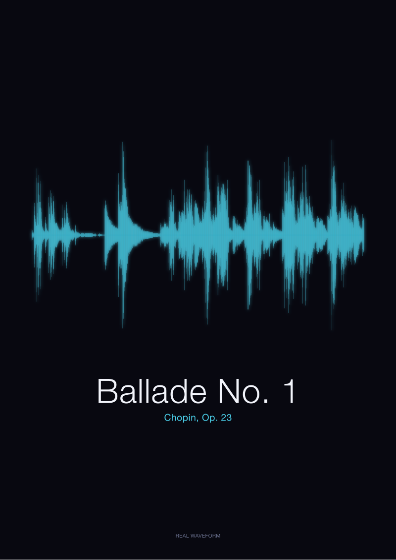
Silence in music is not absence. It is the white space of a waveform — the flat stretches between the peaks, the paper the sound is drawn on. When we render the real amplitude of a public-domain recording of Chopin's Ballade No. 1, Op. 23, the quiet dominates the sheet. That quiet is not empty. It is the reason the loud passages sound loud, and the reason a nocturne looks nothing like a polonaise even before a single note is named. The shape of a piece is the ratio of its noise to its rest, and no listener escapes that arithmetic. Three scenarios follow. Each is a different way of buying silence — a nocturne, a spoken word, a study score on paper.
We should say what this piece is not. It is not a defence of the rest bar as a philosophical object. It is a postmortem of the mistake we made, three years running, when we described our own prints as "the sound of a piece." Prints are not the sound of a piece. Prints are the balance between where the sound lives and where it does not, and the second half of that sentence is what almost every buyer misreads on their first walk through the shop. Picture three of them.
Scenario 1: The Listener Who Wants a Nocturne for a Bedroom Wall
Imagine a listener — call her the bedroom-wall buyer — who writes to us with a very specific request. She wants a nocturne. She has been playing one before sleep for about a year, and she has decided the room needs a visual echo of that habit. She sends us a screenshot of a decorative waveform she found on a print-on-demand site: even, symmetrical, a smooth wave that could have been drawn with a compass. She asks whether we can render "something like this, but for a real Chopin recording."
We disappoint her. Kindly, we hope, but the answer is no, and the answer is instructive. Let us walk through what actually happens when we render a nocturne-adjacent piece — in this case, we open the CC0 recording of the Ballade No. 1, Op. 23, from the Musopen Chopin collection on archive.org, and we draw it honestly. What comes back is not the compass-drawn curve. It is a sheet that is mostly white, punctuated by three or four dense clusters of amplitude, with long flat runs between them where the piece is holding its breath. The eye reads the flat runs first. That is the failure the decorative print quietly buries: it fabricates a rhythm the recording does not have, and it flattens the dynamic range into wallpaper.
The bedroom-wall buyer wanted the visual echo of quiet listening, and the decorative print would have given her a visual echo of a treadmill. Here is the mistake we watched people make, in real time, before we started leading with the real render in our shop previews. Three critical errors, in order. The first: they think a waveform is a picture of a melody. It is not. It is a picture of amplitude over time — the loudness envelope, nothing else. Melody does not survive the transformation. The second: they think an even wave looks calm. It does not. It looks synthetic, because no real recording is that even, and the eye, even an untrained eye, notices. The third: they think silence would look boring. It is the opposite. On the Ballade sheet, the long low stretches are what make the loud attacks land. Remove them and the loud passages have nothing to be loud against.
The rule we now offer the bedroom-wall buyer is this. If you want a piece for a room where you rest, buy the piece that has the most rest on its own paper. Look at the ratio of white to ink. In the Ballade, that ratio favours the wall, not the compass.
Scenario 2: The Couple Framing the First Word They Said to Each Other
Let us picture a second case. A couple writes to us — a French speaker and an Italian speaker — who met on a train and want to frame the first word each said to the other. He said *bonjour*. She said *ciao*. They want the two words rendered side by side on the same paper. They have already tried three novelty-print vendors, and each vendor has sent them back a wave that "looks like a word." The waves in question are, without exception, indistinguishable from each other. The couple has noticed. That is why they wrote.
We generate the two signals locally — macOS speech synthesis, an original signal in each case, no copyright entanglement, both rendered from the actual audio and not from a stylised guess. What comes back is not what the novelty vendors sold. *Bonjour* has a specific silhouette: a soft plosive at the front, a sustained vowel body in the middle, a long tail as the voice falls. *Ciao* is stranger and more compact. The affricate at the start makes a sharp vertical column of amplitude — the eye reads it as a wall — and then the rest of the word is a single tapered exhalation. The two waves are not interchangeable. One is a corridor with a door at the front. The other is a hillside.
Where the novelty vendors failed is worth naming, because it is the same failure across all of them. They rendered the words as approximate shapes rather than as measured signals. They smoothed the silences out. They cropped the tails. They matched the height of the two waves so that they would sit prettily on the same page. Each of those decisions destroyed the specific thing the couple came looking for: the visual proof that these were two different mouths saying two different words on a real afternoon.
The three lessons of the postmortem, applied here, are the same as with the bedroom-wall buyer, but the register shifts. First, do not let the rendering smooth what the recording did not smooth — the flat stretches at the ends of *bonjour* are the reason it reads as French rather than Italian, and cropping them turns the print into a lie. Second, do not normalise the amplitudes of two signals so that they match. If *ciao* is quieter overall, print it quieter. The asymmetry is the memory. Third — and this is the one the couple understood immediately — silence between the two words on the same paper is not empty space. It is the compartment between them where the train carried on down the track before either of them answered.
 Nocturne
The print from this article · from €29.95
View the print →
Nocturne
The print from this article · from €29.95
View the print →
Scenario 3: The Pianist Studying the Fantaisie-Impromptu on Paper
The third scenario is the one we field most often from music students. Imagine a pianist, mid-conservatory, who is working on the Fantaisie-Impromptu, Op. 66, and who wants a print of the piece not as a decoration but as a study object. She is trying to memorise where the sextuplets in the right hand release into the calmer middle section, and she has been counting bars from the score without much luck. She has an idea, half-articulated: what if she could see the loudness of the piece as a single long horizontal drawing, and use the shape as a mnemonic for where the piece is going?
The failure to watch out for here is a very specific one. If we render the Op. 66 recording as a waveform, we do get a legible shape — the outer sections make a dense mass of amplitude, and the middle section drops into something much quieter — but if we treat the print as a substitute for the score, we mislead her. A waveform is not a score. It cannot tell her which hand is playing which figure, it cannot tell her the pitch, and it cannot tell her the metronome mark. It can only tell her where the piece is loud and where it is not. That is a real piece of information, but it is one piece, not the piece.
Handled correctly — as a supplement, not a substitute — the Op. 66 waveform gives her something the score does not. The score shows the notation of the middle section as a texture of calm chords, but it does not show her, at a glance, how long that calm actually lasts relative to the outer storms. The waveform does. It converts a bar count into a visual proportion, and once she has seen the proportion, she does not forget it. The middle section is not a brief respite. It is a long, held field of low amplitude — a room with quiet walls, held between two much noisier rooms.
Three rules we now put in the pianist's letter when we ship a study print. Do not read pitch from the waveform; it is not there. Do not read tempo from horizontal length alone, without knowing the recording's duration. Do read the ratio of loud to quiet as a proportional map — a proportional map is what the score does not give you, and it is what you came here for. The Fantaisie-Impromptu print sits on her desk next to the score. It is not competing with the score. It is doing the thing the score refuses to do, which is to compress the whole piece into a single horizontal glance.
What All Three Share
Three buyers, three failures we had to postmortem in our own shop before we could describe our work honestly. The bedroom-wall buyer nearly bought a decorative wave that fabricated a rhythm the recording did not have. The couple nearly framed two identical shapes and called them separate memories. The pianist nearly used a waveform as a score. In each case, the mistake was the same mistake in a different costume: treating the waveform as a picture of *the sound* rather than as a picture of *the sound's shape over time, including where the sound is not*.
The white space is doing work in every one of the three sheets. On the Ballade print, it is what makes the loud passages register as loud. On the *bonjour* and *ciao* print, it is the pause that separates the two mouths and holds the train between them. On the Fantaisie-Impromptu print, it is the proportion of calm to storm — the middle section's true weight. Remove the silence in any of these three renders and you do not get a cleaner drawing. You get a lie.
There is a deeper rule underneath. Amplitude is not emotion. The loud passages of the Ballade are not more emotional than the quiet ones; they are only louder. If the eye reads the waveform as an emotional map, the eye is wrong. What the eye is really reading is a physical fact — air pressure, over time, at a microphone — and that physical fact is what you are gifting when you buy one of these prints. The emotion belongs to the listener. The paper belongs to the air.
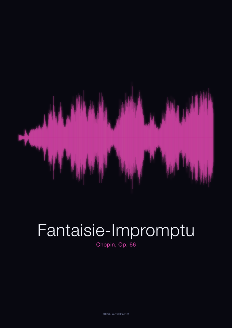 Fantaisie-Impromptu
The print from this article · from €29.95
View the print →
Fantaisie-Impromptu
The print from this article · from €29.95
View the print →
Which Scenario Is You
If you are the bedroom-wall buyer, you already know it. You want a piece that behaves quietly on the paper, and the ratio of white to ink is the number you are shopping for. Do not look for balance. Look for asymmetry — a sheet where the quiet passages dominate and the loud ones punctuate. That is a room you can sleep in.
If you are the couple, or the friend of the couple, or the person marking any specific spoken moment, you are shopping for a shape that is unmistakably itself. The test is simple. Cover the label. If you can still tell which word is which, the render is honest. If you cannot, someone smoothed the silences out on the way to the frame.
If you are the pianist — or the composer, or the teacher, or the parent of the student — you are shopping for a proportional map, and you already have the score. The waveform is the second half of your desk, not a replacement for the first half. Pieces we keep in the studio's own rotation, including the Ballade and the Op. 66, live at our shop rendered from the same public-domain recordings we described here. If none of the three scenarios fits, the honest thing to say is that the print may not be what you need. Silence is a particular kind of gift, and it is not for every wall.
From the collection


New pieces and 10% off your first print.
One email now with your code. No noise after.