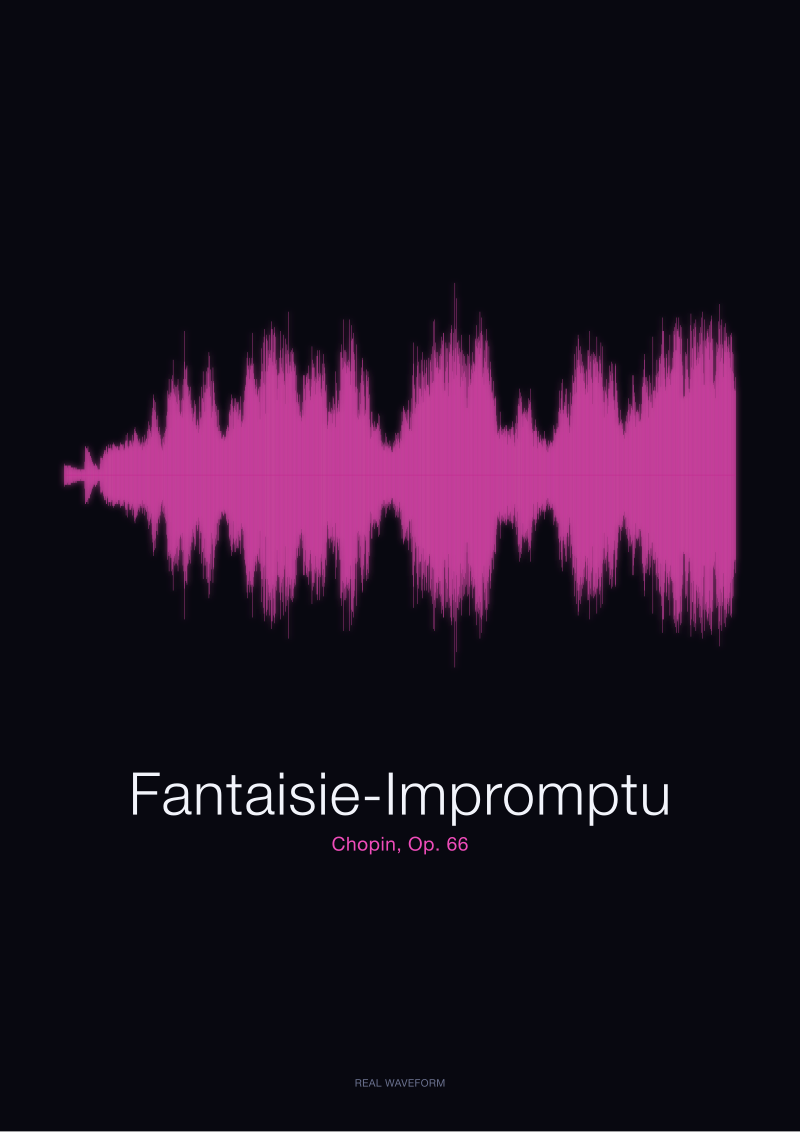
The Fantaisie-Impromptu draws a shoulder-heavy silhouette on paper: a dense middle burst where the presto agitato piles semiquavers into a near-solid wall of amplitude, flanked on either side by the moderato cantabile's calmer swells. It is Chopin's Op. 66, rendered in our shop from the public-domain recording archived in the Musopen Chopin collection — a real amplitude reading of real air, not a decorative curve. And the received wisdom among modern print buyers — that unframed is cleaner, more contemporary, more considered, that a good waveform should be allowed to breathe against the paper's own edge — is wrong for this specific piece. Frame it. Hear us out.
Why the Unframed Default Is Actually Right
The case for hanging a waveform print unframed is not a fashion. It is a defensible position, and we want to state it in its strongest form before we push back on it.
A waveform is already a boundary object. It is a line drawing that begins and ends in silence, and the paper's own margin does the same work a frame would do: it says *the sound stops here*. Adding a frame around that margin is, in this reading, a redundancy — you are drawing a rectangle around a shape that already knows how to end. Contemporary print culture has spent a decade unlearning the ornate, and there is real design intelligence in the unlearning. The gallery-tape mount, the raw-edge poster, the flush-cut deckle against a plaster wall — these are not affectations. They are choices that trust the object.
There is also a material argument. A frame introduces glass, and glass introduces reflection, and reflection fights the very thing a waveform is trying to do: sit still on the wall and let you read its shape. Anyone who has hung a framed print opposite a window has watched the image dissolve into the room at three in the afternoon. An unframed print, mounted flush, has none of that problem. It absorbs light instead of bouncing it. It behaves more like a page than a picture.
And there is a scale argument. A waveform is horizontal — often severely so, four or five to one — and a frame around a horizontal object almost always reads as *bigger than it needs to be*. The moulding adds two or three inches on every side, and the eye reads those inches as part of the image's ambition. Unframed, the print announces its own dimensions honestly. Framed, it announces the frame first.
We concede all of this. The unframed default is not a mistake. For most of the catalogue — the nocturnes, the preludes, the slow études that draw long, low, elegant silhouettes with plenty of internal quiet — we would sign off on unframed without a second look. It is the right call. It is the tasteful call. It is, for most of what we print, the call we would make ourselves.
But here is what that framing misses entirely: the Fantaisie-Impromptu is not a horizontal object. It is a shouldered one, and shoulders need somewhere to land.
Where It Breaks Down for the Fantaisie-Impromptu
Look at what the Op. 66 waveform actually does on paper. The moderato cantabile opens and closes the piece — Chopin's ternary shape, a lyric outer section holding a virtuoso middle — and on the amplitude reading those outer sections are not quiet in any meaningful sense. They swell. They breathe. But they do not touch the vertical extremes of the paper. The line moves in the middle third of the available height, generous but contained, like a voice speaking at conversational volume.
Then the presto agitato arrives, and the shape changes register entirely. The right-hand semiquavers, unrelenting, layered against the left-hand triplets that give the piece its famous cross-rhythm, drive the amplitude reading to something close to a solid block. Not a wave anymore. A shoulder. A dense, near-rectangular mass that reaches for the top and bottom edges of the render and holds there for the duration of the middle section, before the cantabile returns and lets the shape breathe back down.
This is what we mean by shoulder-heavy. The silhouette has a distinctly architectural centre. It reads less like a waveform and more like a building: base, mass, roofline. And the problem with hanging an architectural silhouette flush against a wall, without a frame, is that the wall becomes structural to the composition. The eye does not stop at the paper's edge. It keeps going. It reads the wall's colour, texture, and edge as continuous with the drawing. Which is fine when the drawing is a horizontal wave that fades into its own margin. It is not fine when the drawing is a block of amplitude that needs to *land* somewhere.
Unframed, the Fantaisie-Impromptu's central shoulder appears to be pressing outward against nothing, and the composition loses its grip. The cantabile passages read as decoration around the mass instead of as counterweight to it. The whole point of Chopin's ternary structure — the calm framing the storm — collapses, because the outer calm has nothing to press against on the outside.
A frame provides that outside pressure. Not decoratively. Structurally. The moulding tells the eye where the composition ends, which lets the outer moderato passages read as the softening they are, and which lets the presto shoulder read as the arrival it is. Take the frame away and the piece loses half its argument.
 Fantaisie-Impromptu
The print from this article · from €29.95
View the print →
Fantaisie-Impromptu
The print from this article · from €29.95
View the print →
The Rule the Studio Uses Instead
The convention we run against is that framing is a *room* decision — that you match the frame to the wall, the furniture, the light. That is the interior-designer's rule, and for a lot of art it is a fine rule.
The rule we use is different: framing is a *shape* decision. Look at the waveform first. Ask whether its silhouette needs a boundary or whether it already provides one. Only then think about the wall.
The shortcut we give is this: horizontal-dominant silhouettes with soft internal dynamics — long, low, breathing lines that use the middle band of the paper — can go unframed. The paper's own edge does the work. But shouldered silhouettes — pieces where the amplitude reaches architecturally toward the top and bottom of the render, where there is a clear mass in the composition — need a frame. Not for protection. For syntax. The frame is the punctuation that lets the shape end.
The Fantaisie-Impromptu is the clearest shouldered silhouette we render. Chopin's Op. 66 does something formally unusual for a piece in the *impromptu* tradition: it insists on a virtuoso middle section that is genuinely denser, not just faster, than its outer material. On the amplitude reading, that density is visible as a near-solid block. And a solid block, hung on a wall without a boundary, does not read as a composition. It reads as an object floating in a room. Frame it and the object becomes a picture. Frame it and Chopin's structure becomes legible again.
There is a secondary point worth making, which is about the mat. If you frame the Fantaisie-Impromptu, mat it generously. A narrow mat — a half-inch, an inch — will make the shoulder press against the frame's inner edge, and you will have simply moved the problem one layer outward. A generous mat, two inches or more on every side, gives the shoulder somewhere to recede into. The white of the mat becomes the same white as the paper, the frame becomes the outer boundary, and the composition reads as a triptych of silences: the cantabile, the mat, the wall. That is the correct hierarchy for this piece.
Everyone else's rule — pick the frame that matches your sofa — is not wrong, exactly. It is just answering a different question. Their question is *how do I decorate a room*. Ours is *how do I let this shape end*. The two questions give different answers roughly a third of the time, and the Fantaisie-Impromptu is exactly the case where they diverge.
When the Unframed Default Still Wins
We should be honest about where our rule surrenders. If the print is going into a room that already carries visual weight — a heavy bookshelf beside it, a dark wall, a strong architectural moulding around the doorway — then adding a frame around the Fantaisie-Impromptu compounds the density and the composition starts to feel loud in the room even before you hear the music in your head. In that setting, unframed and flush-mounted wins, and the loss of internal structural syntax is the price you pay for the room's overall balance.
The other case is scale. If the print is being hung small — under about eighteen inches on the long edge — the shoulder is compressed enough that the paper's margin can carry it. Frame it if you like, but do not feel you have to. The unframed default is a real option at small sizes, and the room-first rule is close enough to right that most people will not notice the difference.
And if the Fantaisie-Impromptu is going up beside other prints from the catalogue — a nocturne, a prelude, something soft-silhouetted — then internal consistency across the group matters more than the individual piece's argument. Hang them all unframed together and the group reads as a series. Frame the Fantaisie-Impromptu alone in a row of unframed prints, and the eye reads the frame as an accusation of the others. Uniformity wins over correctness in a series.
 Nocturne
The print from this article · from €29.95
View the print →
Nocturne
The print from this article · from €29.95
View the print →
From the collection


New pieces and 10% off your first print.
One email now with your code. No noise after.