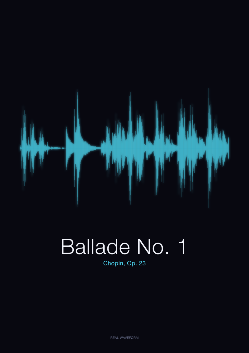
Pull up the CC0 recording of Chopin's Ballade No. 1 from the Musopen collection on archive.org. Render its amplitude waveform. The silhouette is jagged, uneven, full of tall spikes and long low valleys — the shape of a pianist choosing when to lean in and when to withdraw. Now imagine the same performance run through modern pop mastering: the peaks flattened to the ceiling, the valleys raised to meet them, the silhouette compressed into a solid rectangular slab. That is the loudness war, and it is visible before you hear a note.
The Receipt: Two Waveforms of the Same Chopin, Side by Side
We render from source. The Ballade No. 1, Op. 23, in the Musopen public-domain archive is a straight capture: microphones in a room, a piano, a performer, and the file that came out. When we draw its amplitude waveform, we are drawing the actual pressure variations recorded in that room, sample by sample, at whatever rate the file was encoded. Nothing has been added.
What you see on the page is not a design choice. It is a receipt. The opening bars sit low against the horizontal axis — quiet, sparse, most of the frame empty. Around the transitions, the wave lifts into a cluster of tall, narrow spikes. Between them, long stretches of near-silence. The overall envelope of the piece looks less like a wall and more like a mountain range at dusk: peaks, valleys, air.
Now hold that shape in your head and picture the same recording taken to a modern mastering engineer briefed for streaming loudness. The engineer would run compression to reduce the difference between the loudest and quietest moments. They would apply a limiter to shave the tallest peaks flat. They would raise the overall gain so the entire waveform pushes toward the top of the frame. The valleys would climb. The peaks would clip against an invisible ceiling. What began as a mountain range would become a plateau — the same performance, redrawn as a rectangle.
The two silhouettes represent the same notes. The pianist did not play louder. The room did not change. Only the file did. This is what we mean when we say mastering is visible: the shape of the sound has been re-authored, and the drawing tells you so.
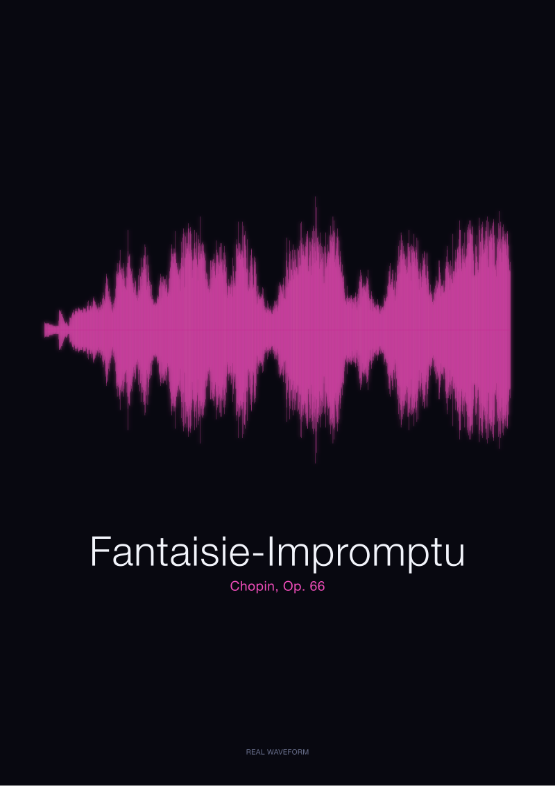
The Fantaisie-Impromptu, Op. 66, from the same Musopen collection behaves the same way. Its original waveform is dynamic — the outer sections dense and forward, the middle section (the famous melodic passage) sparse and low. Compressed and limited, that architecture collapses into uniform density. The middle section stops looking middle. The piece stops looking like itself.
What Mastering Actually Does to the Shape
Mastering is the last technical step between a mix and a released file. Historically it did modest work: level-matching a group of tracks so they sit together on an album, correcting broad tonal issues, preparing the master for its delivery format. The waveform going in and the waveform coming out looked substantially the same.
Three tools, applied aggressively, change that. Compression reduces the ratio between loud passages and quiet ones by pulling loud material downward once it crosses a threshold. Limiting is compression at an extreme setting used as a ceiling — it prevents any sample from exceeding a chosen level, at the cost of clipping the tips of tall transients. Gain, applied after both, raises everything so the compressed and limited material fills the available headroom.
Read as shapes: compression narrows the vertical range of the waveform. Limiting cuts the top off any peak that dares to stand tall. Gain then pushes the whole squashed body upward until it touches the frame. The visual result is inevitable. Peaks that were tall and thin become short and blunt. Valleys that were near-silent become halfway to full. The distinctive silhouette of a performance — the shape that told you where the pianist breathed — is replaced by a fill.
There is a technical term for this: crest factor. It is the ratio between the peak of the signal and its average level. A high crest factor means tall spikes rising out of a quieter body — the natural shape of unamplified music. A low crest factor means peaks barely taller than average — the shape of aggressive mastering. Every drawing of a waveform is, in effect, a drawing of the crest factor.
The Chopin recordings in the public-domain archive have a high crest factor. That is why they look the way they do. A brick-walled pop master has a very low crest factor. That is why it looks the way it does. The eye is reading the same physics the ear is reading; it is simply faster.
None of this is a value judgement about mastering itself. Level correction, tonal balance, format preparation — these are craft. The line is crossed when the tool set is used not to serve the performance but to compete with other tracks on a playback rotation. That is where the loudness war begins.
 Ballade No. 1
The print from this article · from €29.95
View the print →
Ballade No. 1
The print from this article · from €29.95
View the print →
The Loudness War, Drawn: Why Modern Pop Looks Like a Brick
The loudness war is a decades-long escalation in which mastered releases have become progressively louder, on average, than the releases that preceded them. The mechanism is simple. If two songs play back-to-back and one is perceptibly louder, listeners tend to rate the louder one as sounding better, even when other qualities are held constant. Labels and mastering engineers, aware of this effect, competed to make each new release sit at least as loud as its neighbours on radio and, later, on playlists.
Because a digital file has a fixed maximum level, the only way to make a track sound louder without exceeding that ceiling is to raise the quiet parts. Compression and limiting do exactly that. Applied lightly, they are inaudible. Applied heavily, they change the character of the recording. Applied to the extreme reached during the peak years of the loudness war, they redraw the file entirely.
The visual signature is unmistakable. A well-preserved dynamic master, drawn as a waveform, looks like terrain. A brick-walled master looks like a bar of soap: rectangular, flat-topped, edges perpendicular to the timeline. The waveforms of certain widely publicised releases from the mid-2000s became case studies in exactly this shape — the top of the wave running as a continuous horizontal line for minutes at a stretch, meaning the file had been pushed against its ceiling so consistently that the limiter never rested.
Streaming platforms have since introduced loudness normalisation, which measures the perceived loudness of a track and adjusts playback gain so that all tracks in a queue play back at roughly the same level. This partially removes the incentive to master loud, because a track that arrives too loud will simply be turned down at playback, sacrificing dynamic range without gaining any competitive volume. The economic argument for the loudness war weakened. The habit did not disappear overnight.
The historical record of what happened is visible in any waveform viewer. Compare a well-preserved classical recording, or an early-1980s pop release, against a mid-2000s pop master, and the change in shape is unambiguous. It is not a stylistic drift. It is the same document type printed at successively higher contrast until the letters bleed into each other. The music inside may still be excellent. The drawing has stopped being able to tell you so.
What This Means for What You Hang on a Wall
We render prints from source recordings. When the source is a dynamic master — a Chopin ballade, a spoken word, a live capture — the print has architecture. There is white space where the music breathes. There are peaks that stand alone, valleys that let the eye rest, transitions that draw attention because they are visible transitions. The print reads as a document of a specific performance. Two takes of the same piece produce two different silhouettes.
When the source is a heavily brick-walled master, the print is a rectangle. It is a truthful print — it is what the file looks like — but the file has been engineered so that no two performances would produce meaningfully different silhouettes. The visual information has been compressed out of the recording before we ever draw it. A print of a modern loudness-normalised pop track can still be beautiful as a graphic object, but it is a print of a file, not a print of a performance.
This is one reason we work from the public-domain classical archive and from other sources with dynamic-master lineages. It is not aesthetic preference alone. It is that dynamic recordings give us something to draw. The Ballade No. 1 print looks the way it does because Chopin wrote a piece with wide dynamic range, and the pianist honoured it, and the engineer did not flatten it, and we did not invent it. Every jagged peak in the frame is a moment the performer chose. Every low valley is a moment they held back. The drawing is an honest map of a set of decisions.
If you gift a print of recorded sound, what you are gifting is the shape of that specific document — not the piece in the abstract, but that recording of it, that day, that room, that master. This is why the mastering question is not incidental to what a waveform print is. It is the question. A print rendered from a brick-walled source is a print of an industrial process. A print rendered from a dynamic source is a print of a performance.
The natural next question is what happens when the recording itself is neither piano nor pop but something in between — a spoken word, a heartbeat, a first cry, a voice message. Those signals live at their own crest factors, obey their own physics, and produce their own silhouettes. Reading them well is a different craft, and it is where the studio's work with non-musical recordings — see the Ballade No. 1 print has examples — begins.
 Fantaisie-Impromptu
The print from this article · from €29.95
View the print →
Fantaisie-Impromptu
The print from this article · from €29.95
View the print →
From the collection



New pieces and 10% off your first print.
One email now with your code. No noise after.