We spent an afternoon reading everything the search engines will surface about minimalist music prints. Every gallery round-up, every "wall art for music lovers" listicle, every Etsy-adjacent explainer. What we found is that almost none of them are about music. They are about album covers with the text removed — a Radiohead sleeve reduced to a red mountain, a Joy Division waveform (which is famously a pulsar, not a song) reprinted in six colourways, a Miles Davis silhouette in navy. The word minimalist does the work of hiding that nothing has been minimised, and the word music does the work of hiding that the sound is nowhere on the page.
The pattern is almost embarrassing once you notice it. Every round-up cycles through the same forty or fifty sleeves, occasionally rearranged, occasionally recoloured, always presented as though the graphic design of a record's packaging were the same object as the record itself. We would like to argue, at some length, that it is not.
What They All Get Wrong
The shared error is a category mistake. The writing treats "minimalist music print" as a graphic-design subgenre — a look, a colour palette, a way of setting sans-serif type — rather than as anything to do with music as sound. Once you make that swap, the entire vocabulary of the round-up article follows. Colour palette. Mid-century references. Bauhaus influence. Pantone this, Pantone that. The word music becomes ornamental. It could just as well say minimalist film prints, minimalist book prints, minimalist football prints; the structural argument would not change and, in most of the articles we read, the visual templates barely change either.
The default template we saw repeated, in one form or another, in almost every piece: take a well-known album cover, strip the artist and title text, boost the contrast, sometimes rebuild the artwork in flat vector, and sell the result as a "minimalist interpretation" of the record. A Dark Side of the Moon prism, no text. A Nevermind baby, no text. A Kind of Blue silhouette of Miles, no text. This is not minimalism. It is subtraction. Two different verbs. Minimalism reduces a thing to what is essential to it; subtraction removes a thing that was there. If you take an album cover and delete the words, the words are missing. The cover has not become more essentially itself. It has become an album cover with a hole in it.
The second and more revealing error is the near-universal appearance of the Joy Division Unknown Pleasures cover in these lists, always described as the archetype of a "music waveform print". It is not a waveform. It is a stacked plot of successive radio pulses from the pulsar CP 1919, taken from a 1970 doctoral thesis in radio astronomy. There is no music on that cover. There is no sound of any kind on that cover. It is a chart of a rotating neutron star. Round-ups routinely present it as the origin of the "sound wave print" genre while getting wrong what the image even shows. When the flagship example of a genre is actually a picture of a dead star, we should probably ask whether the genre, as described, is really about music at all.
Third, the articles almost never distinguish between graphic reference and physical evidence. A silhouette of a trumpet references jazz; it is not jazz. A red mountain references a specific album; it is not the album. There is nothing in any of these images that came from the sound itself. If you played the record backwards through the print, the print would not change. That is the tell.
What Is Almost Always Missing
What is missing is the recording. Not the record as a piece of packaged product, but the recording as an event in time — the moving air a specific pianist pushed through a specific room on a specific afternoon, captured, digitised, and drawable. None of the round-ups we read treated a music print as a rendering of that. The recording, the actual sound, is nowhere on the page.
Once you notice its absence, you start to notice everything else that follows from it. There is no discussion of which performance is being represented. There is no mention of a source file. There is no acknowledgement that two recordings of the same piece — Chopin's Fantaisie-Impromptu, Op. 66, played by two different pianists — produce two visibly different shapes, because the rubato is different, the pedalling is different, the microphone placement is different, the room is different. A print derived from one of them and a print derived from another would not be interchangeable. The album-cover-with-the-text-removed template cannot represent that difference because there is nothing recording-specific in the image to begin with. Every "Chopin print" in the round-up looks the same as every other, because none of them is grounded in a Chopin.
Also missing: any physics. The amplitude waveform is not a mystical object. It is a plot of air pressure over time, sampled at some fixed rate — the same signal that reached the microphone, reduced to a two-dimensional trace. It has an attack when the note begins, a swell where the sound sustains, a decay where it fades, and long stretches of white space where nothing much is happening. It looks like the music because it is the music, drawn. A Ballade No. 1 by Chopin, rendered from a real recording, has quiet stretches that are visibly quiet, and climactic passages that are visibly taller. The round-ups almost never explain any of this because their images do not have any of it. There is nothing to explain when the picture is just a shape somebody drew.
The most telling omission is provenance. Serious music prints answer three questions on the page or in the caption: which piece, which performance, and where did the source audio come from. A Fantaisie-Impromptu Op. 66 rendered from the public-domain Musopen collection at archive.org is a different object from a decorative squiggle labelled "classical music vibes". The first has evidence; the second has a mood board. The round-ups do not distinguish them because their frame does not have a place for the distinction.
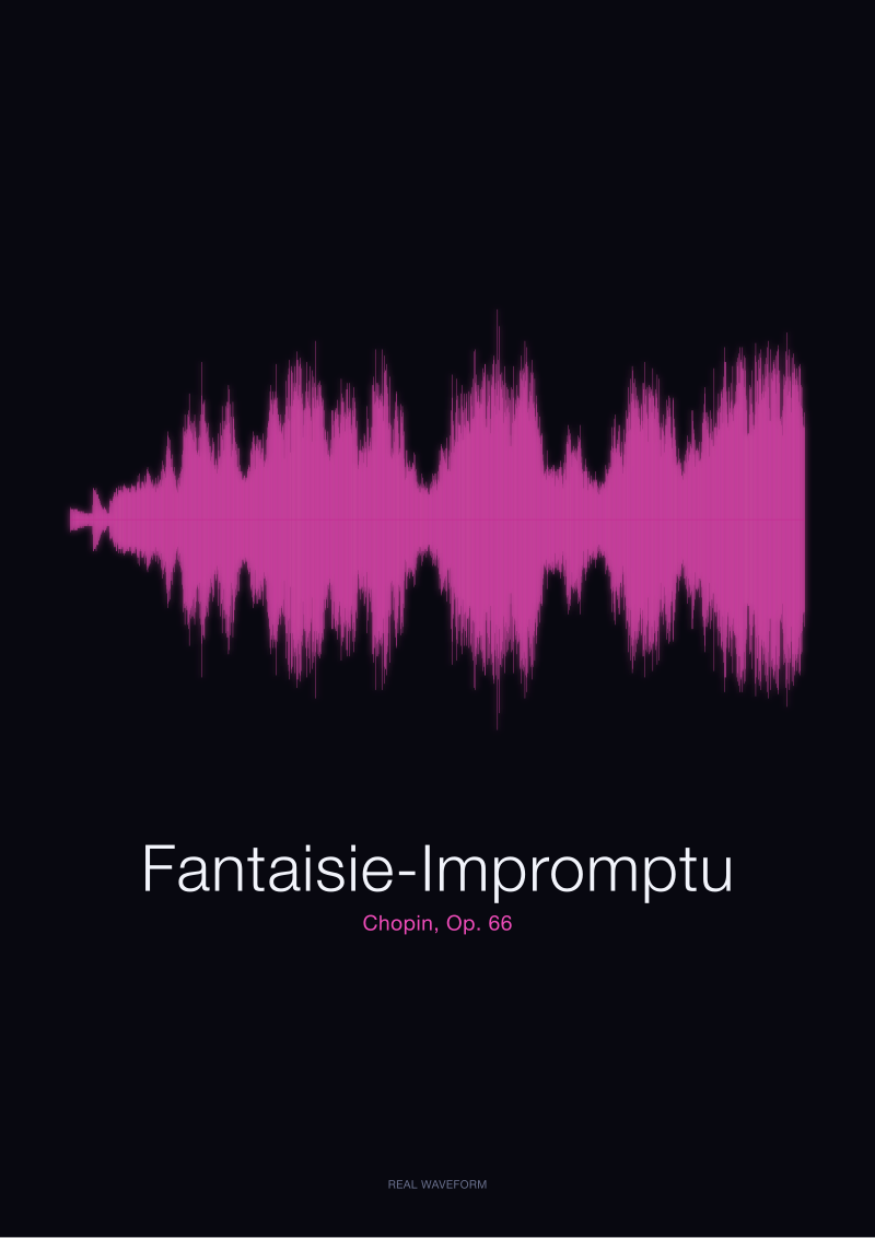 Fantaisie-Impromptu
The print from this article · from €29.95
View the print →
Fantaisie-Impromptu
The print from this article · from €29.95
View the print →
What I Would Say Instead
A minimalist music print, if the phrase is going to mean anything at all, is a drawing of air over time. Nothing else. The minimalism is not a design aesthetic imported from mid-century posters — it is what the signal already looks like when you stop dressing it up. Air pressure fluctuates, a microphone captures the fluctuation, a computer plots it, and the result is a long thin horizon of tall parts and quiet parts. That is the image. There is nothing to add. If you add anything, you are back in graphic design.
Take Chopin's Ballade No. 1, Op. 23, from a public-domain recording. Rendered as an amplitude waveform, it is mostly a low, quiet band, punctuated by two or three unmistakable peaks where the piece breaks open and the pianist leans into the instrument. You can point at the coda from across the room. That is not a metaphor for the music. It is the music, drawn. The Fantaisie-Impromptu, Op. 66, from the same collection, produces an almost opposite silhouette — dense, chattering, a near-continuous line of activity across the middle section, with a suddenly still lyrical passage where the whole page seems to exhale. Anyone who has heard the piece can read the shape. Anyone who has not can look at it and know something true about the sound before ever pressing play.
Spoken word behaves the same way. A single French word — bonjour, generated locally as a plain speech signal — has a shape you could pick out of a lineup. Two syllables, one softer opening, one slightly firmer close. Ciao, in Italian, is different: a single sharp attack, a quick decay, almost no tail. These are not "waveform aesthetics". They are drawings of the actual sound of somebody saying the word. If you generated the same word from the same synthesiser twice, the shapes would be identical. If you had two different people say it, they would not.
This is what a music print should be, and this is the frame the round-up articles are missing. Not "art inspired by music". Not "a minimalist interpretation of a classic album". A print of the sound itself, tied to a named recording, with a source you can trace. The design discipline is not about picking a pleasing palette; it is about not adding anything the audio did not put there. No decorative curves. No smoothed-out illustrator versions. The wave is already the design. Everything else is noise.
We would also drop the album-cover framing entirely, because it is a category error. Album art is a promotional object made by a designer, sometimes brilliant, but describing a package. A waveform of the record inside the package is a description of the contents. The two are related the way a book cover is related to the book: one is about the other, but they are not the same object, and confusing them is not a matter of taste, it is a matter of what the object is for. A print of Chopin's Ballade is not a Chopin poster. It is a picture of what Chopin, on one particular afternoon, sounded like. Which is a smaller claim, and a much stranger one, and the only claim of the two that requires the music to be there.
For anyone who wants to look at the actual shapes described here — a Ballade No. 1, a Fantaisie-Impromptu, a bonjour, a ciao, each rendered from the real audio and nothing else — we keep them in the studio's own see the Fantaisie-Impromptu print. Everything else on the page is a graphic decision. The wave is not.
FAQ
Is a minimalist music print the same thing as an album cover print?
No, and treating them as the same thing is the confusion most of the online writing runs on. An album cover print is a version of a record's packaging with the text stripped, styled, or reissued as decor. A music print in the sense we mean it is a rendering of the sound itself — an amplitude waveform derived from a specific recording. One is a graphic-design object referring to a record. The other is a drawing of the record's contents. They can share a wall, but they are not the same category.
Is the Joy Division Unknown Pleasures cover a music waveform?
It is not. The image on that cover is a stacked plot of radio pulses from the pulsar CP 1919, reproduced from a 1970 doctoral thesis in radio astronomy. There is no audio source involved. The reason it comes up in almost every article about "sound wave prints" is that it looks like what people imagine a waveform to be, and the misattribution has become self-perpetuating. A print of an actual recording — a Chopin Ballade, for example — looks different, and comes from different physics.
What does a minimalist music print actually show?
It shows amplitude over time. In plain terms: how loud the recording is, moment by moment, drawn as a horizontal line that grows tall where the sound is loud and stays flat where it is quiet. Silences become white space. Attacks become sharp vertical spikes. A slow lyrical passage looks like a low, calm band. There is no interpretation layer. The shape is the signal, plotted directly from the audio file, with no decorative smoothing.
Does every recording of the same piece produce the same waveform?
No, and this is one of the more interesting facts about the format. Two pianists playing Chopin's Fantaisie-Impromptu will produce two visibly different shapes, because tempo, dynamics, pedalling, and room acoustics are all different. Even the same pianist recorded twice will not repeat exactly. This is why a serious music print names its recording: the waveform is a portrait of a specific performance, not a generic representation of the piece.
Can spoken words be turned into minimalist prints too?
Yes, and they make the point cleanly. A short spoken word like bonjour or ciao, recorded or generated as a plain speech signal, has a shape you can recognise: two soft syllables for the French, a single sharp attack and quick decay for the Italian. The waveform of a word is not a metaphor for the word. It is a drawing of the air that carried it. The same physics that makes a Chopin visible makes a hello visible.
What is the difference between a decorative waveform and a real one?
A decorative waveform is drawn by a designer to look like a waveform — often a repeating pattern of neat oscillations, mirrored top-to-bottom, coloured for aesthetics. It comes from nowhere in particular. A real waveform is generated from an actual audio file; it is asymmetric, uneven, full of quiet gaps and unpredictable peaks, and it corresponds one-to-one with something you can play. If you cannot name the source recording, it is decoration.
Why does the writing about this genre almost never mention the recording?
Because the frame is inherited from graphic-design coverage, where the object of discussion is a poster, not a sound. When "music print" is treated as a look rather than a signal, there is no reason for a source recording to appear in the article — the image on the page did not come from one. The absence of provenance in most round-ups is the strongest evidence that the images they are describing are not, in any technical sense, prints of music.
Where can I see waveforms of specific recordings drawn this way?
The studio keeps a small set at see the Fantaisie-Impromptu print, each grounded in a named recording with the source stated on the page. Chopin's Ballade No. 1, Op. 23 and the Fantaisie-Impromptu, Op. 66 are drawn from the public-domain Musopen collection hosted at archive.org. The spoken-word pieces are generated locally as original signals. In every case, the shape on the paper came from the audio and nowhere else — which, as far as we are concerned, is the whole definition of a music print.
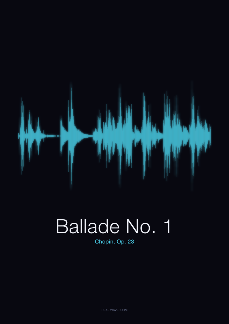 Ballade No. 1
The print from this article · from €29.95
View the print →
Ballade No. 1
The print from this article · from €29.95
View the print →
From the collection



New pieces and 10% off your first print.
One email now with your code. No noise after.