Quiet pieces draw the most dramatic waveforms. That is the direct claim, and this piece is a small flowchart built to prove it. We render real recordings for a living — Chopin's Ballade No. 1, the Fantaisie-Impromptu, even the single spoken word bonjour into a microphone — and the shapes we get back are never what a first-time viewer predicts. Loud does not mean tall on paper. Loud held for two minutes averages into a flat block of grey. Silence surrounded by a sudden attack is what looks like a cliff. We are going to ask you three questions about the piece in your head, and each answer routes you to a different silhouette.
Question 1: Does the Piece Contain Long Stretches of Near-Silence?
This is the first fork because it is the one that decides everything downstream. A waveform is a picture of amplitude over time. If amplitude sits near zero for whole passages, the moments where it does not sit near zero are visually enormous — not because they are objectively loud, but because the eye compares them to the flatness beside them. Drama on paper is contrast, not volume.
Think of the shape as a landscape. If you are looking at desert plateau for miles and then a single mesa rises, the mesa reads as tall. If the whole terrain is mountains, no individual peak stands out; the eye normalises. The waveform obeys the same rule your retina does.
If Yes
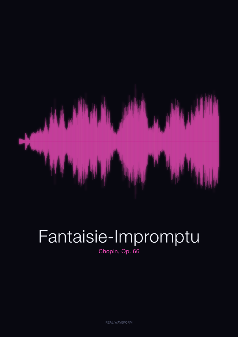
If the piece breathes — if the composer writes sustained pianissimo, held rests, phrases that trail into nothing — you are going to get a drawing with cliffs. The Fantaisie-Impromptu is the textbook case in our studio. The Op. 66 middle section is famously tender, played hush against the hammering outer sections. When we render the full performance, the middle looks like a valley floor and the returning presto looks like the ridge line above it. The vertical range of the print is set by the loudest attacks, but the visual identity of the print is set by how much of the horizontal axis sits close to the baseline. More rest, more contrast, more drawing.
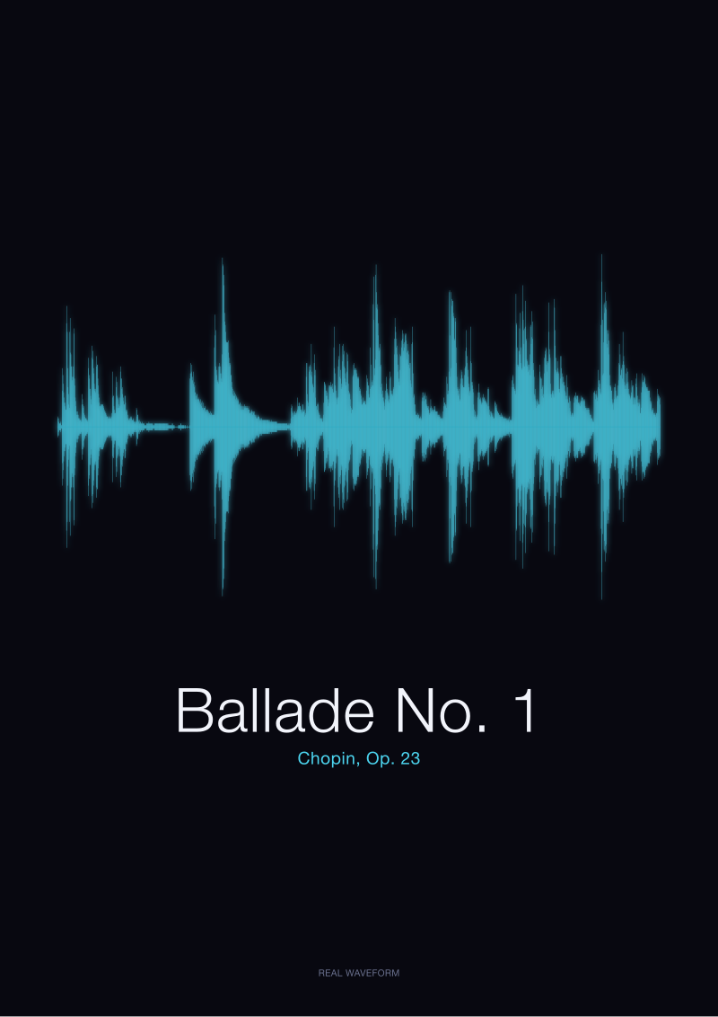
The Ballade No. 1 does something even sharper. Chopin's Op. 23 opens with a phrase that hovers, hesitates, sits at a level a distracted listener might call background. Then, minutes in, the coda breaks. On our rendered wave, the coda is not merely bigger than the opening. It reads as a different geological event. Because the opening built a long, low baseline for the eye, the coda gets to look like a wall.
If No
If the piece sits at one dynamic — think a march played at forte throughout, or a Baroque toccata that never lets the bow leave the string — the waveform flattens into a wide band. It still has micro-detail, and to a trained eye there is texture inside that band, but the silhouette is a rectangle. Beautiful, uniform, monumental. Not dramatic.
This is why steady-loud recordings, which feel intense in the room, disappoint clients who imagine their print will look like a heartbeat monitor mid-crisis. There is nothing to react against. Every sample is close to the loudest sample. The eye has no plateau to measure the mountain against, so the mountain flattens into terrain.
Question 2: Does the Dynamic Range Swing Between Whisper and Attack, or Sit at One Volume?
Question one was about silence — the absence of signal. Question two is about the presence of signal, and specifically how far the piece asks a performer to travel between their softest note and their loudest. A composer's dynamic markings are, in a real sense, a set of instructions to a future waveform. When Chopin writes pianissimo followed within a few bars by fortissimo, he is drawing the shape of the print before the pianist has touched the keys.
The distance between those two extremes is what physicists and audio engineers call dynamic range. In the visual output it is the difference between the shortest vertical stroke and the tallest one on the same axis. Wide dynamic range gives you tall spikes over shallow ground. Narrow dynamic range gives you a hedge trimmed flat.
If Yes
If the answer is that the piece swings — a nocturne that murmurs and then flares, a ballade that whispers and then hammers — you are in the territory where the waveform earns the word dramatic. This is Chopin's home register. It is why so many of the recordings we render from the Musopen Chopin collection produce prints people describe as musical without being able to say why. The visual grammar of those prints is the visual grammar of dynamic swing: low, low, low, then a sudden vertical stroke, then a taper back down.
Notice we are not saying the loudest note in a swinging piece is objectively louder than the loudest note in a steady-forte piece. Often it is not. A performer digging into a martial chord at sustained forte can hit peaks that rival any pianissimo-punctuated crescendo. But those peaks live inside a landscape of similar peaks, so they never look tall on paper. The tallest note in a swinging piece stands alone. The tallest note in a steady piece stands in a crowd.
If No
If the piece lives at one dynamic level from bar one to the final chord, you will get a rendering that is essentially a filled shape. It has integrity. It has a kind of severity that suits certain repertoire — some organ works, a lot of ceremonial music, plainsong recordings. But it will not look dramatic in the flowchart sense we are building here. It will look uniform.
Some clients love this. A print of a piece that never breaks its own composure has a monastic quality. We do not talk anyone out of it. We only make sure they know what they are ordering: a rectangle with fine internal texture, not a mountain range.
 Ballade No. 1
The print from this article · from €29.95
View the print →
Ballade No. 1
The print from this article · from €29.95
View the print →
Question 3: Are You Looking at the Whole Performance or a Single Bar?
The third fork is the one people forget to ask themselves, and it is the one that changes the picture most. A waveform's drama depends entirely on how much time you compress into how much horizontal space. The same recording rendered across ten centimetres of paper versus rendered across two metres of paper is not just larger or smaller. It is structurally a different image.
At long timescales, the eye sees the architecture: sections, movements, the shape of the arc. At short timescales, the eye sees the grain: individual attacks, the decay curve of a single note, the tiny asymmetry between the pluck and the ring. Both are honest. Neither is more real. They just answer different questions.
If Yes
If you are looking at the whole performance — say, a full nine-minute reading of the Ballade No. 1 rendered onto one horizontal — you are looking at architecture. The long baselines merge into a continuous low band. The dramatic events cluster into a few tall bursts. The eye reads it the way it reads a mountain skyline seen from far away. Individual notes are invisible; only the massed shape of the piece survives. This is the mode most of our prints operate in, because it is the mode that produces images that can hang on a wall and be read from across a room.
The trade-off is that at that scale, the difference between a well-played pianissimo and a genuinely silent bar becomes hard to see. The eye needs a bit more amplitude to register a stroke at all. Very soft passages sink toward the baseline until they nearly touch it.
If No
If you are looking at a single bar, or even a single note, the picture inverts. Zoom into the attack of one note on the Fantaisie-Impromptu and you can see the transient — the sharp initial spike as the hammer strikes the string — followed by the swell as the note blooms, followed by the long slow decay as the string continues to ring. A single spoken word, like our reference rendering of bonjour, does exactly the same thing at a much shorter timescale: an initial burst of consonant, a sustained vowel, a taper into nothing. Zoomed in, every sound becomes its own little life cycle.
At this scale, dynamic contrast between passages stops mattering because there is only one passage on the page. What matters instead is the internal shape of the sound: its attack, its swell, its decay. Every note is dramatic when you look at it alone. The drama is just of a different kind — intimate, physical, almost tactile.
If You Answered Everything: The Table That Maps Your Answers to a Waveform Shape
The three questions produce eight possible answer combinations. What follows is the map from your answers to what the print will actually look like on paper. Q1 is whether the piece has long stretches of near-silence. Q2 is whether it swings between whisper and attack. Q3 is whether you are viewing the whole performance or a single bar.
| Q1 | Q2 | Q3 | Recommendation |
|---|---|---|---|
| Yes | Yes | Whole | Maximum drama on paper — cliffs rising out of long low plateaus, the archetypal Chopin ballade silhouette. |
| Yes | Yes | Single bar | Intimate drama — one attack, one bloom, one taper, isolated against surrounding rest. |
| Yes | No | Whole | Quiet architecture with occasional swells — meditative, breathing, closer to landscape than cliff. |
| Yes | No | Single bar | A single sound framed by silence on both sides — the shape of one word or one note held. |
| No | Yes | Whole | Dense terrain with peaks throughout — mountain range, not mesa; less contrast, more density. |
| No | Yes | Single bar | A powerful attack read at close range — steep front edge, long ring, no reference silence around it. |
| No | No | Whole | A uniform filled band — monastic, severe, textured but not spiky. |
| No | No | Single bar | Micro-detail of a steady sound — grain, texture, the internal life of a sustained tone. |
The pattern is legible once you sit with it. Every Yes on Q1 adds vertical drama by giving the eye a flat baseline to measure peaks against. Every Yes on Q2 widens the amplitude range, so the peaks are taller relative to the troughs. Every Whole on Q3 favours architecture over grain, showing the arc of the piece rather than the anatomy of any single sound. The archetypal dramatic waveform — the one people picture in their head when they order a Chopin print — is Yes/Yes/Whole. Not by accident. It is what the composer designed for and what the format rewards.
This is also why we default, when we render commercial prints in our /shop/, to whole-performance renderings of pieces that breathe. The Ballade No. 1 and the Fantaisie-Impromptu are in that collection for exactly that reason: their answers to the three questions come out at the far end of every axis. The prints reward being hung on a wall and read from across a room, because their drama is architectural, not textural.
This piece does not address a few things worth naming. It does not explain the microphone and mastering choices that change the peak-to-baseline ratio of the same performance from one recording to another — that is a separate argument about the physical chain between the piano and the file. It does not address perceptual loudness curves, which are why the human ear registers some frequencies as louder than the waveform strictly says. And it does not cover how stereo separation shows up when a wave is drawn from two channels rather than one. Each of those is a real question, and each deserves its own piece.
 Fantaisie-Impromptu
The print from this article · from €29.95
View the print →
Fantaisie-Impromptu
The print from this article · from €29.95
View the print →
FAQ
Does a louder recording always produce a taller waveform?
No. Amplitude is what the waveform draws, and amplitude is measured relative to the loudest sample in the file. A recording mastered to sit near the ceiling for its entire duration will look flat and wide because the eye has no lower reference to measure the tall moments against. A quieter recording with a few sudden attacks will look far more dramatic because the surrounding baseline is low.
Why does silence look so important in the shape of a print?
Silence gives contrast. A waveform is a comparison, sample by sample, between amplitude and zero. Long passages near zero create a visual baseline. When a note finally arrives, the eye reads it against that baseline and interprets the vertical stroke as tall. Without silence in the piece, every attack has other attacks around it and none stand out.
Are Chopin's pieces especially good for this kind of visualisation?
Yes, and it is largely because Chopin wrote with such wide dynamic range and such frequent use of rests, sustained pedal, and pianissimo passages. Works like the Ballade No. 1 and the Fantaisie-Impromptu contain the exact ingredients that produce visually dramatic waveforms: long quiet stretches, sudden dynamic surges, and clear architectural arcs from opening to coda.
What does zooming in on a single note actually show?
It shows the internal life cycle of the sound: the sharp initial spike of the attack, the swell as the note fills out, and the long taper of the decay. Even a spoken word like bonjour, rendered from a single microphone recording, follows the same pattern. The consonant makes a burst, the vowel sustains, and the sound fades. At close range, every sound has this three-part shape.
Can a steady, loud piece ever produce a dramatic waveform?
Not in the cliff-and-plateau sense. It produces a different kind of image — a filled rectangular band with fine internal texture. Some listeners and buyers prefer that severity; it suits ceremonial or continuous repertoire. But it will not read as dramatic in the way a swinging Chopin performance does, because there is no low baseline against which any peak can look tall.
Does the length of the print change how dramatic the waveform looks?
It changes the mode entirely. A long horizontal print of a whole performance emphasises architecture: sections, arcs, the shape of the piece as a whole. A short print, or a zoom into a single passage, emphasises grain: the anatomy of individual attacks and decays. Neither is more accurate. They answer different questions about the same recording.
Is the waveform we render an interpretation, or the actual signal?
It is the actual signal. Every print from our studio is drawn directly from the sample values of the source audio — the Musopen Chopin collection for the piano works under CC0, or the original file for a spoken-word rendering like bonjour or ciao. We do not smooth it, stylise it, or substitute a decorative curve. What you see on paper is what the microphone captured, plotted honestly.
From the collection



New pieces and 10% off your first print.
One email now with your code. No noise after.