Most sound wave art sold for music rooms is not a sound. Hear us out. The waveform printed on the average canvas — the one that promises a favourite song made visible, the one that curves in perfect symmetry above a lyric — is a decorative line drawn in vector software, matched to no audio file, rendered from no recording. We know because we render the opposite: real amplitude waveforms pulled from the actual audio, including public-domain recordings of Chopin's Ballade No. 1, Op. 23, and Fantaisie-Impromptu, Op. 66, both from the Musopen CC0 collection on archive.org. The gap between a drawing and a recording is the entire subject of this piece.
Methodology: What We Tested, What We Sampled, What We Could Not Verify
We did not run a laboratory study. We ran an editorial audit, which is a narrower thing and worth naming honestly. Our sample was drawn from the category as it presents itself to any buyer typing "sound wave art for a music room" into a search bar: the print-on-demand marketplaces, the personalised-gift sites, the Etsy sellers, the wall-decor pages of home retailers. We looked at product listings, at preview images, at seller descriptions, at the small print about how the image is generated.
We asked three questions of each listing. First: does the seller name the source recording, or does it name only a mood, a song title, or a lyric? Second: does the preview waveform contain the physical fingerprints of a real recording — asymmetric peaks, long low sections, the specific silhouette of an attack and decay — or is it visibly symmetric, evenly spaced, and cosmetically groomed? Third: if the seller offers to render a customer-submitted track, does the marketing language commit to the amplitude of that track, or does it commit only to a "waveform in the shape of your song," which is not the same promise?
Two limitations. We cannot audit the private files a seller may hold on a hard drive; we can only audit what is publicly shown or claimed. And we did not sample every listing on every platform — the category is too large. What we can say is what the visible surface of the market reads like, and what our own render pipeline tells us about the difference.
Finding #1: The Majority of Listings Are Decorative Curves With No Audio Behind Them
Look closely at the waveform on the average music-room canvas and something odd happens: the peaks mirror each other. Both halves of the curve are the same height. The line is smooth where a real waveform would be jagged. The silhouette rises and falls in a rhythm that has nothing to do with any recording — it has to do with what looked balanced to the designer in Illustrator at 2 a.m.
This is not a scandal. It is a design choice, and for many buyers it is the correct one; a decorative line above a lyric is a legitimate genre of poster. But it is not sound wave art in the physical sense of the phrase. It is wave-shaped art. A real amplitude waveform is a plot of how much a speaker cone would move at each moment of a recording. It is inherently asymmetric because music is inherently asymmetric — a piano attack is not the mirror image of its decay, and a held chord is not the mirror image of its release.
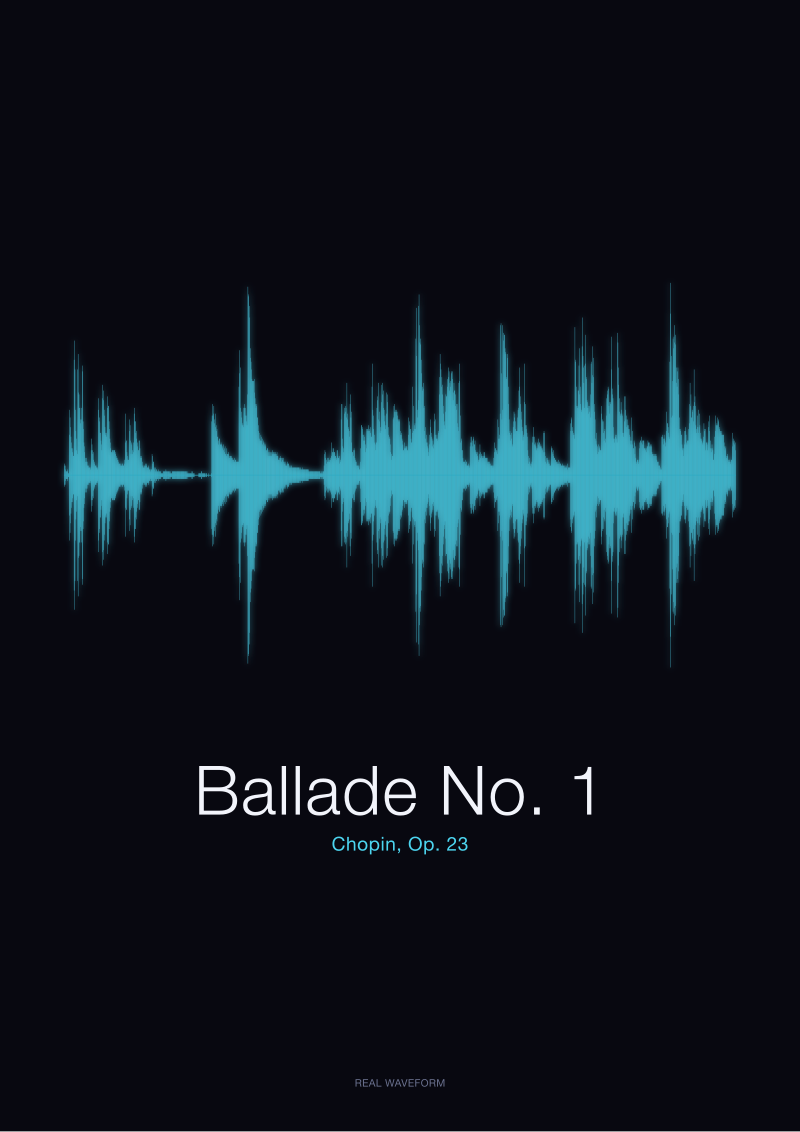
When we rendered the Musopen public-domain recording of Chopin's Ballade No. 1, Op. 23, the shape that came out did not look like a canvas from the personalised-gift aisle. It looked like a landscape: long quiet valleys, sudden mountainous peaks in the coda, a texture that no vector tool would draw because no designer would choose to leave that much of a canvas nearly empty. The decorative curve is a stylisation. The recording is a document.
 Ballade No. 1
The print from this article · from €29.95
View the print →
Ballade No. 1
The print from this article · from €29.95
View the print →
Finding #2: The 'Your Song' Category Rarely Preserves the Actual Waveform of the Track
The most common sub-category in this market is the personalised print: send the seller a link to your song, receive back a canvas of "its" waveform. We looked closely at how those listings describe what is actually rendered. The language slips, consistently, in the same place.
Some sellers commit to the real waveform. They will say, in the fine print, that the image is generated from the audio file itself, that the peaks and troughs correspond to the amplitude of the track. Those listings are the honest ones and there are fewer of them than a casual reader would guess. The rest commit to something looser — "a waveform inspired by your song", "a stylised sound wave", "a wave design based on your track". Read the verbs. "Inspired by" is not "generated from". "Based on" is a design brief, not a signal-processing operation.
The tell in the preview image is usually the endings. A real recording tapers. The last second of most tracks is quieter than the middle. On the decorative canvases, the waveform ends at the same height it began, because symmetry is prettier than truth. On a real waveform, the end of a Chopin nocturne trails into a long low line — the pianist lifting the pedal, the room absorbing what is left. That trailing line is one of the things that makes a waveform actually the recording it claims to be, and it is one of the first things a cosmetic version quietly removes.
Finding #3: Real Waveforms of Named Pieces Have Silhouettes That Cannot Be Improvised
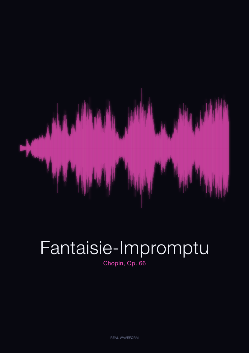
Every recording has a fingerprint. Our print of Chopin's Fantaisie-Impromptu, Op. 66, has a silhouette that no one could invent from a description of the piece. The opening is dense — the right hand's four-against-three figuration produces a nearly continuous band of amplitude, thick and uninterrupted, that looks on the page like a solid ribbon. Then the middle section drops. The famous D-flat major melody sits lower on the page than a designer would expect, because it is played softer, and its amplitude line is a series of lyrical humps rather than a wall of sound. Then the return of the opening figuration and, eventually, the recording's tapered end.
You cannot draw that shape from imagination. You have to render it from the audio. And once you have rendered it, the shape belongs to that specific recording — a different pianist, a different microphone, a different hall, and the silhouette changes. This is the physical claim behind sound wave art in its literal sense: a print is a document of a performance, not a picture of a piece.
Even a spoken word has this property. Our render of a single word — "Bonjour", generated locally as an original signal — has a shape that is unmistakably that word. The two syllables have different amplitudes; the soft consonant at the start is a low mark; the vowel that follows is a peak. "Ciao" has its own shape, shorter, with the plosive attack of the C and the trailing vowel. Two words, two waveforms, no confusion. That is what a real amplitude waveform does. A decorative line cannot do it.
 Fantaisie-Impromptu
The print from this article · from €29.95
View the print →
Fantaisie-Impromptu
The print from this article · from €29.95
View the print →
Finding #4: A Music Room Is the One Room Where the Shape Has to Be Honest
You can put a decorative wave on a bathroom wall. It will hold. In a kitchen, in a hallway, in a rental where the art rotates with the season, a stylised curve is a fine object and no one loses anything by not asking harder questions of it.
A music room is different. In a music room, people who care about sound will stand in front of the print and look. They will notice, over time, that the peaks are too tidy. They will notice that the silhouette bears no relation to any piece they know. They will notice that the print promises a Nocturne and shows a shape that could equally be a pop chorus or a wave in a stock illustration. The room punishes the dishonest object.
The inverse is also true. In a music room, a real waveform of a piece the room actually plays becomes a second listening. Someone stands in front of the print of Chopin's Ballade No. 1 and locates the coda — the loudest section, the tall peaks, the place in the recording where the dynamic range opens up. They trace the quiet middle. They read the shape the way a musician reads a score, and the print rewards the attention. This is the argument for putting a real waveform in the one room where the argument gets tested. It has to be the recording, because the room will notice.
Comparison
| Question | Decorative wave art | "Inspired by your song" print | Real amplitude waveform |
|---|---|---|---|
| Source named? | No | Sometimes | Always |
| Peaks asymmetric? | No | Rarely | Yes |
| Recording identifiable from shape? | No | No | Yes |
| Ending tapers to silence? | No | No | Yes |
| Belongs in a music room? | Decoratively | Sentimentally | Documentarily |
What This Does NOT Prove
This audit does not prove that decorative wave art is worthless. It has a legitimate place in the wider poster market, and buyers who want a wave-shaped design above a lyric are being served exactly what they came for. Our claim is narrower: the object being sold is a drawing, and calling it sound wave art in the physical sense is a category error the market has quietly normalised.
It also does not prove that every "personalised" seller is misrepresenting. Some render from the actual audio and say so in plain language. We did not attempt an exhaustive census; we described the pattern that dominates the visible surface of the category. And we cannot verify what any individual seller does behind the scenes without buying every print and comparing it, sample by sample, against the source file — which is a study we did not run.
The Takeaway
If the room is a music room, the shape on the wall has to be the recording. Anything else is a decoration that will not survive close listening.
FAQ
How can I tell if a sound wave art print is from the real recording?
Look at three things. First, the seller's language — "generated from the audio" is a physical claim; "inspired by your song" is a design claim. Second, the shape itself — a real waveform is asymmetric, with peaks of different heights on the top and bottom halves. Third, the ending — a real recording tapers to silence, so the last portion of the waveform should be visibly quieter than the middle. If all three fail, you are looking at a drawing.
Does the specific recording matter, or is any performance of the piece the same?
Every recording has its own silhouette. A different pianist, a different tempo, a different microphone placement, and the waveform changes. That is why we name our sources — our Ballade No. 1 print is the public-domain recording from the Musopen Chopin collection on archive.org, not a generic idea of the piece. Two performances of the same nocturne can produce visibly different shapes, and for a music room that specificity is the point.
Why do the decorative canvases look so symmetric compared to real waveforms?
Because they were drawn in vector software by a designer, not rendered from an audio file. A designer working on a poster naturally reaches for balance — mirrored peaks, even spacing, a clean baseline. A real recording has none of that. Music is asymmetric by nature: attacks are sharper than decays, loud passages are surrounded by quieter ones, and endings trail off. The tidy symmetry of a decorative wave is the visible signature that no audio was involved.
Can spoken words be rendered as sound wave art too?
Yes, and they carry the same physical honesty as music. A single word has a shape: the consonants sit at one amplitude, the vowels at another, and the whole silhouette is unmistakably that word once you know how to read it. Our own local renders of "Bonjour" and "Ciao" show this clearly — two short signals, two distinct fingerprints. A spoken phrase, a vow, a child's name recorded once and rendered once is a legitimate use of the format.
Is there a piece that works particularly well for a music room wall?
Pieces with wide dynamic range render into the most visually rewarding waveforms because the shape has somewhere to go — quiet valleys, mountainous peaks, tapered endings. Chopin's Ballade No. 1, Op. 23, is a strong example: long lyrical sections that sit low on the page, a coda that rises into tall dense peaks. Fantaisie-Impromptu, Op. 66, offers the opposite pleasure — a dense outer figuration wrapped around a quieter, lyrical middle. Both are in the studio's rendered catalogue at /shop/.
What is the difference between a waveform and a spectrogram?
A waveform plots amplitude over time — how loud the recording is at each moment, drawn as a line that rises and falls. A spectrogram plots frequency over time — which pitches are sounding at each moment, drawn as a heatmap. Both are honest visualisations of a recording, but they answer different questions. Sound wave art in the ordinary sense refers to the waveform: the silhouette of loudness, the shape a speaker cone would trace if you slowed it down enough to see.
From the collection



New pieces and 10% off your first print.
One email now with your code. No noise after.