We have read a great many articles on what a waveform is and what amplitude means, in the course of rendering real recordings — Chopin's Ballade No. 1, the Fantaisie-Impromptu, a single spoken "Bonjour", a single spoken "Ciao" — into prints you can hang on a wall. Almost all of those articles are technically correct and quietly misleading. They reach for the tuning fork, the sine wave, the schoolbook diagram of a clean up-and-down curve, and then they stop. They never get to the thing on the page. They never explain why a nocturne looks mostly like a whisper of ink and a piece of speech looks like a small, dense city.
We keep going back to those pieces because they explain the vocabulary and then abandon the reader at the door of the thing the vocabulary is for. So this is our attempt at the article we wanted to find, three years ago, when a client first asked us what, precisely, they were about to have framed and put above their piano.
What They All Get Wrong
The shared error runs on a single move: reach for the sine wave, draw it, walk away. You have seen the picture — the smooth curve that goes up, comes down, crosses zero, goes down, comes up again, endlessly, at perfectly even intervals. It is presented as if it were the shape of sound. It is the shape of one specific sound: a pure tone at a single frequency, sustained forever, with no attack and no decay. It is the shape of a tuning fork in a laboratory, not the shape of any music anyone has ever wanted to hear.
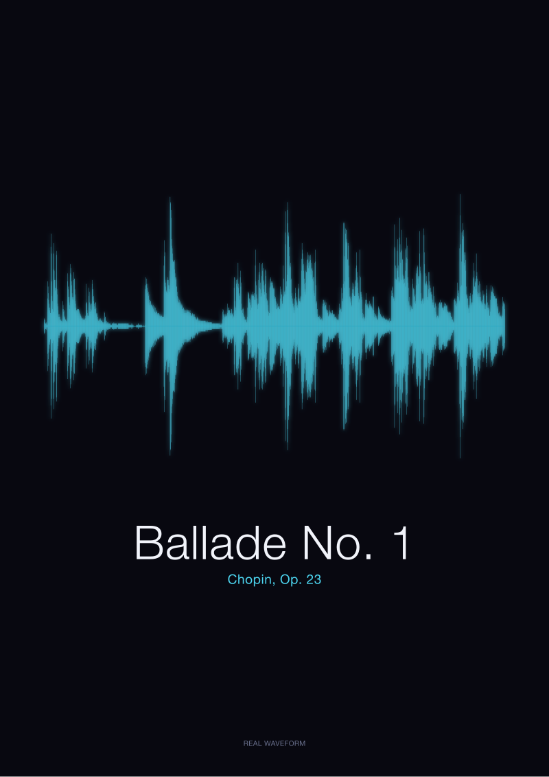
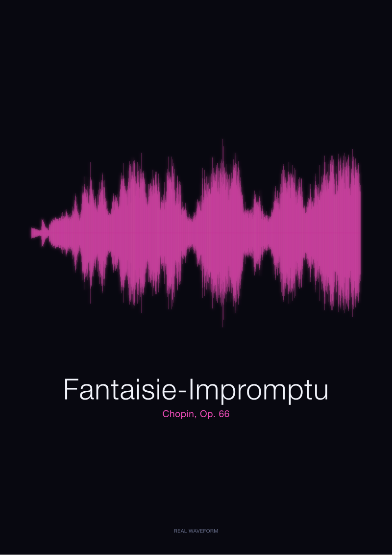
Real music does not look like that. A recording of Chopin's Ballade No. 1 does not look like a sine wave, does not look like a stack of sine waves, does not resemble any of the diagrams commonly used to introduce the concept. It looks like a range of mountains drawn by someone with a very fine pen and a very unsteady hand — long stretches of low, jagged ink where the piano is thinking; sudden vertical spikes where the left hand comes in on a chord; a plateau in the middle that seems, at first glance, to have no internal structure at all until you look closely and see that every millimetre of the plateau is a different height. The Fantaisie-Impromptu looks different again, faster, denser, more evenly weighted top to bottom. A single spoken word — "Bonjour", "Ciao" — looks different from either: a short, self-contained silhouette, a compact skyline of a syllable or two.
The articles never get here. They present the sine wave as the archetype, then treat every real sound as a "complex version" of the sine wave, which is true in the mathematical sense and useless in the visual sense. It is like teaching someone to recognise a face by starting with a circle and telling them a face is a "complex circle". The reader is left thinking a waveform is a decorative squiggle that vaguely represents sound, rather than what it actually is: a precise, second-by-second measurement of the air in front of the microphone. The gap between the diagram and the drawing is the gap between the definition of music and a piece of music. Most explanations never close it.
What Is Almost Always Missing
Three things are missing from nearly every waveform explainer, and their absence is what leaves the reader with a picture that will not survive contact with a real recording.
The first is time. A waveform has two axes: the vertical one is amplitude, and everyone talks about it; the horizontal one is time, and almost no one talks about what happens to it when a nine-minute piano piece is drawn across a single sheet of paper. The Ballade No. 1 runs roughly nine minutes end to end. Rendered at print width, every centimetre of the drawing is somewhere around half a minute of music. This is why a nocturne looks "quiet" and a piece of speech looks "dense": they are drawn at radically different time compressions, and no explainer we have seen tells the reader that the horizontal scale is a choice, not a property of the sound. Change the compression and the same sound produces a different-looking drawing.
The second is the distinction between amplitude and loudness. Articles use the words interchangeably. They are not the same. Amplitude is a physical measurement — how far the air pressure at the microphone deviates from rest, in either direction, at each moment in time. Loudness is a perceptual response — how loud the sound seems to a listener, which depends on frequency, duration, context, and the ear's own non-linearity. A soft passage in the Fantaisie-Impromptu can have brief amplitude spikes taller than a sustained passage that sounds twice as loud. The waveform does not care what your ear does. It records the air. Explainers routinely conflate the two and leave the reader believing that the tallest peak in the drawing is the loudest moment in the piece. Often it is not.
The third is that every waveform is the waveform of a specific recording of a specific performance. There is no such thing as the waveform of Ballade No. 1. There is only the waveform of this take, this pianist, this hall, this microphone position, this day. Change any of those, and the drawing changes. The explainers speak of "the waveform of a song" as if it were an inherent property of the composition, like its key signature. It is not. It is a portrait of one moment of one person playing.
 Ballade No. 1
The print from this article · from €29.95
View the print →
Ballade No. 1
The print from this article · from €29.95
View the print →
What I Would Say Instead
A waveform is a drawing of air, over time. That is the whole thing.
When a piano string is struck, the hammer displaces the air near it, which displaces the air next to it, and so on outward until a small pressure wave reaches the diaphragm of a microphone and pushes it, very slightly, forward. Then the string swings back and the air behind it thins, and the microphone diaphragm is pulled, very slightly, backward. This happens many thousands of times per second. The recording device measures the diaphragm's position at each instant — typically forty-four thousand one hundred times per second for a standard audio file — and stores a number. The waveform is a plot of those numbers. The horizontal axis is time. The vertical axis is how far the diaphragm was displaced from rest at that instant, in either direction. Zero, in the middle, is silence: air at rest, microphone at rest, nothing happening. A tall peak, above or below the line, is a moment when the air was pushing or pulling the microphone unusually hard.
That is amplitude. Not loudness, not volume, not intensity in any perceptual sense — just displacement. How far from still.
Once you have this in your head, the drawings start to speak. The public-domain recording of Chopin's Ballade No. 1 we work from — Op. 23, from the Musopen collection on archive.org — looks the way it looks because Chopin wrote a piece that spends most of its time in the lower register of dynamics and then, in a handful of places, does not. The vast quiet middle of the drawing is not empty; every one of those small marks is a real note, a real touch of a real key. The tall spikes near the end are where the piece cracks open. The shape is honest. It is not a stylisation. It is what the air did in the room where that recording was made, transcribed at the resolution the microphone could see.
A spoken word looks entirely different from a played piece not because it is louder or quieter — often it is neither — but because a syllable is a very short event with a fast attack, a brief swell, and a quick decay. "Bonjour", generated locally and recorded, has the compact skyline of a breath in, a plosive edge on the "b", a swell through the vowel, a fade. "Ciao" is shorter still. Beside a Chopin Ballade, they look like a single street next to a mountain range, because they are.
We render these things — the Ballade No. 1, the Fantaisie-Impromptu, the spoken "Bonjour" and "Ciao" — into prints at our shop, and the entire practice depends on the reader understanding that what they are looking at is not decoration but measurement. A drawing of air, at the moment a piece of music was played. This piece does not address the physics of how the ear translates air pressure into the sensation of loudness — that is a separate argument about biology, not about sound. It does not address the mathematics of Fourier decomposition, which is how frequency content is extracted from a waveform but not what a waveform is. And it does not address stereo — every drawing here is mono, a single channel, and what happens when you add a second microphone is a different piece entirely.
FAQ
Is a waveform the same thing as a sound wave?
Not quite. A sound wave is what happens in the air — a moving pattern of pressure changes travelling outward from a source. A waveform is a drawing of what a single point in that pattern looked like over time, as measured by one microphone. The sound wave exists in three dimensions and moves; the waveform is a two-dimensional record of one place in it, frozen and plotted. Two microphones in the same room produce two different waveforms of the same sound wave.
Why does louder music not always have a taller waveform?
Because "loud" is what your ear does and "tall" is what the air did. Amplitude measures air-pressure displacement at the microphone. Loudness perception depends on frequency, duration, and psychoacoustic effects — a short spike at 8 kHz can be taller in the drawing than a sustained low note that sounds twice as loud to you. Modern recordings are also often compressed in mastering, which pulls the tallest peaks down while raising the average, producing drawings that look denser than they sound.
What does the horizontal axis represent?
Time. The waveform reads left to right, and every point along the horizontal line corresponds to a specific instant in the recording. How much time each centimetre represents depends on how the drawing is scaled — a nine-minute piece rendered at print width compresses time far more than a two-second spoken word rendered at the same width. This is a choice made by whoever draws it, not a property of the sound itself.
What is the zero line in the middle?
It is silence. More precisely, it is air at rest and microphone diaphragm at rest — no pressure difference from the ambient baseline. Every point above the line is a moment when the air was pushing the diaphragm forward; every point below is a moment when the air was pulling it back. A recording of a perfectly quiet room would be a nearly flat line at zero, with only the faint fuzz of the microphone's own electronic noise.
Why does a Chopin Ballade waveform look so different from a spoken word?
Because the two sounds have very different structures in time. A piano piece unfolds over minutes, weaving quiet and loud passages, and when compressed to fit a print it becomes a long, largely low-amplitude landscape with occasional tall features. A spoken word is a short event with a fast attack, a vowel swell, and a quick fade — drawn at the same scale it becomes a compact, dense silhouette. The difference is architectural, not merely a matter of "loud versus quiet".
Does every recording of the same piece produce the same waveform?
No. Every recording is a portrait of one specific performance in one specific space through one specific microphone chain. Two pianists playing the same score will produce different amplitude patterns because their touch, timing, and dynamics differ. Even the same pianist playing the same piece twice in the same hall will produce two subtly different drawings. This is why a waveform print of a beloved recording is not interchangeable with any other version of that piece — it is that take, and no other.
What is amplitude measured in?
In raw form, amplitude is measured as the displacement value stored in each sample of the audio file — a number that represents how far the microphone diaphragm moved from rest at that instant. In practical work it is often described in decibels relative to full scale (dBFS), where zero is the loudest value the file can store and everything else is a negative number below it. But the drawn waveform itself is dimensionless: a shape whose height at every point is proportional to that instant's displacement, normalised to fit the frame.
 Fantaisie-Impromptu
The print from this article · from €29.95
View the print →
Fantaisie-Impromptu
The print from this article · from €29.95
View the print →
From the collection



New pieces and 10% off your first print.
One email now with your code. No noise after.