The conventional wisdom about waveform art is compelling, and it is repeated on every product page selling one: a song has a shape, that shape is unique, and printing it turns a recording into a visible object. Search the phrase "what a song looks like" and you will see the same image returned a hundred times — a symmetrical ribbon, mirrored top and bottom, tapering at the ends, thickening in the middle. It looks like music. It looks like proof. We render waveforms for a living, from real public-domain recordings — Chopin's Ballade No. 1, Op. 23, and the Fantaisie-Impromptu, Op. 66, among them — and we want to say clearly, before defending the format, where the popular version of it stops being true.
Why the Conventional Answer to "What Does a Song Look Like" Is Mostly Right
Start with the concession, because it is a large one. A recording does have a shape. Not metaphorically, not as marketing language, but as a physical fact. Sound is a pressure change in air over time. Digitally captured, that pressure becomes a long list of numbers — amplitude samples, tens of thousands per second — and any faithful graph of those numbers over time is a waveform. It is a drawing of the air the microphone caught. It is not decorative. It is a document.
Because the sample list is unique to that specific recording, the drawing is unique too. Two pianists playing the same Chopin nocturne produce two different pressure histories, and therefore two different silhouettes. Rubato pulls the shape sideways. A heavier attack sharpens the vertical spikes. A closed-lid piano produces a rounder envelope than an open-lid one. Even the room the recording was made in leaves a signature — reverberation lengthens the tail of every phrase, a fact you can see with your eye once you know to look for it. So the sentimental claim — this print is the shape of *your* recording, not anyone else's — is technically correct. It is one of the few pieces of gift-shop marketing that survives contact with a physics textbook.
The mirrored-ribbon aesthetic, too, has an honest lineage. Audio editors have drawn waveforms with symmetric positive and negative amplitude for forty years because the underlying signal is signed — pressure rises above and falls below atmospheric baseline. Mirroring is not a lie. It is one legitimate way to plot a bipolar signal. The gift-shop version inherited a convention from professional software, sanded it smooth, and hung it on a wall. So when a customer says "that is what my first-dance song looks like," they are, in the most reasonable reading, correct.
But everything after that sentence is where the format usually starts lying — and where most of what is sold as "waveform art" quietly stops being a drawing of sound at all.
Where the Pretty-Curve Version Breaks Down
We have inspected a lot of these prints. The failure mode is consistent, and it has three layers.
The first layer is that a great many "waveform art" prints on the market are not derived from audio at all. They are decorative curves — a stylised silhouette placed under the title of the song, then sold with copy that implies the shape came from the recording. There is no audio file behind the image. There cannot be, in some cases, because the seller was never given one; they were given a Spotify link and a delivery date. The shape you receive is a template. The song title is variable data.
The second layer is subtler and applies even to prints that were rendered from real audio. To make the shape "look like music" in the sanitised sense buyers expect, the file is aggressively downsampled and normalised. A three-minute recording contains roughly eight million samples at standard CD resolution. A print is perhaps two thousand pixels wide. Compression is unavoidable. The question is *how* you compress. The pretty version takes the loudest peak in each pixel-wide window, mirrors it, and throws away everything else. The result reads as a continuous, evenly-thick ribbon — because the reduction operation guarantees it will. You are not looking at a song; you are looking at the envelope of a song's loudest moments, symmetrised for wall appeal.
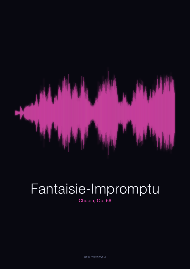
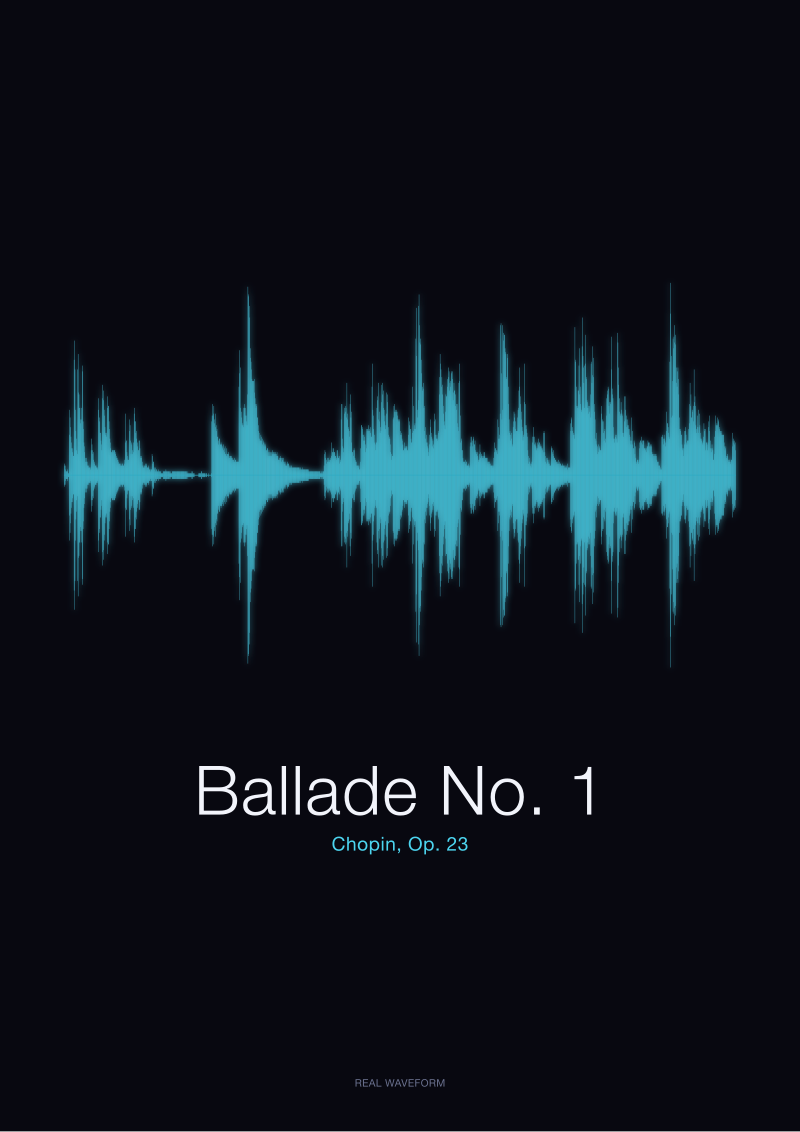
The third layer is the honest one, and it is where even a careful render still cannot do what buyers hope. Amplitude is not musicality. The opening of the Ballade No. 1 is quiet, hesitant, harmonically restless — and on a waveform it registers as a thin, almost invisible line. The coda, three-quarters of the way in, is loud and blunt and, by most listeners' account, the least interesting minute of the piece. On a waveform, the coda is a wall. The Fantaisie-Impromptu, Op. 66, in its rapid outer sections, plays sixteenth notes so densely that the pixel windows fill in completely; the shape becomes a fat, uninformative bar. The famous slow middle section — the one people actually hum — is the visually recessed part.
Now compare "Bonjour" and "Ciao," two spoken words we generated locally through macOS speech synthesis. On a waveform they look nearly interchangeable: two short bursts, similar envelope, similar decay. The shape does not tell you what language you are looking at, let alone what the word means. If a two-syllable greeting fools the format, so does a lot of music.
 Fantaisie-Impromptu
The print from this article · from €29.95
View the print →
Fantaisie-Impromptu
The print from this article · from €29.95
View the print →
The Rule We Use in the Studio Instead
Our rule is unglamorous, and it is why we do not produce the ribbon-symmetric version of a print unless a customer specifically requests one. We render at the highest resolution the paper can carry, from the actual audio file, without mirroring and without normalising the quiet passages up to match the loud ones. If the opening of the Ballade is a thread, we let it be a thread. If the coda is a wall, we let it be a wall. The shape you take home is, as far as we can make it, the shape of the pressure history of that recording, plotted honestly against time. It is less flattering than the template. It is more useful as a document.
Three practices come out of that rule. First, we work from a specific, identified recording — the Musopen public-domain Chopin collection, in our case, released CC0 and traceable back to a single performer and take. "Chopin's Fantaisie-Impromptu" is not a shape; a *particular recording* of it is. We name the take in the caption because the same piece performed by two different pianists produces two visibly different silhouettes, and the buyer should know which one they own.
Second, we choose the reduction operation carefully. Peak-picking on a large scale is the fastest way to make a print look like every other print. Root-mean-square reduction preserves relative dynamics better and lets the quiet parts stay quiet on the page. That single technical choice — peak vs. RMS — is most of the aesthetic difference between the honest render and the gift-shop render.
Third, we do not symmetrise unless the underlying signal genuinely is symmetric. Piano recordings tend to be nearly so; unmixed voice recordings often are not. Mirroring an asymmetric signal for tidiness is the point at which we would rather show the customer the raw asymmetry and explain it. This is the piece the studio's see the Fantaisie-Impromptu print is built on: real waveforms of the pieces we discuss, printed at a scale where dynamic range survives the paper.
When the Decorative Version Still Wins
Our rule is not universal, and we will say so plainly. Sometimes what a person wants on a wall is a gesture, not a document — a graceful curve labelled with a song title, meant to *remind* them of the recording rather than to be a faithful graph of it. That is a reasonable thing to want, and the template version delivers it more efficiently than an honest render does. For very short signals — a single spoken word, a doorbell, a wedding vow of ten seconds — even the truthful waveform will look, at print scale, like a decorative shape; the difference between honest and stylised nearly collapses. And for prints intended to be viewed from across a room rather than read up close, the subtleties that matter to us — the thread of the Ballade's opening, the honest asymmetry of a voice — read as noise at that distance, and the mirrored ribbon simply looks like music to more people, more of the time.
 Ballade No. 1
The print from this article · from €29.95
View the print →
Ballade No. 1
The print from this article · from €29.95
View the print →
From the collection



New pieces and 10% off your first print.
One email now with your code. No noise after.