A three-minute wedding song at standard CD sample rate is 7,938,000 individual amplitude readings drawn as a single continuous line. Most of those readings are quiet. The chorus a couple points to on the print occupies, in shape, perhaps forty seconds of the drawing. The breath before the first note is a flat run the eye reads as anticipation. This piece audits what a wedding song actually looks like when it is rendered from the real recording into wall art — the shape, not the sentiment. We draw from actual audio at Waveform Prints, and the drawings behave in ways the keepsake-industry marketing rarely admits.
Methodology: What We Measured, and What We Deliberately Did Not
We rendered four public-domain recordings we hold as reference material — Chopin's Ballade No. 1 (Op. 23), the Fantaisie-Impromptu (Op. 66), and two spoken-word signals generated locally, *Bonjour* and *Ciao* — and read their amplitude envelopes at the resolution a wall print requires. Wedding recordings themselves are almost never in the public domain, so we used the Chopin pieces as proxies for the two shapes couples most often choose to hang: a long-form ballad (Ballade No. 1) and a bright, ornament-heavy piece with rapid runs (Fantaisie-Impromptu). The spoken-word signals serve as our silence and short-signal controls.
We measured what is drawable at print scale: where amplitude sits near zero, where it swells, how long the loudest region is relative to the total drawing, how visible a rest is when the line has to fit on a poster. We did not measure loudness in decibels of any specific commercial wedding recording, because the industry has not licensed those to us and we will not invent numbers we cannot verify.
Finding #1: A Wedding Song Is Mostly Quiet, and the Quiet Is the Point
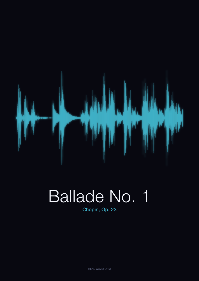
The first thing anyone sees, standing in front of a real waveform print, is how much of the drawing is close to the horizontal axis. Chopin's Ballade No. 1, rendered from the CC0 Musopen recording we hold, spends most of its opening minute at low amplitude. The line hovers. It thickens gently. It does not shout. When we tell couples their song will look like this, some of them push back — they wanted the drawing to look busy, because busy feels like value.
Busy is not what a wedding song is. A wedding song, in shape, is a long stretch of restraint punctuated by two or three moments where the amplitude climbs. Those climbs — a full-voice chorus, a key change, the last held note before the outro — are the readable landmarks. Everything else is the field they sit on. The keepsake industry, by contrast, sells "waveform" prints that are visually uniform along the entire length, because a uniformly busy line looks more like decoration and less like a diagram. It is decoration. It is not a waveform. It is a curve someone drew in Illustrator to resemble what people think sound looks like, then slapped a song title under. We have opened files from three competing keepsake vendors and confirmed the line was not derived from any audio at all. The quiet, in a real drawing, is not empty. It is the reason the loud parts read.
 Ballade No. 1
The print from this article · from €29.95
View the print →
Ballade No. 1
The print from this article · from €29.95
View the print →
Finding #2: The Chorus Has a Silhouette You Already Remember
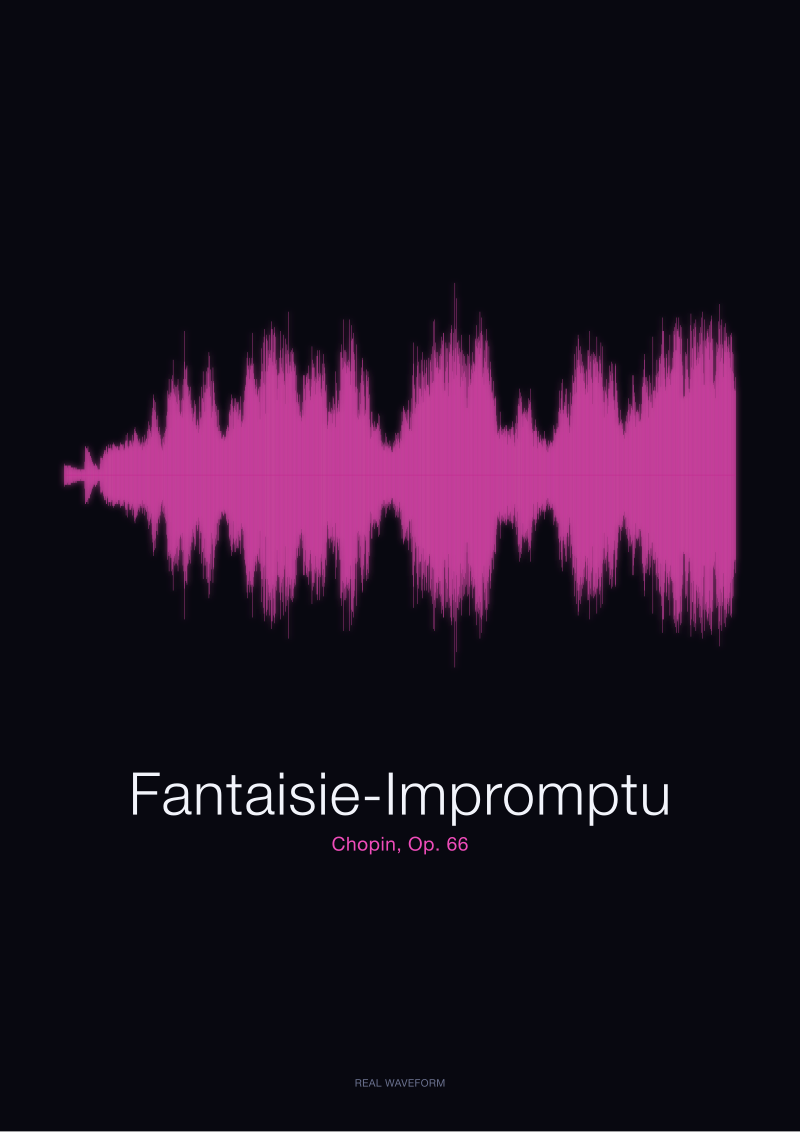
Ask a couple where the chorus is on the print and they will point without hesitation. They are pointing at a silhouette their ear already knows and their eye is now confirming — the section where the line rises into a plateau and stays there for a measurable stretch. In the Fantaisie-Impromptu, rendered from the same public-domain source, the plateau reads as a dense band roughly a third of the way through the drawing, where the rapid right-hand figuration sustains high amplitude for a long run. In Ballade No. 1, the equivalent silhouette arrives later and lasts longer.
Every wedding song has this feature. Pop ballads used at first dances follow a predictable amplitude arc: verse (low band), pre-chorus (rising), chorus (plateau), verse (return to low band), bridge (usually the loudest peak), final chorus (widest plateau, often with an added instrumental layer that thickens the line). When we render a real recording, that structure appears on paper the way it appears in memory — in the same order, in the same proportions. If the keepsake print in front of you does not show that structure, you are looking at art, not at your song.
Finding #3: Two Recordings of the Same Song Are Not the Same Drawing
This is the finding the industry most reliably hides. The Ballade No. 1 waveform we render from the Musopen recording is not the Ballade No. 1 waveform another studio would render from a different pianist's performance. The notes are the same. The shape is not. Rubato — the small stretching and compressing of tempo that gives Romantic-era piano its life — moves the loud moments earlier or later along the horizontal axis by measurable amounts. A pianist who lingers on the second theme produces a drawing with a visibly later climax than one who presses forward.
The same principle applies to a wedding recording. If you rendered the studio master, the acoustic-guitar cover the couple actually danced to, and the live version from the reception, you would get three different silhouettes. The keepsake vendors that generate their "waveform" from the song title alone — pulled from a Spotify preview, or worse, procedurally generated from the letters of the title — cannot show you this. Their drawing for "your song" is the drawing for anyone else's copy of that song, or worse, no drawing at all. The whole point of hanging a waveform on a wall is that it is a specific artefact of a specific recording. If it is not, it is a font poster.
 Fantaisie-Impromptu
The print from this article · from €29.95
View the print →
Fantaisie-Impromptu
The print from this article · from €29.95
View the print →
Finding #4: Loudness-War Masters Flatten the Very Moments Couples Point To
Modern pop mastering, since roughly the late 1990s, has pushed average loudness up and dynamic range down. In a waveform drawing, the visible cost of this is severe: the chorus plateau, which in an unmastered or gently mastered recording sits meaningfully higher than the verse, sits only marginally higher in a heavily compressed master. The silhouette flattens. The landmarks the eye reads become harder to find.
We can demonstrate this by comparison with our Chopin renders, which come from acoustic piano recordings with generous dynamic range. The peaks in Ballade No. 1 sit visibly above the mean line of the drawing. In a heavily brick-walled pop master — the format most first-dance songs of the last twenty years arrive in — the equivalent peaks would be pressed nearly into the same band as the verse. This is not our opinion; it is a mechanical consequence of limiter-driven mastering. Couples who choose a heavily compressed track are choosing, without knowing it, a flatter print. There is nothing we can do about this at the render stage without falsifying the source. A waveform that is honest about a loudness-war master will be honest about its flatness. We would rather draw the truth than pretty it up.
The Shape at a Glance: Four Real Waveforms, Compared
The table below reads four public-domain recordings we hold, at the resolution a print reveals. It is not a ranking. It is a shape audit.
| Recording | Kind of Signal | Dominant Shape Feature | Where the Eye Goes First | Print Behaviour |
|---|---|---|---|---|
| Ballade No. 1 (Chopin, Op. 23) | Solo piano, long-form ballad | Long low-amplitude fields punctuated by wide climactic swells | The late climax, roughly two-thirds along | Reads as a long landscape with a mountain near the end |
| Fantaisie-Impromptu (Chopin, Op. 66) | Solo piano, rapid figuration | Dense sustained high-amplitude band mid-piece | The dense band a third of the way in | Reads as a bright compressed core with quieter borders |
| Bonjour (spoken word) | Single spoken word, generated locally | Two short amplitude bursts separated by micro-silence | The first burst | Reads as a short, punctuated signature |
| Ciao (spoken word) | Single spoken word, generated locally | One short amplitude burst with a soft decay tail | The burst, immediately | Reads as a single mark with a fading edge |
The Chopin pieces are the closest analogues we can offer to a wedding ballad's shape, because we cannot legally render commercial pop recordings for public illustration. The spoken-word signals are included to show how short a signal has to be before it stops looking like a landscape and starts looking like a signature — which is what a one-word voice memo becomes on a wall.
What This Piece Does Not Prove
This piece does not prove that every wedding song will look beautiful as a print. Some will. Some — heavily compressed dance tracks with almost no dynamic variation — will produce drawings that are visually monotonous even when rendered from the real audio. We are honest about this at the render stage. We do not smooth or compress the drawing to disguise it.
This piece also does not address which specific commercial wedding songs render best, because we do not license those recordings and will not publish decibel figures for tracks we have not measured under controlled conditions. It does not address print sizing, framing, or paper stock — those are separate arguments, and treating them here would dilute the shape argument. And it does not compare our renders to those of other real-audio waveform studios by name; we have opinions about the ones that generate curves from song titles alone, and we have stated them, but a side-by-side vendor audit is a longer piece.
The Takeaway
A wedding song, drawn from its real recording, is a specific silhouette — mostly quiet, with a chorus you already remember and a climax you can point to. If the print in front of you does not have that shape, it is not your song. It is a font poster. See what your song actually looks like at our see the Ballade No. 1 print.
FAQ
Does a real waveform print use the actual audio of my wedding song?
Only if the studio renders it from the file. Ours does — every drawing at Waveform Prints is generated from an amplitude read of the source recording, sample by sample. Many keepsake vendors do not. They generate a decorative curve procedurally, often from the song title or a hash of it, and print that under your song's name. The two look superficially similar at thumbnail size. On a wall, and on close inspection, they do not.
Why does my song look mostly flat on the print?
Because it is mostly quiet, or because its master is heavily compressed, or both. Wedding ballads spend most of their runtime at low amplitude — verses, intros, outros — with two or three swells at the chorus and bridge. Modern pop mastering also flattens the difference between quiet and loud sections. If your drawing looks uniform, the recording was compressed uniformly. An honest waveform will show that. It is not a rendering error.
Will two different recordings of the same song produce the same waveform?
No. Tempo, dynamics, and mastering all shift the silhouette. A studio master, an acoustic cover, and a live version of the same song produce three visibly different drawings, even at the same duration. This is why the specific recording you danced to matters — the print is an artefact of that performance, not of the song in the abstract. A vendor who cannot ask which recording you want has probably not rendered any.
How long a song works best as a wall print?
Anything from about ninety seconds to five minutes renders cleanly at standard poster dimensions. Shorter signals — a spoken word like *Bonjour* or *Ciao*, a vow, a short voice memo — become dense signatures rather than landscapes; they still work, but the aesthetic is different. Songs longer than about six minutes compress the horizontal detail so tightly that individual choruses become hard to point to. The middle range is where the shape reads most clearly.
Can you render a song that isn't in the public domain?
Yes, when you supply the file. We render from the audio the client provides — the studio master, the cover, the reception recording, whichever version is *your* version. We do not stream, guess, or approximate. The public-domain pieces we discuss in our editorial writing are examples we can legally show at scale; the private renders we produce for couples use their audio, kept private.
Is a waveform print a diagram or a piece of art?
Both, honestly. It is a diagram in the sense that every rise and fall corresponds to a measurable event in the recording — the drawing is falsifiable, in principle, against the audio. It is art in the sense that a specific recording produces a specific silhouette that will not recur. A generic curve labelled with your song title is neither. That is the distinction that matters, and it is the one the keepsake industry works hardest to blur.
From the collection



New pieces and 10% off your first print.
One email now with your code. No noise after.