We pulled two prints off the drying rack this morning and laid them next to each other on the studio table. On the left: the Minute Waltz, Op. 64 No. 1, rendered from the public-domain Musopen recording — a thin, quick ribbon of a shape, over almost as soon as your eye starts reading it. On the right: the Heroic Polonaise, Op. 53, from the same CC0 Chopin collection — a longer form with visible shoulders, dense passages, and a silhouette that fills its frame. Same composer. Same source archive. Two entirely different drawings of air. This is a note on how to choose between them.
The Two Waveforms, Side by Side, Before Any Interpretation
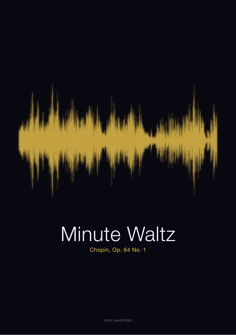
Before we say anything about mood, gift context, or wall behaviour, look at the two shapes as shapes. The Minute Waltz occupies a short horizontal stretch. Its amplitude sits in a narrow band for most of its duration — a fast, oscillating ribbon that trembles up and down without ever throwing an arm out of the frame. There is almost no white space inside it. The activity is continuous. The eye reads it left-to-right in one breath and reaches the end before it has settled into the drawing.
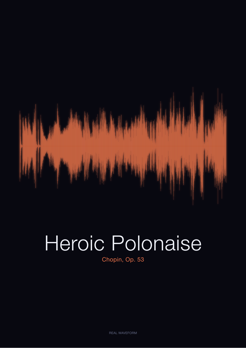
The Heroic Polonaise, from the same public-domain Musopen Chopin collection at archive.org/details/musopen-chopin, is a different animal on paper. Its horizontal footprint is several times longer. Its vertical amplitude is not uniform: there are passages where the waveform swells to the edges of the frame and passages where it retreats to a whisper. Silences appear as measurable white space between phrases. The drawing has a rhythm of density and thinness that the eye reads as chapters rather than a single sentence.
Neither of these is an artistic choice on our part. We do not sculpt the shape or tidy it. Both prints are rendered from the actual audio of a CC0 1.0 (Public Domain) recording — real amplitude data plotted honestly. What you are looking at when you compare the two is not two illustrations of two pieces. You are looking at the two pieces themselves, drawn by their own air pressure. Every choice below flows from that fact.
What the Minute Waltz Actually Looks Like on Paper
The Minute Waltz — misnamed, as most listeners know, because it does not last one minute and Chopin never intended it to — is a piece built almost entirely from motion. On the paper, that reads as an unbroken texture. The amplitude ribbon oscillates rapidly and never asks the eye to pause. There is no dramatic drop into silence, no vast swelling passage that dwarfs the rest. It is a piece whose signature, visually, is consistency.
That consistency is the drawing's charm. Held at arm's length, the Minute Waltz waveform reads as a single confident gesture — a stroke drawn in one movement, without a lifted hand. It looks the way a fast, small piece of music sounds: light on its feet, energetic, unwilling to sit down. There is a physical intimacy to it. The whole thing fits in the eye at once. You do not scan it in sections; you take it in the way you take in a signature.
This is a shape that does specific things on a wall. It sits well at a smaller print size — the compression of the horizontal makes the oscillation denser and more jewel-like. It reads well above a desk, in a hallway, on a narrow strip of wall between two doorframes. It does not demand a long approach or a step-back moment. It is a piece of visual music that lives at close range, the way the recording itself lives at close range in the ear.
If someone in your life loves this piece for its sparkle, its wit, its refusal to be heavy — that is exactly the print's behaviour on paper. There is no melancholy in the silhouette. There is no drama waiting in a corner. The shape is what the piece is: quick, glittering, done before you were ready.
 Heroic Polonaise
The print from this article · from €29.95
View the print →
Heroic Polonaise
The print from this article · from €29.95
View the print →
What the Heroic Polonaise Actually Looks Like on Paper
The Heroic Polonaise, Op. 53, is a different proposition entirely. On paper it takes up more room, and the room it takes is not filled uniformly. The waveform has what we tend to call, in the studio, shoulders — moments where the amplitude climbs abruptly, holds a broad plateau, then falls back. These are the passages every listener knows: the great striding chords, the passages where Chopin turns the piano into something closer to an orchestra. In the drawing, they read as dense, dark bands that push to the top and bottom of the frame.
Between those shoulders, the waveform thins. There are lyrical passages where the amplitude relaxes to a slender central line, and true rests where the drawing almost pauses. This is the piece's structural signature made visible: contrast. Loud against soft. Dense against sparse. Weight against air. If the Minute Waltz is a single confident gesture, the Heroic Polonaise is a paragraph with argument in it — a shape you read across, section by section, rather than absorb at a glance.
That behaviour scales the print differently. The Heroic Polonaise wants a longer horizontal format and a larger overall footprint. It rewards being viewed at a step's distance, where the eye can move along the shoulders and register the returning motif. Above a fireplace, along a hallway that invites walking, over a piano — these are the placements where the drawing behaves as it was drawn to behave.
The other thing worth naming: this waveform carries seriousness. Not solemnity, exactly, but weight. The shape declares itself. If the recipient is someone whose relationship with the piece is about pride, endurance, a certain kind of standing-up-straight quality that the polonaise has always carried in Polish musical memory, the print holds that meaning without needing a caption. The silhouette does the work.
The Room, the Recipient, the Wall: Matching Shape to Life
The question we get asked most often is not "which piece is better" — no serious listener asks that — but "which shape belongs where." Here is how we think about it in the studio when a customer describes a room or a recipient and asks us to help.
Consider the wall first. A short, self-contained wall — the space above a nightstand, between two windows, over a small writing desk — belongs to the Minute Waltz. The drawing is compact enough to feel resolved at that scale. The dense oscillation reads well from close range, which is exactly the range at which most people encounter those walls. Try to hang the Heroic Polonaise there and its length either forces a shrunken print (which loses the shoulders) or a horizontal squeeze that flattens the contrast. The shape does not want that room.
A long wall, a room with a natural walking axis, a fireplace mantel, a space above a piano — these want the Heroic Polonaise. Its horizontal is architectural. Its light-and-dark rhythm creates its own tempo across the wall. Someone crossing the room reads it left-to-right the way they would read a phrase of music, and the contrast between the shoulder passages and the lyrical stretches gives the eye somewhere to travel.
Now the recipient. Consider what the person's relationship to the piece actually is. If they love the Minute Waltz because it makes them smile — because it is the piece their grandmother played on Sunday afternoons, because it is the encore that always closed the recital, because it is what they hum when they are happy — the ribbon shape carries that. It is not a monument. It is a small, precise pleasure made visible. That is the correct emotional register for a gift built around delight.
If the piece in question is the Heroic Polonaise, the relationship is almost never casual. People choose this piece because it means something structural to them — a piece they played themselves and never forgot, a piece attached to a national or personal identity, a piece that got them through something. The drawing's weight matches that weight. Handing someone a slender, glancing shape of the Heroic Polonaise would misread what the piece is to them. Handing them the full silhouette, with its shoulders and its silences intact, honours it.
And a practical note about performance: because both prints are rendered from real recordings of real performances, small interpretive choices by the pianist — a slightly slower tempo, a longer held chord, a breath before the recapitulation — leave their fingerprints in the waveform. No two renderings of the Heroic Polonaise would produce identical drawings. What you are receiving, in either case, is a specific performance's silhouette, not a generic diagram of the piece. That specificity is part of the gift.
 Minute Waltz
The print from this article · from €29.95
View the print →
Minute Waltz
The print from this article · from €29.95
View the print →
If You Only Remember One Thing
The Minute Waltz gives you delight in a small, complete shape. The Heroic Polonaise gives you weight in a long, architectural one. If you cannot decide, decide about the wall and the person first — the drawings will resolve the choice for you almost immediately.
And if you love both pieces and the wall permits: they hang beautifully as a pair, because they were never in competition. One is Chopin in his lightest hand, the other Chopin at his most commanding. The two shapes side by side on a wall tell the truth about a composer who could do both without breaking stride.
FAQ
Are both prints made from the same recording archive?
Yes. Both the Minute Waltz (Op. 64 No. 1) and the Heroic Polonaise (Op. 53) in our catalogue are rendered from the public-domain Musopen Chopin collection at archive.org/details/musopen-chopin, released under CC0 1.0. We use the actual audio waveform of the recording — the amplitude data plotted honestly — not a decorative curve drawn to look like music. That shared source is what makes the two prints genuinely comparable as shapes on paper.
Which of the two prints suits a smaller wall better?
The Minute Waltz. Its waveform is a short, dense, uniformly active ribbon, and it holds its character at a compact print size — the oscillation stays legible and jewel-like when compressed. The Heroic Polonaise, by contrast, needs horizontal room for its shoulders and silences to breathe; shrunk down, the contrast between its loud and quiet passages flattens out and the shape loses much of what makes it the shape it is.
Do the two waveforms actually look different, or is that a marketing claim?
They look genuinely different, and the difference is not stylised. The Minute Waltz is a fast, continuous oscillation with little variation in amplitude across its short duration. The Heroic Polonaise has distinct passages of dense high-amplitude activity — the shoulders — separated by lyrical stretches and true rests that appear as measurable white space. Placed side by side on the studio table, they read as two entirely different silhouettes drawn by two different kinds of playing.
Which one is the better gift for a serious pianist?
Neither, universally — it depends on what the recipient plays and cares about. A pianist who returns often to the Heroic Polonaise as a piece of personal or cultural weight will read the print's architecture as recognition. A pianist whose relationship with the Minute Waltz is about lightness, encore-repertoire delight, or a specific memory of the piece will read the ribbon shape the same way. The correct gift is the one that matches the recipient's actual relationship to the music.
Can the same piece produce two different waveforms depending on the performance?
Yes, and that is part of what makes waveform prints specific. Every recording is a particular performance: a particular tempo, particular rubato, particular held chords, particular silences. Those choices leave visible traces in the amplitude data. Two Heroic Polonaise recordings by two pianists would produce two related but non-identical silhouettes. The prints in our catalogue come from the specific CC0 Musopen recordings, so what you are receiving is that performance's shape, not a generic diagram.
Do you sell the two prints as a pair?
Yes — and they hang particularly well together because the shapes are complementary rather than competing. The Minute Waltz gives the pair its lightness and compact energy; the Heroic Polonaise gives it length, contrast, and weight. Together they represent something true about Chopin: the same hand behind both the glittering short piece and the striding, architectural one. You can find both listings alongside the rest of the Chopin waveform catalogue at /shop/.
Is the silence in the Heroic Polonaise really visible on the print?
Yes. Where the recording has a rest — a moment where the pianist lifts and the room is quiet — the amplitude collapses to a near-flat line. On the printed shape, that reads as white space between denser passages. It is one of the reasons the Heroic Polonaise drawing has the rhythm it does: the piece is not uniformly loud, and the print refuses to pretend it is. The Minute Waltz, by contrast, has very little of that white space because the piece itself barely stops moving.
Which print reads better from across a room?
The Heroic Polonaise. Its shoulders and silences create high-contrast silhouette information that the eye picks up from several steps away — the shape has an unmistakable outline. The Minute Waltz reads best from close range, where the density of its oscillation becomes visible detail; from across a room it can look like a single quiet line. Match viewing distance to shape, and each print does what it was drawn to do.
From the collection



New pieces and 10% off your first print.
One email now with your code. No noise after.