Every few months someone asks us to render the world's national anthems side by side, stacked like a chart of skylines, so a reader can point and say *that* one is loudest, *that* one is proudest, *that* one is saddest. It is a beautiful idea and a broken one. A waveform is a drawing of air pressure over time — nothing more generous than that. It does not know which country it belongs to, which orchestra played it, which room it was recorded in, or whether the crowd stood. Before we get to what such a comparison could honestly show, we owe you the reason we keep turning the commission down.
The Comparison Everyone Wants to Make Is the Wrong One
The image is seductive. Fifty-three anthems, or a hundred and ninety-three, stacked in a grid like a Muybridge motion study, and somewhere in the middle you would find a pattern that told you something about how nations sound when they sing about themselves. A tall spiky one for the country that goes to war a lot. A soft undulating one for the country that keeps forgetting the words. A perfectly symmetrical one for the country that spent a century polishing its self-image. The premise practically hums with promise.
We know why the ask keeps coming. Waveforms look, at a glance, like data. They have shape, they have measurable height, they run left to right, they occupy the visual grammar of a chart. So the eye assumes they can be read like one. Point at the tallest peak, win the argument. Compare two silhouettes, declare a winner. It is the same intuition that makes people believe a heart-rate graph tells you something about love.
It doesn't work. Not because we're being fussy, but because a waveform of an anthem is a drawing of a specific recording of that anthem, made in a specific room, by a specific ensemble, at a specific dynamic level chosen by a specific conductor, captured through specific microphones and normalised — or not — by a specific engineer. Change any of those and you change the silhouette. Not the piece. The silhouette.
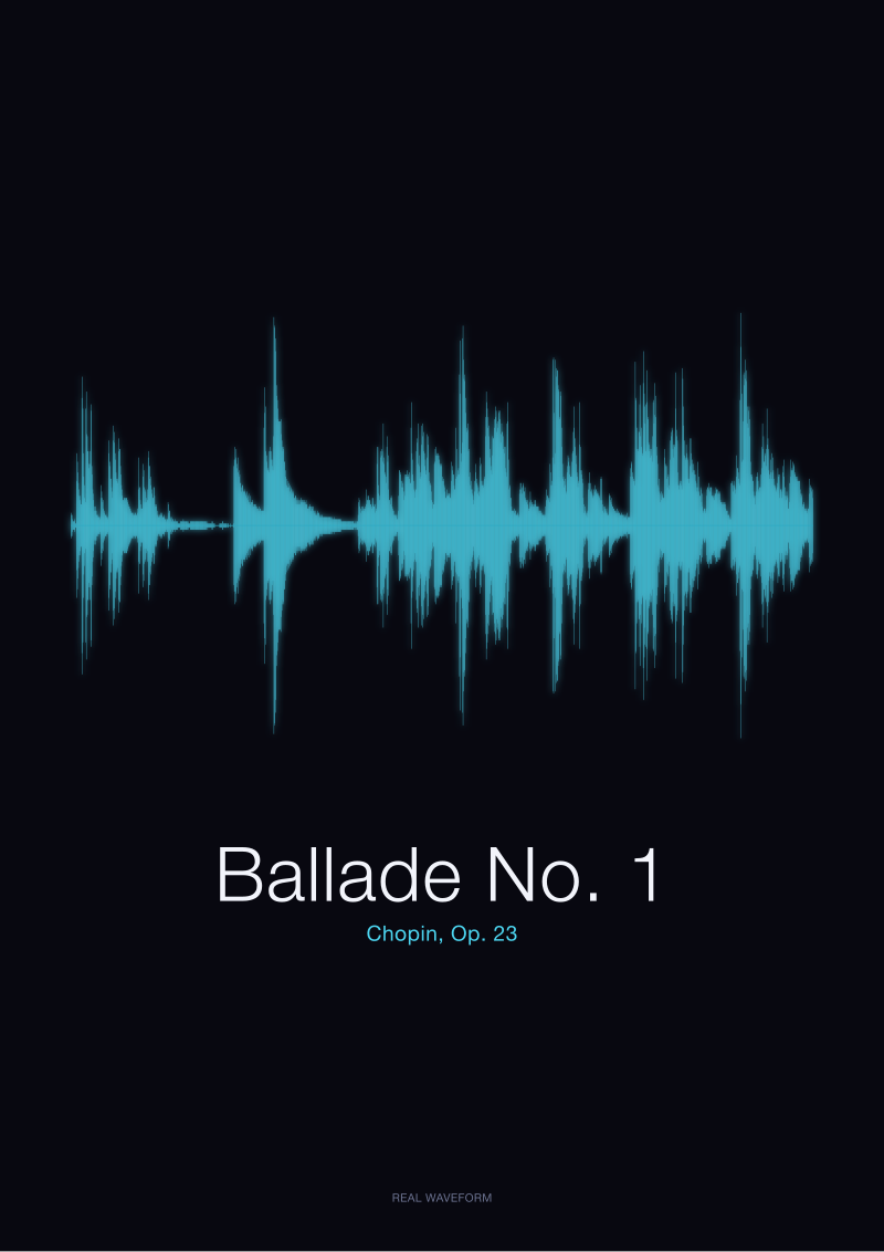
Take a concrete case from our own archive. When we rendered Chopin's Ballade No. 1 from the public-domain Musopen recording, the shape that came out was long, uneven, with two conspicuously loud passages and a great deal of what looks like empty air. Someone glancing at it might conclude Chopin was a quiet composer prone to long pauses. That would be nonsense. What they would actually be reading is one pianist's decision, in one hall, on one day, to hold back for two-thirds of a nine-minute piece so that the eventual climax would land. Another recording of the same Ballade — different pianist, different room, different microphone distance — would produce a visibly different silhouette. Same notes on the page. Different drawing of the air.
Now scale that problem up by however many anthems you were going to put in the grid. You are no longer comparing anthems. You are comparing recording sessions.
There is a version of the request we are willing to talk about, and we'll get there. But the version most people want — the skylines-of-nations grid, definitive and comparable — is a lie we cannot in good conscience print, framed and hung and sold with a straight face.
What a Waveform Actually Draws, and What It Quietly Discards
Here is what a waveform is, plainly. A microphone measures the pressure of air against a membrane, thousands of times per second. Each measurement is a number. Plot those numbers on a horizontal axis called time, with a vertical axis called amplitude, and you have a waveform. Nothing more.
Read that back and notice what isn't in it. There is no pitch. A soprano at the top of her register and a tuba at the bottom of its can produce identical waveform amplitudes; the drawing does not distinguish. There is no timbre — no way to tell a violin from a synth pad, or from a car horn, if all three happen to be equally loud. There is no harmony, no chord voicing, no counterpoint, no key. There is no lyric. There is no tempo indication beyond the fact that events unfold over time; the waveform of a fast anthem and a slow one, if the loud moments happen to land in similar places, will look strangely alike.
What a waveform *does* draw is a silhouette of energy. Where the sound got louder, the line goes taller. Where the sound went quiet or silent, the line collapses toward a thin ribbon along the middle. That is it. That is the entire language. It is enough for some things — we have built a whole studio around what it is enough for — but it is not remotely enough to compare the character of two pieces of music.
An easy way to see this is to look at speech. In our archive we keep the waveforms of two spoken words: the French *Bonjour* and the Italian *Ciao*, both generated locally as original signals. They are recordings of, respectively, a two-syllable greeting and a one-syllable greeting. They have distinct silhouettes — of course they do; the mouth does different things. But if you handed those two shapes to someone who had never heard the words, they would not, from the drawings alone, be able to tell you which language was warmer, which culture more formal, which speaker more welcoming. The waveform records the pressure. It does not record the meaning.
Now try to transfer that failure to national anthems. The waveform of a stadium-scale performance at full volume will look enormous. The waveform of the same anthem played on a solo piano in a practice room will look small. Neither shape tells you anything true about the country. Both are true reports of specific air pressure in specific rooms on specific afternoons.
The waveform is honest. It just isn't answering the question the comparison is trying to ask.
There's a subtler point buried here that we think matters. People assume waveforms discard information *accidentally*, the way a low-resolution photograph discards detail. They don't. Waveforms discard information *categorically*. They were never carrying pitch or timbre or meaning in the first place. Asking a waveform to compare two anthems' character is like asking a shadow to compare two people's eye colour. The shadow isn't being coy. It doesn't have that data to give.
 Ballade No. 1
The print from this article · from €29.95
View the print →
Ballade No. 1
The print from this article · from €29.95
View the print →
The Honest Version of the Question, and Where It Leads Next
We think there is still something worth doing here, and we want to say what it is.
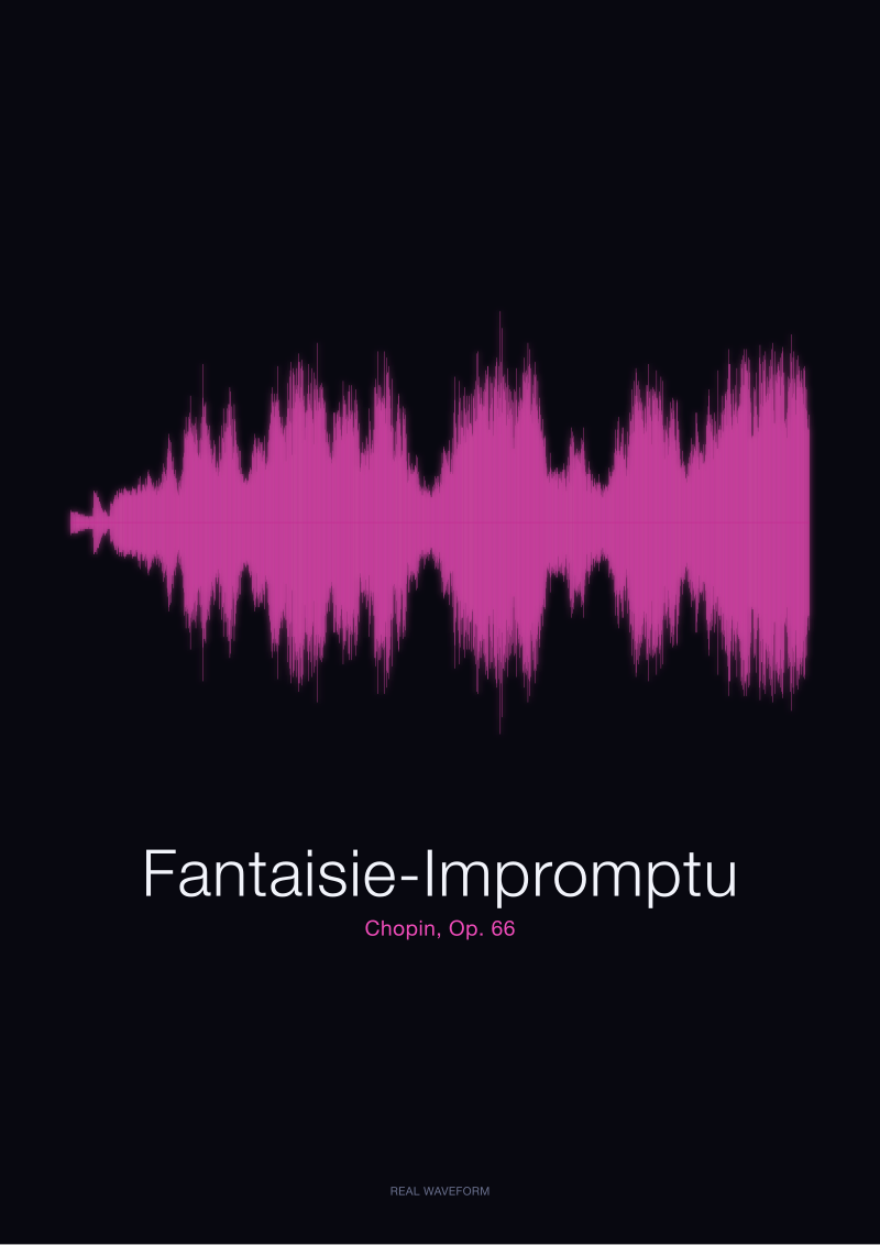
The honest version of the question is not "what do national anthems look like as waveforms" but "what does *this recording* of *this anthem* look like as a waveform, and what does that particular silhouette tell us about how it was performed?" That question we can answer, and answer well. It is what we do all day. When we render the Chopin Fantaisie-Impromptu from the Musopen CC0 recording, we are not making a claim about Chopin. We are making a portrait of one performance — the moments the pianist attacked hardest, the moments they held back, the shape of the piece as it was played, once, and captured. It is a document of an interpretation, not of a composition. That distinction is the whole ethic of the studio.
Reframe an anthem commission that way and it stops being a lie. A print of a specific national anthem, sourced from a specific named recording and dated, is honest. It shows you the silhouette of a specific rendition. Someone else's rendition would be a different print. Neither is *the* anthem. Both are portraits of an evening's air.
We suspect the reason people want the grid version is that they are actually asking a different question, and the waveform is the wrong instrument for it. If what you want to know is which anthems are structurally shortest, look up the score length. If you want to know which are melodically most complex, you want note-density analysis of the sheet music. If you want to know which are historically most warlike, you want the lyrics and the year of adoption. If you want to know which are most emotionally loaded for their citizens, you want to ask their citizens, not their spectrograms. There are good questions in the neighbourhood of the original request. The waveform just doesn't answer any of them, and pretending it does would mean selling a chart-shaped object with the credibility of a chart and none of the underlying rigour. That is a thing other people can do. We would rather not.
Which means that the honest handoff, at the end of a piece like this, is not a chart. It is a redirection. If you were hoping to be told that one country's anthem is louder than another's on paper, we can't sell you that print, because the print would be lying to you. But if you were hoping to hold a single recording of a piece you care about — an anthem your grandfather sang, a Chopin your mother played, a spoken word your child said once into a microphone — and see the shape that specific air made on that specific day, then we can. That is what our shop is full of. A portrait is a different, smaller, truer thing than a comparison.
The next question the reader ought to be asking is not which visualisation compares anthems best. It is which of their own recordings deserves to be drawn.
This piece started life as a commissioned brief. A client wanted the skylines-of-nations grid, and we sat down to figure out how to render it without lying. What came out, three drafts later, was an argument against the commission itself, and a quiet defence of the smaller, stranger thing waveforms are actually good at. We did not intend to write a refusal. We intended to write a chart. The chart kept refusing to be honest, so eventually we wrote about that instead.
 Fantaisie-Impromptu
The print from this article · from €29.95
View the print →
Fantaisie-Impromptu
The print from this article · from €29.95
View the print →
From the collection



New pieces and 10% off your first print.
One email now with your code. No noise after.