There is a pattern we keep seeing when a customer asks where to hang a Minute Waltz print. The question arrives room-first — "would it work above the sofa?" — and the piece itself, Chopin's Op. 64 No. 1, is treated as decorative furniture that happens to be musical. The waveform we render is the real amplitude trace of a public-domain recording from the Musopen Chopin collection on archive.org, not a stylised curve. It has a specific silhouette: fast, bright, densely packed, roughly a minute and a half of near-continuous motion. That shape wants specific walls. Most rooms people propose are the wrong ones, and for reasons the shape itself explains.
The Pattern of Hanging Music in the Wrong Room
The pattern is this: people choose the room first, then ask whether the piece will fit. That is the wrong order.
A waveform, unlike a landscape or an abstract print, has a specific reading time. When we render the CC0 Musopen recording of Op. 64 No. 1 as an amplitude trace, we are drawing what the ear does across roughly ninety seconds. The eye reads a landscape once, then reads it as a whole from then on. The eye reads a waveform sequentially, left to right, because that is what waveforms are: time laid flat. A viewer standing in front of it is not looking at a picture. They are looking at a duration. The room needs to give them time to do that, or the print becomes wallpaper.
That is why the room-first question fails so often. "Above the sofa" is a compositional question — will it centre nicely, does the frame match the lamps — and it treats the print as static image. But the Minute Waltz is not a static image. It is a dense scribble of activity, close-spaced peaks running almost edge to edge, with only a small handful of visible troughs where Chopin lets the line breathe. A viewer standing three metres away in a large living room sees only "busy horizontal band". They do not see the piece. They see texture. That is a waste of the shape.
The correction is not complicated, but it is counterintuitive: hang the Minute Waltz where a person will stand close and stay still. Not where a person will glance from across the room. That single reversal — proximity over spectacle — decides most of what follows. Every room in the house scores itself against it.
The Hallway Mistake: Treating a Waltz Like a Landscape
The most frequently proposed room is the hallway. It is also the most consistently wrong.
The hallway feels right on paper because it is horizontal, and the Minute Waltz waveform is horizontal, and there is a satisfying visual rhyme between corridor and print. Decorators love that rhyme. We understand the instinct. But the hallway punishes the piece for a specific reason: nobody stops in a hallway. It is a room designed for transit, and its whole psychology is forward motion. A waveform hung there gets read at walking speed, which is about one metre per second, which is faster than any human can actually parse a densely packed amplitude trace.
The Minute Waltz makes this worse than it would be for another piece. A nocturne on paper is mostly quiet — long stretches of low amplitude, then a swell, then quiet again. A viewer walking past a nocturne print still catches the shape, because the shape is largely negative space. The Minute Waltz is the opposite. It is nearly continuous energy from beginning to end. Its silhouette does not resolve at a glance. Read it fast and it becomes visual noise. That is the hallway problem in one sentence: the piece with the least white space is the piece most punished by short viewing time.
There is also a lighting issue that the hallway rarely solves. Corridors tend to be lit for safe passage rather than for reading detail, which means low, even light with few contrast cues. A waveform's readability depends on being able to distinguish the peak line from its ground. Under corridor lighting, the tightly packed peaks of Op. 64 No. 1 flatten into a bar. If you have already put a print in the hallway and are wondering why it looks like a strip of texture rather than a piece of music, the answer is almost always the lighting, not the framing.
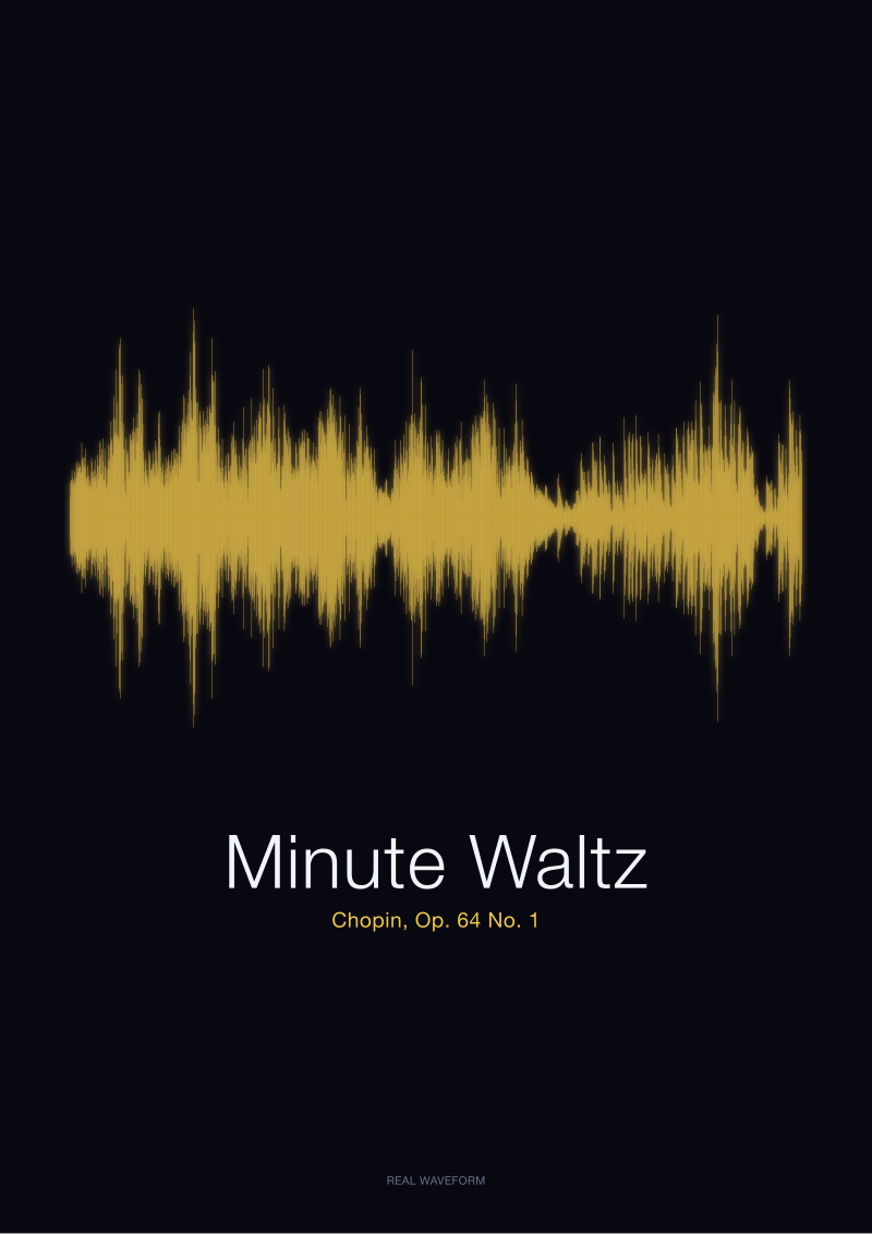 Minute Waltz
The print from this article · from €29.95
View the print →
Minute Waltz
The print from this article · from €29.95
View the print →
The Bedroom Overcorrection: Softening a Shape That Was Never Loud
The bedroom is proposed as the opposite gesture. If the hallway is transit, the bedroom is stillness. If corridors rush the eye, the bedroom lets it dwell. This sounds correct. Often it isn't, and the reason is a small misreading of what Op. 64 No. 1 actually sounds like.
The Minute Waltz is not slow music. It is not calm music. Chopin marked it Molto vivace, and the shape of the waveform confirms what the ear already knows: this is fast, agile, playful, sometimes almost breathless. The bedroom gets proposed because customers associate Chopin with restfulness in a general way — the composer as a category of nighttime listening — rather than because this particular piece belongs there. The Musopen recording we render is a solo piano performance of roughly the expected duration, and its amplitude envelope is not restful. It bristles.
There is a subcategory of this same mistake we see often: hanging Op. 64 No. 1 above the bed as an intended sleep-adjacent object. The failure mode there is not aesthetic — it is emotional. The waveform is the last thing seen at night and the first thing seen in the morning, and the shape it insists on is quick, unresolved motion. Some people genuinely want that; most do not. Amplitude is not emotion, and a viewer's dawn eye reads the peaks as activity, not as lullaby, no matter how peaceful the framing.
Where the bedroom does work is when the piece is being hung as personal history rather than as ambient decoration — a first dance, a piece a parent used to play, a recording tied to a specific memory. Then the shape stops being about mood management and starts being about recognition. The eye that lands on it every morning is not reading amplitude; it is reading a duration it already knows by heart. That is a different job entirely, and the bedroom is fine for it.
The Minute Waltz is not the wrong print for a home; it is the wrong print for the room most people instinctively pick.
The Kitchen Case Nobody Argues For (And Should)
Nobody proposes the kitchen. We would like to change that.
The kitchen — and specifically the wall opposite where somebody stands at a counter or sink for minutes at a time — is quietly the strongest room for this particular waveform, and the reason is entirely about viewing duration. A kitchen is a room in which a person stands still, close to a wall, for stretches long enough to actually read a ninety-second piece of music. Chopping vegetables, waiting for water, watching a pan. These are not transit moments. They are dwell moments. A waveform hung at eye level in the kitchen finally gets the one thing the hallway denied it: time.
The lighting argument runs in the same direction. Kitchens tend to be the brightest rooms in a house, with high, even light designed for detail work. That light is exactly what a densely packed amplitude trace needs. The individual peaks of the Musopen recording become legible under kitchen light in a way they simply are not under living-room ambient. A viewer who has spent thirty seconds waiting for the kettle can, without trying, count the phrasing gestures Chopin builds into the piece. The shape stops being texture and becomes music that happens to be visible.
There is a practical objection here about grease, steam and moisture. We take it seriously. A print in a kitchen wants distance from the hob and glazing that will not fog, and it wants to be away from direct splash zones. But a wall two or three metres from the cooking surface, on the opposite side of a galley or across an island, is more forgiving than the objection assumes. The bigger risk is not steam; it is putting the piece somewhere the eye already goes for other reasons — the wall directly behind the sink, for instance, competes with the window. That is a bad job for any waveform. Give the print a wall of its own and it will earn it.
The dining room is the near neighbour of this argument, and much of what applies to the kitchen applies there too, with one adjustment: the viewer at a dining table is seated and stationary, which is ideal, but often at a distance that erases the fine peaks of a piece as dense as Op. 64 No. 1. If the wall is close — a compact dining space, a two-person table — the case is strong. If the wall is far — a long farmhouse table with the print at the far end — the shape flattens again, and a piece with more visible negative space would sit there better. The Minute Waltz rewards proximity. Design the hang around that.
 Nocturne
The print from this article · from €29.95
View the print →
Nocturne
The print from this article · from €29.95
View the print →
So What Do You Actually Do
If you have already bought the print, or you are about to, the operating rule is simple. Ignore the wall that "needs something". Look instead for the wall you or someone else genuinely stands in front of. A study wall behind a monitor, a kitchen wall opposite the counter, a small hallway alcove at the top of a stairs where someone pauses for post — anywhere the body is stationary and the eye is close. If the wall passes that test, the room label becomes irrelevant.
If you are choosing between rooms and are stuck, use viewing time as your only criterion. Count the seconds a person actually spends within two metres of the wall in question on a normal day. Under thirty seconds and the Minute Waltz will lose to itself, because its shape needs longer than a glance to open. Over a minute and the piece stops being decoration and starts being what it is: a rendered performance of a Chopin waltz, close-packed, playful, the exact silhouette of the recording archived at archive.org/details/musopen-chopin under a CC0 licence, printed from real amplitude data. When somebody stops long enough to see that, they are not looking at a picture. They are looking at a piece of music from the outside.
The next question worth asking is not where to hang it, but which recording's silhouette you want on the wall in the first place — because different performances of Op. 64 No. 1 produce genuinely different waveforms, and that choice, not the room, is where the real editorial work begins. Our shop at /shop/ carries the Minute Waltz print rendered from the Musopen CC0 recording; the room decision is yours, but the shape is fixed the moment the performance is chosen. That is where the more interesting conversation starts.
FAQ
Does the Minute Waltz print work in a small apartment where wall space is limited?
Yes, and often better than in a large one. The waveform's dense silhouette rewards close viewing, and small apartments force close viewing by geometry. The failure mode in larger homes is distance: viewers stand back and see texture rather than shape. A studio or one-bedroom with a wall two metres or less from where someone actually sits or stands gives Op. 64 No. 1 the reading time it needs. Room size is less relevant than average viewing distance.
Is there a wrong direction to hang a waveform print of the Minute Waltz?
The waveform reads left to right, the way the recording plays. Hanging it vertically or reversed treats the shape as pure ornament and disconnects it from the piece it renders. Some customers do it deliberately for symmetry with another vertical work, and we understand the instinct, but the argument for horizontal orientation is not decorative — it is that time itself runs one way. Once flipped or turned, the print stops being a drawing of the performance and becomes only a curve.
Should the print be hung at eye level or higher?
Eye level, measured from the position where the viewer will actually stand. This is not the standard gallery rule of 145–150 cm from the floor; it is 145–150 cm from the floor of the exact spot the viewer occupies. In a kitchen where the reader is standing, that is high on the wall. At a low writing desk where the reader is seated, that is lower than instinct suggests. Waveforms reward specificity here more than most images do.
Does the framing matter for how the shape reads?
It matters mainly at the edges. A wide mount around the waveform gives the eye a settling zone before it starts reading the peaks, which helps a busy piece like Op. 64 No. 1 in particular. A tight frame with narrow margins pushes the density of the trace right to the edge and can make the shape feel cramped. Framing colour is a secondary concern, but non-reflective glazing is worth insisting on: a densely packed amplitude trace loses badly to a glare band across its middle.
Is a Minute Waltz print a good gift, and for whom?
It works best as a gift when the recipient has a specific tie to the piece: someone who played it as a student, someone for whom it soundtracked a period of life, someone gifted a Chopin collection as a child. The waveform then becomes a shape they already know from the inside. As a generic classical-music gift for a non-recipient, it is weaker — the density of Op. 64 No. 1 needs the viewer to want to read it. Gifting a song is gifting a shape, and the shape has to mean something.
Can the print be hung near a speaker or turntable without looking contrived?
It can, and there is a coherence to it that most decor pairings lack: the wall shows the shape of what the speakers are producing. The risk is redundancy only if the same recording is what plays through them; even then, the redundancy is the point for many collectors. The more common mistake is hanging the print behind the listening chair rather than in front of it, where the ear is aimed but the eye cannot follow. Put the shape where the eye rests during listening, not behind the head.
Why does Op. 64 No. 1 specifically not work in most living rooms?
Because most living rooms are designed for group viewing distance — three to five metres from the sofa to the opposite wall — and that distance flattens the densely packed peaks of the Minute Waltz into a bar of texture. Living rooms with intimate seating, a chair pulled close to a bookshelf wall, an alcove near a window seat, work fine. The problem is not the room; it is the standard living-room hang, which was designed for landscapes and paintings that read whole, not for waveforms that read across time.
From the collection


New pieces and 10% off your first print.
One email now with your code. No noise after.