People ask us for a colour palette for the Heroic Polonaise the way they ask a sommelier for a wine that goes with beige. We understand the instinct and we are going to help, but the honest answer is a flowchart, not a swatch. Chopin's Op. 53 has a real amplitude waveform — a public-domain recording from the Musopen collection on archive.org, rendered as the actual shape of the actual air moving — and that shape has shoulders, silences, and a famous octave passage that lands like a door slamming. Below are three questions. Answer them, then read the table.
Question 1: Is Your Room Loud or Quiet?
We do not mean decibels. We mean the visual noise of the surfaces already on your walls. A room with a busy rug, three framed prints, a gallery wall of family photographs and a patterned sofa is a loud room. A room with one large window, an off-white wall, a single chair and a lamp is a quiet room. Before you pick any colour for a Heroic Polonaise print, you have to be honest about which one you actually live in.
The reason this question comes first is that Op. 53 is not a quiet piece. Its waveform has visible shoulders — dense bands of amplitude where Chopin drives the left hand into that repeated octave figure that everybody who has ever heard the piece can hum without knowing the opus number. If you put a high-contrast, ink-heavy rendering of that shape into a room that is already visually overloaded, you will not be adding music. You will be adding a fourteenth thing to look at, and the fourteenth thing always loses.
If Yes (your room is loud)
Go low-contrast. That means the waveform ink and the paper have to be closer together in tonal value than your instinct will suggest. A charcoal wave on warm off-white paper reads as one object from four metres away, not as a fight. Skip anything with a saturated background — no navy, no deep green, no oxblood. Those palettes photograph beautifully on a studio backdrop and then disappear entirely into a room that already has a patterned throw.
The Heroic Polonaise's silhouette does not need help being noticed. It has the shoulders. Let the wall do less work.
If No (your room is quiet)
Now you can afford contrast. This is the room where a black wave on cream, or an ivory wave on a deep muted teal, will actually earn its place. Quiet rooms are the ones where a single high-contrast object stops being decoration and starts being punctuation — the visual equivalent of the piece's opening chord, which arrives, in the Musopen recording, with almost no run-up. Silence, then the shoulder.
The mistake in a quiet room is going quiet with the print too. You will end up with a whisper on a whisper, and the waveform will read as a decorative squiggle rather than as the shape of a specific piece of music. If your room is disciplined, let the print be loud enough to reward the discipline.
Question 2: Are You Framing the Shape or the Story?
This is the question people skip, and it is the one that decides whether the print survives your third redecoration or gets moved to the hallway within a year. There are two entirely different reasons to put a waveform on a wall. Confusing them ruins both.
Framing the shape means you are treating the waveform as an abstract graphic. You like how Op. 53 looks — the density in the middle, the tail, the compositional weight — and you want that shape to work as a formal object regardless of whether anyone in the room can identify the piece. This is a design decision. It answers to the same rules as any other abstract print: proportion, negative space, tonal relationship to the wall.
Framing the story means you are treating the waveform as a piece of specific music you love. Maybe it was played at a wedding. Maybe it is the piece your grandmother used to practise. Maybe you first heard it in a film and it has never left you. Here the print is a marker of a real thing that happened, and the colour palette has to answer to memory, not to the sofa.
If Yes (you are framing the shape)
Colour the print to the room. Pull the paper tone from the wall's undertone — if the wall is a warm off-white, do not put a cool grey mount next to it — and pull the ink tone from the darkest wood or metal already in the room. This is boring, functional, and correct. The waveform becomes a compositional element that happens to be a Chopin polonaise. Nobody who walks in will ask about the music, and that is fine. You did not put it up for them.
Avoid the trap of trying to signal that this is "classical music" through the palette. Sepia, gold leaf, script fonts, cream with a dark green border — all of that is Merchant Ivory cosplay. The waveform itself is the piece. It does not need costume.
If No (you are framing the story)
Now colour has to answer to the memory. If the memory is of a specific recording heard in a specific place — a concert hall in winter, your parents' living room, a car on a long drive — start there. What did the light look like? What was the dominant colour of the walls, the upholstery, the sky through the window? That is your palette. Not because it will "match" your current interior but because the print's job is to hold the memory, and memories are stored in colour before they are stored in language.
If you can do this correctly, the print will be slightly out of place in your room forever, and that is the entire point. It is not decor. It is a marker. A marker that harmonises perfectly with its surroundings has stopped marking anything.
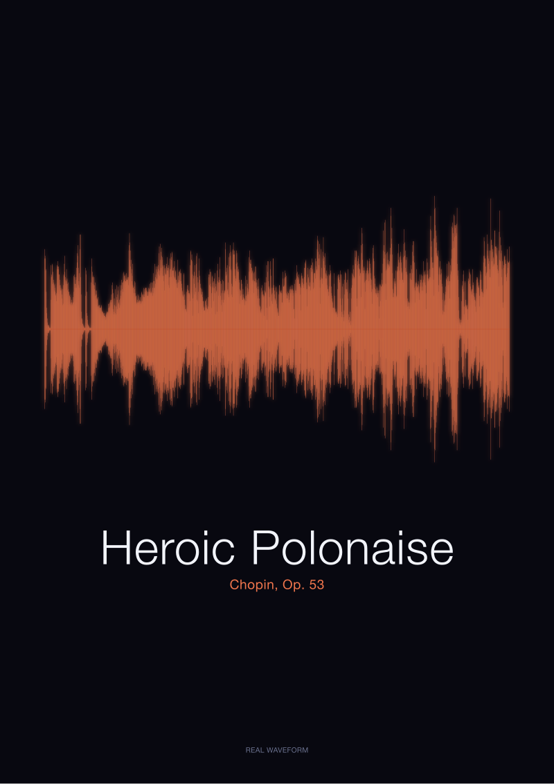 Heroic Polonaise
The print from this article · from €29.95
View the print →
Heroic Polonaise
The print from this article · from €29.95
View the print →
Question 3: Do You Own the Recording, or Just the Idea of It?
We are careful about this one because it decides whether the print is honest. There are people who genuinely listen to the Heroic Polonaise — the exact recording rendered into the waveform, or one they know well enough to hum the middle section without wobbling — and there are people who like the idea of being the kind of person who has a Chopin waveform on the wall. Both are allowed. Neither is wrong. But the palette choice is genuinely different.
The Musopen recording is public-domain, CC0, sitting on archive.org. It takes about forty seconds to find and roughly eight minutes to listen to. Before you buy a colour palette for a piece of music, we would gently suggest listening to the piece of music. The waveform on the print is that recording specifically — the actual air the actual pianist moved, not a stylised curve — and the palette should be chosen by someone who has, at minimum, heard the shape they are about to hang.
If Yes (you own the recording, or know the piece)
You already know where the loud parts are. You know that the middle section is where the shoulders live and that the tail is not as quiet as the visual might suggest. Choose the palette that reflects the section you most respond to. If the octave passage is the moment for you, lean into contrast on that band — a rendering that lets the middle read as darker or denser than the ends will give you a print that maps to your listening. If the piece's opening ceremony is what you love, choose a palette that lets the first shoulder read.
This is the case where colour can be genuinely personal. You are not decorating. You are annotating.
If No (you are buying it because it sounds like something you should own)
Stop. Go and listen first, then come back. We are not being purist about this. We are being practical. Palettes chosen for pieces the buyer has not internalised age badly, because the choice was made against a vague mental impression rather than against the actual shape. Six months later, when the buyer has heard the piece properly, the palette will feel wrong and the print will migrate to a lower-traffic wall.
The exit criterion here is simple: if you cannot answer, roughly, where the loudest thirty seconds of Op. 53 fall in the piece, you are not ready to pick its colour. Come back in a week. The recording is free.
If You Answered Everything: The Decision Table
Read your three answers across, then read the recommendation. There are eight combinations. The recommendation cell is one sentence because it should be — a longer sentence would be us hedging.
| Q1: Room | Q2: Shape or Story | Q3: Know the Piece? | Recommendation |
|---|---|---|---|
| Loud | Shape | Yes | Low-contrast charcoal-on-cream, paper tone pulled from the wall's undertone, framed narrow. |
| Loud | Shape | No | Same as above, but listen to the recording first — your Q2 answer may flip once you know the shape. |
| Loud | Story | Yes | Pull the palette from the memory, not the sofa; accept that the print will not "match" and that this is correct. |
| Loud | Story | No | Do not buy yet — a story palette without knowledge of the piece is decor cosplay. |
| Quiet | Shape | Yes | High-contrast dark-on-ivory or ivory-on-deep-muted; let the shoulders do the work. |
| Quiet | Shape | No | Listen once, then commit to contrast — quiet rooms punish tentative palette choices. |
| Quiet | Story | Yes | The room can hold a memory-driven palette that ignores its decor entirely; this is the ideal case. |
| Quiet | Story | No | Wait. The right print here is worth waiting a week for. |
The pattern in the table is not subtle. Every "No" in Q3 routes to the same instruction, which is to listen first. Every "Story" answer in Q2 gives colour permission it does not have in the Shape branch. And every "Loud" answer in Q1 narrows the palette options considerably, because loud rooms have already spent most of the visual budget you had to work with. If you found yourself resisting one of these recommendations, the resistance is diagnostic — it is telling you that one of your three answers was aspirational rather than honest. Answer again.
For readers who reached a recommendation they are ready to act on: the studio's own catalogue of Op. 53 renderings, in the palette combinations above, sits at see the Heroic Polonaise print. One mention, no discount language, and we would rather you buy from another workshop than buy the wrong palette from ours.
Honest Limits: What This Piece Did Not Cover
We told you at the top this was a survival handbook. Survival handbooks are honest about what they leave out, because the omissions are usually where people get hurt.
This piece did not cover framing hardware, mount depth, glass versus acrylic, or lighting. Those decisions matter — a beautifully chosen palette behind reflective glass under a spotlight looks like a bathroom mirror — but they are a separate craft, and we are not qualified to write the framer's article. Ask a good framer in person. They will care more than you expect them to.
This piece also did not cover the question of whether the Heroic Polonaise is the right Chopin piece for your room in the first place. We took the query at face value. But Op. 53 is a specific shape, and if you responded to a nocturne's mostly-quiet silhouette more than to a polonaise's shoulders, that is a different waveform and a different palette conversation. We would rather you hang the piece you actually love than the piece you feel you ought to.
And this piece did not cover the philosophical question that sits underneath all of it, which is whether music should be visualised at all. Some listeners think turning a recording into a drawing flattens it. We disagree, obviously, or we would be in a different line of work — but the argument is real, and if you find yourself uneasy about the whole exercise after reading this, that unease is a legitimate answer to Question 3 in disguise. It is worth sitting with.
 Nocturne
The print from this article · from €29.95
View the print →
Nocturne
The print from this article · from €29.95
View the print →
FAQ
Is there an "official" colour palette for the Heroic Polonaise?
No, and be suspicious of anyone who tells you there is. Op. 53 does not have a canonical colour — Chopin did not leave a swatch. What exists is the amplitude waveform of specific recordings, which is a real, measurable shape. Any palette applied to that shape is an interpretive choice made by whoever renders the print. The best palettes answer to the room and the listener, not to a pretend authority.
Can I use the same palette logic for a Nocturne or a Prelude?
Partly. The three questions still apply — loud room versus quiet room, shape versus story, ownership of the recording — but the recommendations flip in places because the shapes are different. A nocturne's waveform is mostly quiet with narrow spikes, so it survives a busy room better than the Heroic Polonaise does, and it punishes low contrast because there is not enough ink on the page to compete with a busy wall. Re-run the tree with the new shape in mind.
Should I choose the palette before or after I choose the frame?
Palette first, always. The frame is a compositional response to the print, not the reverse. If you pick a frame you love and then try to make a Heroic Polonaise palette agree with it, you will either compromise the print or end up buying a second print in three months. Choose the palette against the wall and the listener, then find a frame that disappears.
How big should a Heroic Polonaise waveform print actually be?
Big enough that the shoulders read from across the room. In practice that means the printed waveform should be at least as wide as a standard laptop screen — smaller than that and the density in the middle becomes visual mud rather than the octave-passage shoulder it is meant to represent. If your wall cannot accommodate that width, choose a shorter piece with a simpler waveform instead.
What if I want the print to match a specific colour in my sofa?
This is a Q2 answer disguised as a question. If you are matching the sofa, you are framing the shape, not the story, and the recommendations in the Shape branch apply. Pull the ink tone from the darkest thread in the upholstery rather than the dominant colour — the print needs contrast against the wall, not agreement with the cushions. And be honest that you are decorating, which is fine.
Is a colour print more expensive than a black-and-white one?
Sometimes, depending on the studio, but the cost difference is not the interesting question. The interesting question is whether adding colour adds anything to the specific waveform. For a shape as dense and articulated as Op. 53, colour can dilute the reading — the shoulders lose weight against a chromatic background. Black on cream is not a budget choice for the Heroic Polonaise; it is often the correct choice.
Does the recording I choose actually change the waveform shape?
Yes, meaningfully. Two pianists playing Op. 53 will produce visibly different waveforms — different tempi, different rubato, different dynamic ranges, different silences between phrases. The Musopen public-domain recording has its own silhouette that is not identical to a Rubinstein or a Pollini reading of the same score. If you own a specific recording you love, ask whether a print can be rendered from that audio rather than from a stock waveform.
What if my room changes in a year?
Then the print's answer to Question 1 changes with it, and the palette that was correct for a quiet room may read wrong in a newly busy one. This is why we push people toward Story-framing when we can: story palettes survive redecoration because they were never answering to the room in the first place. Shape palettes are more fragile by design.
From the collection


New pieces and 10% off your first print.
One email now with your code. No noise after.